In another thread I posted a mockup of design concept for my COA and described it as a "jumping off point." As I looked at it over time I went through a few stages. At first I thought it was much too basic and lacked interest. Then the simplicity of it started to grow on me. Now, after looking at many more examples, I see that I have many more options to explore in terms of field divisions and variating ordinaries, among other things. I’m now going to open up this design thread to kick ideas around and hopefully get some creative input to create something worthy of passing on.
So here’s the first draft that I’m calling my starting point. It’s not really the first draft but it’s the first that I’ve shown, we’ll call it v0.1 as we work towards a final v.1.
http://imageshack.us/a/img537/7858/ffae38.jpg
What I’ve come to realize after looking at it for a while is that it’s simply combines a couple elements of heritage and one of personal background. The "argent a cross gules" being a nod to my fathers line back to england, the "azure a double cross or" a nod to my mothers home in Lithuania, and the sword symbolizes my military service. Ideally, I would like to retain these references, but in a way that is a bit more unique. I’ve been seeing a lot of arms that have a lot of character, and I’d like to add some of that to my own.
Maybe it’s because the simple cross is such an ancient ordinary and it’s hard to do anything with it that hasn’t been done, but it seems as if it’s almost not used at all as a main charge. I played with the idea of a lion passant guardant to represent England but passed on because I couldn’t think of a way to use it that I liked. I’ve since seen a few variations of what can be done with animals such as striping or semme, so I might still opt to see that in future versions.
Representing Lithuania with what amounts to a canton was an afterthought. I Originally wanted to use an escutcheon modeled after the shield of the Vytis in the Lithuanian COA. I chose not to use the whole Vytis, which is an armored knight on horseback with a sword and shield, because I thought it would be to busy. There are other options for Lithuania, such as the Columns of Gediminas.
I wanted to use a griffin to represent my military service, it’s one of the elements of my unit, but thought that it may be too many animals when I was also using the lion. I chose the sword as a user friendly option to keep things simple. Of course there are many options to represent military service.
I also wanted to represent the US in some way but I couldn’t find a way that didn’t look to "‘merca!" if you know what I mean.
Just now I’m thinking of combining a few of these elements into the griffin. The lion body could represent England, the Eagle head could represent the US, and the griffin as a whole could represent my military service. Maybe he’s holding the sword and shield of the Vytis and I have 4 elements in one. That would free up a whole lot of shield to play with. Representations of griffins seem to hard to come by, so it will be hard to get a good picture of what I’m imagining.
I’ve found some stuff relating to variations of the ordinaries and it sparked more ideas. Enhanced or abased, nowy, ecime, embowed, faceted, coticed, and others. I’ve been making thumbnail sketches of various ordinaries and divisions.
For the crest, I’m still leaning towards head of hare, but I realize that I should do something to make it more unique as well. I’ve toyed with the idea of chains, bands, rings and other adornments to the head. Also leaves, feathers, mounds and weapons on, under, behind or around the head. Lot’s of options here, but maybe what adorns the crest will depend on what ends up on the shield.
The motto will remain "refrigerator test" for now. I’ll work on that last I think.
In short, an open canvas.
I would make the sword entirely argent for better contrast.
John,
I agree with you that, while the design is fine as far as it goes, you’ll be able to do something more distinctive than borrowing the national symbols to represent your ancestry. However, as a matter of society policy we only do detailed design assistance in the members’ section of the forum, so let’s put this discussion on hold until the guys with the keys to the electronic kingdom get you upgraded to your correct "member" status, then we’ll move the thread where it belongs.
Thanks for your patience.
Since becoming a member and perusing the design threads, I see that what one starts out with is rarely anything even closely resembling what the final product will be. I’m anxious to see what I finally decide on.
I’ve already started abandoning the ideas that I started with. I’ve burned through a pack of post-its with variations that are nothing like what I started with. Some are derivative, like per bend enhanced ermine and gules, with a sword proper. I really like the Virginia Tech Corps of Cadets arms on this site and wanted to see if I might like a variation of that. It had merit. Using some less often seen variations, I tried my hand at using Nowy. What I ended up with looked like a Pokeball. It had no merit. Another looked like a confessional window. Yikes!
The ones that I like seem so simple that I can’t imagine that they would not have already been used 500 years ago. But maybe with some changes they could be unique enough.
More to come.
QuiQuog;102488 wrote:
The ones that I like seem so simple that I can’t imagine that they would not have already been used 500 years ago. But maybe with some changes they could be unique enough.
Don’t be so sure of that. Take a look at this discussion about David Pope’s arms. They are so simple and elegant that surely they had already been recorded but it would appear that they had not been.
I also noted earlier that you mentioned something about a cross being hard to do anything with but there is a wide variety of great things that can be done with a simple cross.
As Joe pointed out earlier, it might be good to move this discussion to the member’s design page before adding your post-it note variations.
I did read that thread about David Pope’s arms and actually had that in my head when I was writing that sentence. It just seems like he hit the lottery with that one, in that it wouldn’t happen very often. I’ll try and not worry about uniqueness yet though.
Joe, if you could move this thread to the members section that would be great.
Apologies if already noted, but the cross of Lorraine is more likely to suggest French rather than Baltic origins.
You may be right about the cross Michael. If every other CoA design thread is any indication though, it won’t even matter. I’ve been looking at various design threads from the past several years and it looks like people typically start out with a lot of ideas, and a "starter shield" with an idea of what they would like. Almost invariably, the end result is nothing like what they posted in the beginning.
Ideas are tossed around and played off of other ideas until someone throws up an emblazonment that causes a group "eureka!" moment. The most prime example I came across so far was Jay Bohn’s design thread that started out with a fried chicken leg on a seme of kidney beans and a cornbread bordure mockery, and ended up as a brilliantly played bean sprout counterchanged. I thought that the kidney bean idea was a road to nowhere, but it turned out to be a stroke of genius.
Other arms that pop into my head are Carrasco, Snyder, and Smith. almost all of the ones I looked at are virtually indistinguishable from where they started. So now as I look at my own v0.1, I wonder what the end result will be.
I wonder if it would help or hurt to post ideas that I sketched on post-its. On one hand, it might show directions I want to go. On the other hand, it might limit the directions others may take.
Anyway, after looking at v0.1 for some time now, it seems very contrived and Playskool simple. I see now how I’ve not made something unique, but rather I’ve taken things from existing arms and cobbled them together into something "heraldic". I’ve been thinking of abandoning the symbols that I wanted to include and simply trying to come up with something that I like for the way it looks. But before I go that route, I’d like to explore other ways of representing my heritage, military, and canting in more abstract ways. Maybe through colors, shapes, allusions and other ways that I may not be aware of.
So where do we start with this? Hassenpheffer on a seme of sliced carrots?
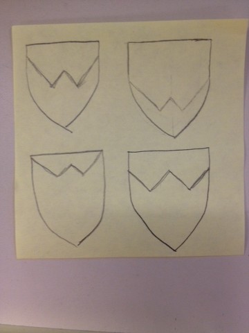
So, speaking of abandoning my earlier ideas, I’ve been sketching up tons of new shapes and trying to think of cants for my name. While I can’t think up much in the way of cants, I thought the design could allude to my last name.
I experimented with this to put a W in the arms:
http://imagizer.imageshack.us/v2/640x480q90/673/ulNQwE.jpg
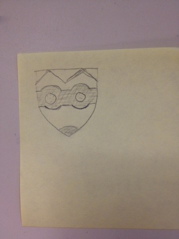
But after a while, all I saw was this:
http://imagizer.imageshack.us/v2/640x480q90/913/frtPCi.jpg
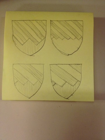
A little further experimentation with dancetty came round to this:
http://imagizer.imageshack.us/v2/640x480q90/673/hCekkv.jpg
Does anybody have an opinion on these? I’m kind of liking the idea of the two on the bottom.
Assuming you’re using conventional hatching for tinctures, these are going to look really "Christmassy"...
I wouldn’t give up so easily on canting arms.
David Pope;102502 wrote:
Assuming you’re using conventional hatching for tinctures, these are going to look really "Christmassy"...
I wouldn’t give up so easily on canting arms.
Ha! No, I only drew it that way because it was easier to draw lines the long way. It only represents a different tincture, what they might be is still up for debate. I meant to mention that.
I didn’t give up on canting, I’m exploring options. I hope that someone will have a spark of brilliance. Unfortunately, I’m not a brilliant person. The closest that I came to a cant is a wig+a Holiday Inn sign. I actually considered a rebus of peruke, pear+a rook, to refer to a wig, or a pair of rooks. Not married to that one.
Incidentally, yours are the only arms that I have seen in these forums to come full circle to where you started and end up with nearly the exact shield you started with.
Going off your drawings how about "Per fess barry dancetty sable and argent and ermine". Ermine is used for lack of a better fur to represent a rabbit pelt I suppose. Come to think of it, this is similar to another arms I proposed in a different thread. I think I have a redundancy problem…
QuiQuog;102503 wrote:
I didn’t give up on canting, I’m exploring options. I hope that someone will have a spark of brilliance. Unfortunately, I’m not a brilliant person. The closest that I came to a cant is a wig+a Holiday Inn sign. I actually considered a rebus of peruke, pear+a rook, to refer to a wig, or a pair of rooks. Not married to that one.
I think that canting can easily become too obscure or too labored. If your surname is Wiggins, I would just stick to the cant on "wig". Here’s what I think would work and be really cool-looking:
Shield: Azure three men’s colonial periwigs Argent, two and one, their queues ribboned Gules.
Crest: On a wig stand Proper, a man’s colonial periwig Argent, its queue ribboned Gules.
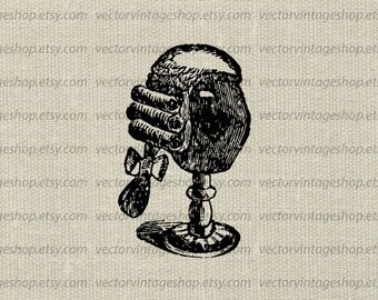
Here’s an image to give you an idea of what I’m thinking:
https://img0.etsystatic.com/025/1/9027267/il_340x270.618461240_7j32.jpg
Maybe one of our resident amateur digital artists can mock up something nice…
I actually don’t want a wig on my arms. There’s something that I like about arms, I think they’re cool. But there’s something unclean about wigs and I just don’t like them. I’ll accept a reference to them that doesn’t scream wig, like head of hare (head of hair) or a pair of rooks (peruke). I hope someone can come up with other ideas, but unless they can make a wig look cool I don’t want one to represent me. Maybe someone will accept that as a challenge.
mjsmith;102504 wrote:
Going off your drawings how about "Per fess barry dancetty sable and argent and ermine". Ermine is used for lack of a better fur to represent a rabbit pelt I suppose. Come to think of it, this is similar to another arms I proposed in a different thread. I think I have a redundancy problem…
That’s kind of where I was heading also, with the per fess dancetty. The problem I see with it is that the big W reminds me of Superman’s S.
QuiQuog;102507 wrote:
That’s kind of where I was heading also, with the per fess dancetty. The problem I see with it is that the big W reminds me of Superman’s S.
Or, more closely, Wonder Woman’s W
http://www.justbeenough.com/wp-content/uploads/2012/09/wonderwoman_large.jpg