http://i832.photobucket.com/albums/zz250/lls38/Archessmall-1.png
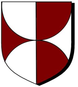
I have been working with divisions of the shield and I came up with the design illustrated here. I would blazon this: Gules, reverse arch enhanced in chief, arch enhanced in base meeting at at fess point both Argent per pale counterchanged. Other suggestions?
Interesting design. How about Per pale Argent and Gules a demi-roundel issuing from chief and another issuing from base meeting at the center point all counterchanged? - perhaps adding "as is more clearly depicted below" ![]()
Just my best guess, others will likely have different & better options.
Michael F. McCartney;103093 wrote:
Interesting design. How about Per pale Argent and Gules a demi-roundel issuing from chief and another issuing from base meeting at the center point all counterchanged? - perhaps adding "as is more clearly depicted below"
Just my best guess, others will likely have different & better options.
Wouldn’t it be per fess Gules and Argent because the roundels are counterchanged?
Per pale Gules and Argent demi-roundels issuing from chief and base conjoined at fess point counterchanged.
What is the difference between a demi-roundel and an arch enhanced? I surmise that an arch enhanced is simply an arch moved higher on the field and does not produce the semi-circle I desired. By the way, I prefer the demi-roundel, keeps it simple.
Kathy McClurg;103094 wrote:
Per pale Gules and Argent demi-roundels issuing from chief and base conjoined at fess point counterchanged.
Beat me to it. This was going to be my guess as well.
j.carrasco;103096 wrote:
Beat me to it. This was going to be my guess as well.
This.
Don’t understand Kathy’s question re: per fess;
but her version of Per pale etc. is better worded than my initial suggestion - kudos!
Kathy McClurg;103094 wrote:
Wouldn’t it be per fess Gules and Argent because the roundels are counterchanged
huh? I think your point was regarding the order of the colors and you got your division wrong. Correct?
Kathy McClurg;103094 wrote:
Per pale Gules and Argent demi-roundels issuing from chief and base conjoined at fess point counterchanged.
Ditto others’ comments.
Nice and simple. Thank you all
Larry
Could we add a forum category for Blazon?
Dear All,
From my own personal opinion, I think blazoning the two hemispheres as ‘demi roundels’ as a bit too cumbersome as roundels should from an aesthetic viewpoint be viewed as charges of a relative ‘normal’ size in proportion of the arms being designed.
Would it not be best to blazon the arms as follows:
Per pale argent and gules issuant from the flanks two piles concave and conjoined at fess point counterchanged
This blazon would appear to be a little more concise whilst describing the original intention of the design.
As ever
John
I’m attracted to John’s blazon, but doesn’t it leave open the possibility that the upper and lower will be more like Gothic arches than half circles?
Not a blazoning question, but I also have reservations about the entire graphic scheme. I haven’t drawn up variations, but I have a feeling that its effectiveness depends on the shape of the shield used. It also seems to my taste to be more clever than useful, for what it’s worth.
Dear Joe,
Regarding your first proposition. Yes, there is always a risk along the lines you mention, but has it not already been so when interpreting a blazon? Of course, English heralds always have the get out clause ‘as depicted more plainly in the margin’ to act as a guide.
I agree with your second proposition that often the overall effect of the arms so designed especially in the present case or similar where the design is dependant on lines of partition and having no other charges that the shape of the shield comes into play. Aesthetically what one had originally envisaged as a design will come to grief when depicted on shields of varied size and shape. Again, to blazon the two hemispheres a ‘demi roundels’ jars somewhat to both my mind and eye.
As ever
John
I agree completely that "roundels" is (are?) wrong for this blazon, but am not sure what’s right. Perhaps "two hemispheres issuant from chief and base meeting at fess point."
"Hemispheres" seems OK in this case - better than "piles concave" which as Joe notes could as easily be gothic arches as semi-circles. Both IMO attractive patterns; not necessarily the same visually but perhaps not really different enough to be considered heraldically unique unless the pointy gothic version is muchly exaggerated.
I tried sketching both patterns on a variety of shield shapes - heater, circular, lozenge, baroque - and while like most any design it works better on some than others, none were IMO total losers, except maybe a shield with a large cut-out in dexter chief for a tilting spear (IMO not a particularly good match for any number of shield designs).
The only weakness I can see for this pattern would be as background for a large central charge which would tend to obscure the partition pattern to look like gyronny of six.
This division seems to me to lend itself to four identical, counterchanged or alternate charges , as shown.
http://i832.photobucket.com/albums/zz250/lls38/Coats of Arms/Coa_Saltires.jpg