Joseph McMillan wrote:
Does that make sense?
Yes Thanks
ESmith wrote:
Elephants aside, I think this turned out very nicely. I think moving the atom (lithium?) off the shield and onto the crest was a good idea and it worked out beautifully. I think this is our first poster to use tenne extensivly in their arms it looks good.
Technically it would be lithium, since it has 3 electrons.
You don’t like the elephant?
Colin,
I must say that I would have never imagined that your choice in charges or tinctures would have ever come together so agreeably. Excellent job on both shield and crest. I really like it. :D
Take care,
Linusboarder wrote:
You don’t like the elephant?
No no, I like the elephant, it works well… I was refering to the King Babar discussion…
ESmith wrote:
No no, I like the elephant, it works well… I was refering to the King Babar discussion…
Oh ok lol ![]()
Better…now take a look at the relative proportions of the shield vs. the crest and helm, as shown in the members’ arms section. Good examples of the right proportions are the arms of Berntsen, Hardin, Kingman-Sugars, Pritchett, and Vernot. (Not to say the others are all badly proportioned, just a handful of examples.)
Typically the crest and helm combined should be about the same height as the shield. Some artists prefer the helm and crest combined to be maybe 10-15% taller than the shield, some prefer them to be maybe 10-15% shorter. Different sources—and different national artistic traditions—prescribe different ratios. But the general idea is that the same person should be able to wear the helm and carry the shield.
Another thought: The mantling is originally a covering for the helmet. It should be attached to the helmet below the crest—it doesn’t just lie behind the helmet and crest, as you have it shown in your picture. Again, refer to the members arms gallery for some good examples.
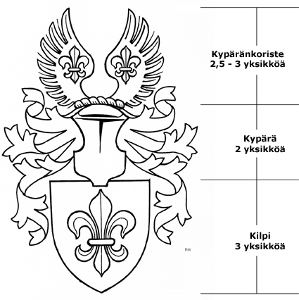
Following up on Joe’s recommendation regarding proportions, here is the Finnish society’s guideline:
http://www.heraldica.fi/Vaakuna/Vaakunan_osat/osat.htm
http://www.heraldica.fi/Vaakuna/Vaakunan_osat/Kuvat/osat.gif
Colin,
If you borrow the example of the crest that Mike just provided, you could substitute the fleurs de lys with your atom/lithium.
—Guy
I think Guy is suggesting showing two atoms, one on each wing, rather than just one atom between the wings. Personally I think this would be an improvement for two reasons: 1) less cramped—allows for fuller, IMO better-proportioned wings, & 2) the atom, while IMO a perfectly fine charge in modern heraldry, doesn’t show up all that well against a white background (between the wings); it (or they) should show better as gold or silver on the red wings—but you should confirm or deny with a refrigerator test.
Also IIRC (too lazy to scroll back ![]() there was some reason you originally wanted two atoms on the bend or bendlet, & this approach gives you both.
there was some reason you originally wanted two atoms on the bend or bendlet, & this approach gives you both.
Having said which, there is absolutely nothing inappropriate or inauthentic about one charge between two wings—its a batter of taste & personal choice.
Ok made some fixes to the crest/helm proportions. (The wings are orange, not red BTW Michael)
http://www.uploadfile.info/uploads/9472fc88ec.png
I am having the most difficulty with the mantling. I am having a difficult time making it look like it’s attached to the back of the hlem, not just sitting behind it.
Quote:
I am having the most difficulty with the mantling. I am having a difficult time making it look like it’s attached to the back of the hlem, not just sitting behind it.
I can give you an artist’s perspective if you’d like. There are two things right away that will give it the look you want.
One, try and angle the helm downward just a wee little bit; normally I’d say angle the top of the helm down a wee bit, but I don’t know if you can make a computer do that in this case?
Two, place the beginnings of the mantle - from the front facing point of view - slightly over the top edges of the helmet; beginning to fall down from at least the inside line of the first and last knot of the wreath (ref the example Mike gave you above).
These two things will make it appear to be coming from the wreath on top of the helmet instead of from behind the helmet. I don’t know if you can do that with a computer or not - sadly not my thing really - but when I am creating them by hand this is the main technique I use for an afrontee helmet to make it appear to come from the wreath instead of behind the helmet.
If you can’t make the computer do it just leave it as is and know that when you go through an artist you will see that he/she will probably do this as a matter of fact otherwise it looks too flat.
It is easier with a side facing helmet, but in your case I would not use a side facing helmet because of the crest itself. So, if your wife wants one try to use one that faces to the side and then you can use a side facing helmet…
Again nice job overall Colin. ![]()
Ok I went back and looked at the original art i pulled the mantling from, and found out i was using it a little wrong, so how does it look now?