OK, this is what we came up with last night in the chat room:
Vert a field seme estoiles Argent two Peels proper in saltire.
http://i195.photobucket.com/albums/z242/WBHenry/EmmaPeel.gif
I don’t know. It works for me (but I’m not a well man).
No, no, Will: those are two Emma Peels in black & white. And I concur, you are not a well man. ![]()
Just remember, Patrick, I had help with this. I’m just the "herald." The "artist" shall remain anonymous! (But you should be relieved to know that I am back on my meds now…)
"Don’t shoot the messenger," eh, Will? Hmm ... besides, i think one Emma Peel should be enough for any man.
I see that Pr. Henry has already shared the raving our delusional minds.
Here are some more fruitful results of the conversation and suggestions from the board. They’re mostly just tweaks to the current design. However, if anyone has an idea that is radically different from what we’ve come up with so far, please chime in.
http://i5.photobucket.com/albums/y155/jonishairy/Heraldry/baker1-2.gif
Original design with two peels instead of the crook.
http://i5.photobucket.com/albums/y155/jonishairy/Heraldry/Baker3-2.gif
Semy (or is that poudre) of thirteen estoiles
http://i5.photobucket.com/albums/y155/jonishairy/Heraldry/Baker3-3.gif
My sad attempt at rendering a loaf of bread.
JRB
Decisions, decisions…
I really like the cross in the first rendition. However, the second and third seem to have a better (more pleasing, equitable?) distribution of the estoiles. (But if you do keep the cross in a final rendition, might I suggest raising it a little higher in chief…it seems "cramped" where it is currently located.)
The bread will help keep the uninitiated from thinking these are "oars."
Curious: Each version uses two different metals for the peels and the estoiles. Is that just personal preference? Why not one metal throughout?
Have you thought about rolling pins instead of peels? ![]()
Things seem to be moving along quite nicely (but I am going to miss Emma).
I, honestly, still liked the one with the white saltire the best, but any of these would fine.
I think you should keep the cross in the honor point though, it looks very nice and IMO brings out the estoiles even more.
Maybe it would look better reversing the color of the stars and peels
Why not make the shield the oven…?
[ATTACH]216[/ATTACH]
Jonathan R. Baker;44401 wrote:
http://i5.photobucket.com/albums/y155/jonishairy/Heraldry/Baker3-2.gif
Semy (or is that poudre) of thirteen estoiles
This is the most pleasing design to my eye. I might add the loaves to the peels, as in the French example, that is three smaller loaves on each peel. If you are enamored with the cross, save it for the basis of a badge design.
As we discussed last night, poudré is the French heraldic term to describe an arbitrary powdering of a specific or unspecific number of charges that differs from semé in that there are no partial charges at the edge of the field.
That is quite cleaver, Michael! (Off topic: Thanks for updating my armorial page so quickly!)
Ah, Michael. I liked that last one and when I got on here to save it to my hard drive it had disappeared. Perhaps it’s because I’m on my workplace network. I’ll try again when I get home.
You certainly gave a new meaning to "heater shield."
JRB
Edit: I can see the images now that I’m at home. Work computers suck.
I showed my dad some of the stuff we’ve worked up, and he really liked Colin’s idea to put the peels on a saltire, but he liked the other stuff as well.
Inspired by a read through the Finnish Genealogical Project thread, here are a couple more renditions. Again, I’m just throwing ideas out there for comments and criticism, so don’t hold back.
http://i5.photobucket.com/albums/y155/jonishairy/Heraldry/Baker4.gif
My wife didn’t like the bezants, so I attempted to make a French loaf.
http://i5.photobucket.com/albums/y155/jonishairy/Heraldry/Baker4-2.gif
I just found out that my parents and grandparents will both be in town for Mother’s Day (that never happens), so I’d like to have a few proposals to show them. I like what we’ve got so far, but I’d like to see any other ideas you guys might have.
Thanks,
JRB
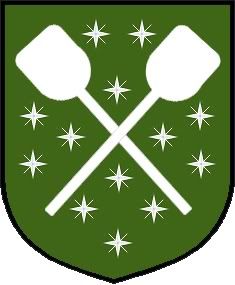
Here’s Michael’s in green with the thirteen stars.
http://i5.photobucket.com/albums/y155/jonishairy/Heraldry/BakerSwanson.gif
JB,
Check out the NAVA principles of flag design. The same principles can be useful in designing CoAs.
Here’s some more with only one metal:
http://i40.photobucket.com/albums/e221/pblanton/baker2.jpg http://i40.photobucket.com/albums/e221/pblanton/Baker3.jpg http://i40.photobucket.com/albums/e221/pblanton/Baker4.jpg http://i40.photobucket.com/albums/e221/pblanton/baker5.jpg
I changed the peels on the saltires to Sable to make them stand out a bit more. The odd looking stars on the last two are actually mullets of four points radiant. This was included to give the idea of a "cross" and "star" in the same charge.
Just some more options to look at.
Take care,