I like that very much for a badge, Michael. Is it of your own devising?
Jonathan R. Baker;52401 wrote:
I like that very much for a badge, Michael. Is it of your own devising?
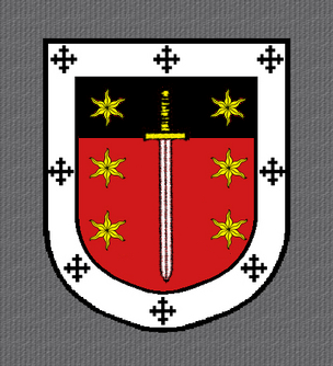
Yes. .... ....
werewolves;52399 wrote:
Just a thought…
Or even with the field ALL Gules but the six stars (not counting the bordure).
Kyle=
Jonathan R. Baker;52398 wrote:
I agree with Joseph. This is much improved over the version with the chief sable. (says the man with a chief sable
Kyle MacLea;52403 wrote:
Or even with the field ALL Gules but the six stars (not counting the bordure).
Kyle=
What? That sentence makes no sense, although I think I know what you’re saying. Now, this is my personal opinion and should be taken as such, but I think you’d be best off losing the chief entirely (which is what I think you’re saying there).
Pardon the "Or" in there, I was trying to express "This picture above… or the same with part that is Sable being Gules too." Poor sentence structure aside, you are on-target with what I mean.
Lose the Sable? I like the vertical sword though, also more suggestive of a cross without being a cross.
Kyle=
Kyle MacLea;52407 wrote:
Pardon the "Or" in there, I was trying to express "This picture above… or the same with part that is Sable being Gules too." Poor sentence structure aside, you are on-target with what I mean.
Lose the Sable? I like the vertical sword though, also more suggestive of a cross without being a cross.
Kyle=
That’s where we really start getting into the vaguries of personal artistic preference. My fave, so far, was the one with the sword in bend and 2 estoiles (although, I’ll parrot Joe and say that the estoiles need to be way bigger). The sword in pale betwixt 6 estoiles version is too static for my tastes (but, again, my tastes don’t make a difference here - they’re going to be your arms). And, yes, I do agree with previous comments: unless you have a specific reason for the chief, I think it gets in the way of the rest of your design elements - clutter for no apparent reason.
So, here, without further delay, are renditions of the two side by side:
http://i52.photobucket.com/albums/g29/PaddyW_photos/kyleboth.jpg
The one with the bendwise sword achieves a certain balance without symmetry that I quite enjoy - it has movement.
The other, while quite nice, is static and not as pleasing to my eye.
Patrick Williams;52413 wrote:
So, here, without further delay, are renditions of the two side by side:
http://i52.photobucket.com/albums/g29/PaddyW_photos/kyleboth.jpg
With the estoiles bigger, I like the first much more than originally. Nice.
Still like the second, but perhaps as you say it is too static.
But of course they are Cristian’s arms. But I think they both look nice, uncluttered, and heraldic.
Kyle=
Michael Swanson;52400 wrote:
Here is a possible charge or badge
\[ATTACH]373[/ATTACH]
Due to some recent discussion (nor relating to this particular thread) between the members of the Board of Governors, I’m going to jump in here. This just barely passes muster (a wonderful design idea and nicely executed, by the way) because it contains elements already discussed. However, it comes really close to new design work. Very, very close. Toes over the line, even.
If you have "new" design ideas for Cristian, or anyone else, for that matter, please send them by pm or email. Please keep discussion here limited to the designs already submitted. I know ... I like playing the design game, too, but until such time as the Board of Governors has the time, energy and/or desire to revisit our policy we are not a design firm, even in the members area. You are free to disagree with me, but please do that by pm or email as well. :rolleyes:
:pope: :mullet: :marine:
Joseph, good call on the larger estoiles. I was worried about making them too large due to creating more cluttering problems, but instead it gets rid of a lot of unused space without being overdone. Personally, I far prefer the two enlarged estoiles with the sword in bend over the sword between the six stars.
Quote:
Lose the Sable? I like the vertical sword though, also more suggestive of a cross without being a cross.
Despite all the visual similarities, I try to avoid the connection between the cross and the sword—it seems contradictory. Besides, I already have 8 crosses on the bordure.
Quote:
And, yes, I do agree with previous comments: unless you have a specific reason for the chief, I think it gets in the way of the rest of your design elements - clutter for no apparent reason.
Yea, the chief was for purely artistic reason. I wanted the three estoiles in chief and I didn’t like the looks of them on the gules, so I added the chief sable. Enlarging them really does solve a lot of the appearance problem that I had with them when they were small on the gules field.
So, how would the emblazonment go…I’m thinking:
Gules, a sword point to base in bend Argent hilted and pommeled Or between two estoiles Or, all within a bordure Argent charged with eight Cross Crosslets Sable.
Quote:
I like that very much for a badge, Michael. Is it of your own devising?
I have to say Michael, I second that sentiment, the badge is awesome. I would be proud to use it.
Well, due to the simplicity of the design, I’m going to go and surf the internet for a few hours now and make sure that I’m not taking away from anyone. Then I’ll go for the refrigerator test, but seeing as it has all of the same elements symbolically as one I’d already accepted, I don’t see any problem with that at all. Like I said before, I like this design just as much as the one with the chief, and that was with the small estoiles—now it’s even better.
I’m sure someone better at blazoning will chip in here, but I think it’s "Gules between two estoiles Or a sword bendwise point to base Argent hilted and pommeled Or all within a bordure Argent charged with eight cross crosslets Sable".