Kenneth Mansfield;71553 wrote:
And not to confuse it further, but Black Bears can be black or brown.
And if you want to confuse it even more, black bears can be black, brown, or white. There’s a white phase of the black bear known as the "Kermode" or "Spirit Bear". And no, it’s not albino.
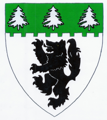
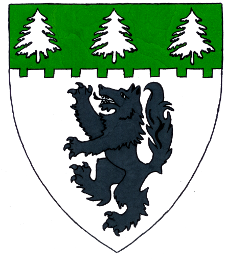
And my take on the arms… one with the wolf armed and langued Azure, one all Sable, one armed Sable and langued Gules.
[ATTACH]621[/ATTACH]
[ATTACH]622[/ATTACH]
[ATTACH]623[/ATTACH]
And my aversion to the use of Proper in modern heraldry most likely comes from the fact that most Scandinavian heraldists feel that it is "bad heraldry"...
Claus K Berntsen;71556 wrote:
And my aversion to the use of Proper in modern heraldry most likely comes from the fact that most Scandinavian heraldists feel that it is "bad heraldry"...
So did my new hero Oswald Barron. In fact, he even argued that the few charges that are normally shown in their natural colors should be blazoned simply as "a raven," "a dove," "a Cornish chough," "a popinjay" without the use of either the corresponding tincture or "proper."
I like the second and third one, not crazy about azure.
Good! Then you’re a little bit closer… ![]()
Two other options…
[ATTACH]625[/ATTACH]
[ATTACH]626[/ATTACH]
Haha, don’t like either of those. I think if just the tongue itself was red, that would be fine, but not the whole mouth. I still prefer the claws black if they can’t be argent.
Oh…and not the best quality since I only had some cheap markers to work with, but here.
http://i127.photobucket.com/albums/p122/BrokenChainsX/Shield-2.png
Here, this one is a bit better…had to buy a $5 marker to get the darkest gray I could.
http://i127.photobucket.com/albums/p122/BrokenChainsX/1Upload.png
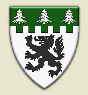
Also I made this alternate design
http://i127.photobucket.com/albums/p122/BrokenChainsX/Alternate.png
Dear Joshua—
I like your last alternative best of all. I think the symmetrical trees are an improvement, and the wolf looks great. All its parts are clear, including eye and tongue; it’s a little leaner than some recent versions, as it should be; and it fills the space of the shield much better.
Congratulations!
Thank you very much. I really like the newest alternate design, I think it’s a little more true looking for heraldry. I also like that I went a little less crazy with the embattled part, more like Kenneths design.