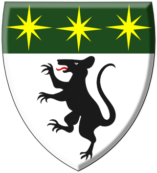
Frankly, Jonathan, none of these rat designs appeal to me as much as this earlier design you proposed:
http://i6.photobucket.com/albums/y249/loaba/AHSDesign2.png
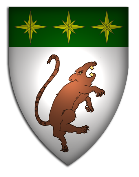
However, of this last batch, my favourites are these that Joshua mocked up:
http://i127.photobucket.com/albums/p122/BrokenChainsX/Rats1.png
http://i127.photobucket.com/albums/p122/BrokenChainsX/Rats2.png
Kenneth Mansfield;82900 wrote:
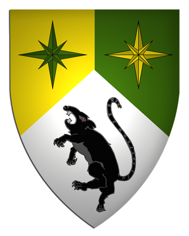
I’m not at a computer where I can draw right now, but I’m pretty sure Joe is suggesting a field parted per pale argent and or with the rampant rat in black and three green compass roses in chief.
Yes, that’s what I meant. Alternatively with a green chief and gold or silver compass roses. I don’t see the military connotation of that, I really don’t—especially since the Army is going to blue uniforms, and none of the US services have ever used gold eight-point stars anyway.
Is there any way you can make these shields without the big spotlight right in the center? I feel like I’m always trying to see around the shadow to get a good view of the chief and base portions of the shield. It makes it a little difficult to see the design as a whole.
noted.
I agree. This one is still my favorite of the bunch and still keeps your original design in mind. I think it’s a nice blend of your old and new designs.
No 24;82910 wrote:
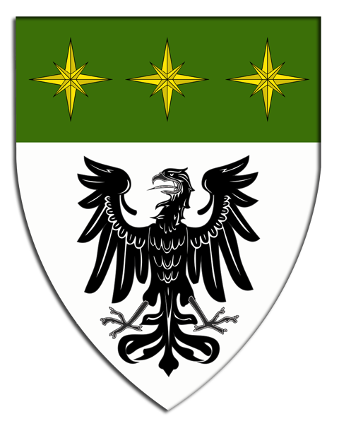
http://i6.photobucket.com/albums/y249/loaba/PRv18copy.png
Eagle for the rat haters…
I really like this. Did you try it with silver mullets? I like minimizing tinctures, but even with four colors it doesn’t look too busy…
David Pope;82911 wrote:
I really like this. Did you try it with silver mullets? I like minimizing tinctures, but even with four colors it doesn’t look too busy…
I agree. This is very nice as well!
And thank you for taking the spotlight out. It’s so much easier to see the entire design. ![]()
As non-fond as I am of the rat, I don’t understand the eagle. So you’re of Polish and German descent; presumably, given the name, you’re also of Spanish descent. Then why not a castle? It makes no more sense to use the emblem from one country’s national or royal arms as your personal arms than any other.
I would suggest that the rat would be more palatable (not literally!) if depicted sejant erect (as in the badge) rather than rampant. In attack mode, he looks rabid.
Joseph McMillan;82913 wrote:
I would suggest that the rat would be more palatable (not literally!) if depicted sejant erect (as in the badge) rather than rampant. In attack mode, he looks rabid.
I think saltant would be ideal. Rampant is slightly off.
While I’m not a fan of the rat either…if it means something to you then that’s a start. Throwing a random animal on the shield that means nothing to you, really doesn’t make sense. I would worry about how other artists will emblazon the rat though (As somebody already mentioned), because I’m sure most artists aren’t going to draw it as ferocious looking as what you have. Another thing to consider is if you want to eventually pass your arms down to your children, and your children’s children…are they really going to want a rat on their shield? My suggestion is if you’re really set on the rat, then move it up to the crest (So then your children can keep the shield, and lose the crest if they so choose) or use the rat for a badge as you’ve already considered.
I do like the version of the arms with the eagle better…that being said, throwing an eagle on the shield just because you’re part Polish and part German, really doesn’t keep the boat above water in my opinion. As Joseph also pointed out, it would be more logical to give a nod to your Spanish ancestry due to the origins of your surname.
Something else to consider when discussing the multiple tinctures (Sorry to keep coming back to this, but it’s bugging me to no end) is to remember that when you shrink your shield down to a small size, things will just look like a coloration chaos and you won’t be able to tell what anything is for the most part. That’s why we always stress that you should keep your designs as simple as possible, while staying unique. Having a lot of tinctures just adds complexity, and visual confusion.
RATs are great pets, real survivors, communal, smart, etc…. And they generally die in 2-4 years, so they are not huge long term comitments :twisted:
Go with the Rat! (but no mice, nasty critters up to no good generally)
I REALLY like your badge.. It would be a true pity if you changed it one bit.
With all the design second guessing. I haven’t seen (or missed) where you let us know your symbolism. Like why vert/or/argent? One more preference than the other? Is there a reason for 2 or three mullets?... etc. Right now it’s not like we are trying to keep your preferences and providing options, but just throwing bunches of personal preferences out there..
But, I think you should keep the badge!
Rats do make excellent pets, I’ll give you that. Best rodent to own. :p