Dohrman Byers;83013 wrote:
I agree that the bear between the oak leaves and acorns is the best of these. I prefered the version suggested earlier, without ordinary:
http://i40.photobucket.com/albums/e221/pblanton/Carrasco2.jpg
The fess confines both bear and leaves and forces them to be smaller. I like bold.
I also think the lobed oak leaves look better—simpler, easier to recognize—than the pin oak leaves.
Nope, this one with the Or background. An Or background also has that "golden state" kinda feel, too.
I’m not sure anyone has suggested it, but for a really good transition from an original idea set to an excellent set of arms, the Eskew Thread is pretty impessive.
I feel the design that Kathy likes just seems to be missing something. Don’t get me wrong, it’s still a very striking design, but it leaves something to be desired. Something I think you’ve found with your latest two designs.
jcar;83031 wrote:
Ok, as promised, we tried the chief Argent with the Sable oak sprigs. Personally, I’m not a fan. I don’t get the same feeling from this one that I do from my original design.
http://i127.photobucket.com/albums/p122/BrokenChainsX/BearIt.png
When I was designing my arms I specifically decided not to use a bear argent because it made me only think of a polar bear. Fine if you’re from Alaska or the Great White North, but….
It does remind one of a polar bear, but if you draw it right you can tell it’s not. Polar bears have a very different body type. It could be a Kermode bear for all you know ![]()
Kathy McClurg;83039 wrote:
Nope, this one with the Or background. An Or background also has that "golden state" kinda feel, too.
I’m not sure anyone has suggested it, but for a really good transition from an original idea set to an excellent set of arms, the Eskew Thread is pretty impessive.
This is what you mean? It still doesn’t really do anything for me. I can’t exactly pinpoint what it is but I feel like the design still lacks something in the background. That’s why I like the version I can up with. It’s not much different but I the fess bar adds something that was missing and makes it stand out much more. Am I wrong? Or is just a matter of taste?
http://img41.imageshack.us/img41/9158/carrasco008d.png
Ironically I just stumbled up and read through the Eskew thread last night. I agree his evolution was pretty awesome and his final COA is incredible (actually one of the favorites I’ve seen on here). But I think what makes his work so well is that it’s such an unusual cant. I think my canting is a little more ordinary but I’m hoping that I can still come up with a design that I think is very striking as well.
Adding the fess bar in this case is a matter of taste. Whatever floats your boat ![]()
Kathy McClurg;83021 wrote:
I’m with Father Byers on this one for shield choice. Undivided field to me is better in general for first assumption in arms - The only reason I didn’t design something that way is because the charges had specific surname and family history meaning and didn’t work well with an undivided field (ravens sable and fouled anchor, Or). There was also a need to ensure we were quite different from any Murdoch or MacKie arms we could find. If I had fridge tested longer, I may have used something other than a chevron for my branch of the family, but overall I’m happy with them. If it’s a matter of oomph, you could consider the field being Or - That stands out more in paper heraldry than argent to my eye. That’s just me - It’s your arms, you need to be happy.
I have no expertise in banners and such, but using the original layout for a banner smacks of not necessarily being recognizeable as you. I’m for shields and banners being basically the same elements with same color combinations. (if the oak leaves are argent on a vert field in your arms, I expect to see argent on a vert field on your banner).
Quite! The banner is the shield as a flag. (There are also cases of a badge-banner, but that is not all that common.)
<div class=“bbcode_center” >
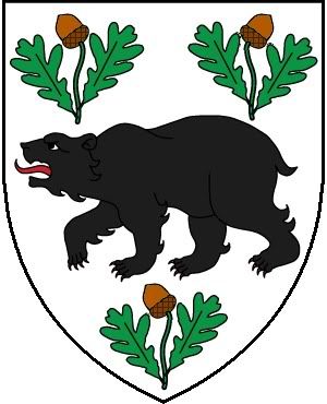
My coat of arms:
[ATTACH]848[/ATTACH]
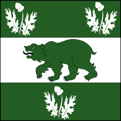
My banner/flag:
[ATTACH]850[/ATTACH]
</div>
To my understanding, in English heraldry at least, banners are (like Mr. Berntsen says) the same as the arms on the shield, but in square form.
Badge banners in English heraldry are actually referred to specifically as "standards" and do not match the arms on the shield. They are usually depicted long and tapered opposite the hoist.
"Pennons" are longer banners wich have the trailing edge cut into two points opposite the hoist but otherwise can display the same actual arms from the shield as a Banner would.
Again, this is all just English usage (please correct me if I’m wrong about any of this).
Jeffrey Boyd Garrison;83095 wrote:
To my understanding, in English heraldry at least, banners are (like Mr. Berntsen says) the same as the arms on the shield, but in square form.
Yes.
Quote:
Badge banners in English heraldry are actually referred to specifically as "standards" and do not match the arms on the shield. They are usually depicted long and tapered opposite the hoist.
Ummm. No.
A "badge banner" is a banner displaying one’s badge, as in this excellent example of Peter Harling’s badge banner by John Ferguson.
<div class=“bbcode_center” >
http://heraldry-scotland.com/HSSforum/download/file.php?id=44
</div>
The standard is a different flag altogether.
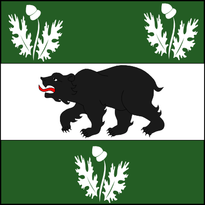
Although most of the time you don’t end up displaying your arms in flag form, it is worth considering how the square shape of the flag will affect your design. For example:
http://i127.photobucket.com/albums/p122/BrokenChainsX/Example1-1.png
http://i127.photobucket.com/albums/p122/BrokenChainsX/Example2-1.png
All of this good to know. Just thought that as long as your basic design was still there you could play with the coloring. Thanks for clarifying!
While we’re at it I do have a few other questions. 1) is the motto something that from changes from person to person like a crest or is that part of the shield and is passed down? 2) same with the badge?
I’ll hazard a guess in regards to the motto and suggest that it is passed down. It’s a family motto, no?
Mottos are really something that is pretty optional in most countries. While I think it is a good idea to keep your motto the same, there are quite a few cases where people change their motto as time goes on. I myself haven’t officially adopted a motto yet, though I have played around with several. Frankly, while they’re a nice touch to have, they tend to not be considered overly important in comparison to the shield and crest. So while it can be passed down from father to son along with the arms, most people would be accepting of it being changed along the way.
So I’m beginning to think about my crest and have a design in mind based off of the original idea I had for my shield.
Issuant from a wreath Vert, Sable and Argent a demi-bear rampant Sable armed Argent and langued Azure, in his dexter paw a sword Or hilted and pommeled Sanguine, sinister paw resting on an open book proper with a mullet azure on the dexter page and a mullet sanguine on the sinister page
or
...blah blah blah… an open book with two ribbon bookmarks Azure and Sanguine
Thoughts on this?
jcar;83121 wrote:
So I’m beginning to think about my crest and have a design in mind based off of the original idea I had for my shield.
Issuant from a wreath Vert, Sable and Argent a demi-bear rampant Sable armed Argent and langued Azure, in his dexter paw a sword Or hilted and pommeled Sanguine, sinister paw resting on an open book proper with a mullet azure on the dexter page and a mullet sanguine on the sinister page
or
...blah blah blah… an open book with two ribbon bookmarks Azure and Sanguine
Thoughts on this?
I really like the crest currently used as your avatar: a demi-bear rampant sable…