Actually, for my maternal grandfather and all his descendents.
<div class=“bbcode_center” >
http://i64.photobucket.com/albums/h161/blackgas/appletatra2-1.jpg
</div>
Rationale:
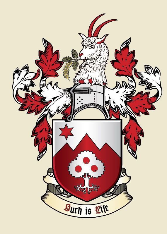
A cant on the name Jablonka, which means apple tree. The three apples represent the children (2 daughters and a son), and the mullet in dexter chief represents a 4th child, a son who died in infancy and was said by my grandmother to "look down on them always." As a nod to the fact that almost everyone in the family has moved to different countries, and to my mother’s professed sense of ‘rootlessness,’ the tree is eradicated.
The mountains in the background represent the Tatra range, where my family lived as free beer brewers in feudal times. It also represents mountaineering, something very important in the family (lots of hiking, as well as military service in two generations as mountain troops.)
On a cruder level, the mountains and mullet loosely reference the arms of the Slovenian flag, where half of the family came from, and the colors point both towards Austria and Poland’s colors.
Looking for general crit, and need a little help with the blazon (I’ve gotten really rusty!):
Blazon:
"Party per _______ argent and gules, an eradicated apple tree argent fructed of three proper, in dexter chief a mullet gules."
or:
"Party per _______ argent and gules, in dexter chief a mullet gules, in base an eradicated apple tree argent fructed of three proper."
or:
"Argent on three mountains gules an eradicated apple tree argent fructed of three proper, in dexter chief a mullet gules."
I think your design is simple and elegant. Well done! My only concern is the the apples in the tree my get lost within the giant field of gules behind it (especially the two lower ones since there is a small space in between the branches that is the same color). If all three apples could be moved up into the tree a little more or if the tree could be a little bigger and fuller I think it would fine.
A beautiful design, and lovely symbolism. Bravo.
I don’t know what the blazon for that partition would be. Some variation of dancety I would imagine. Per fess dancety of three points upward, the middle point enhanced?? Someone will have a better suggestion than that…
thanks!
Here it is with the crest (and a modified tree). A goat seems appropriate, mountain-loving and very stubborn ![]()
</div>
I think it’s a beautiful design actually. I can’t say I’d change anything at all.
What a fantastic design. I also love the symbolism; simply brilliant.
Very striking - well done!
Nice arms, but I prefer either B1 or F2 on the rejected list.
I love this design.
I am having a hard time with blazoning though. Seems to me that you have taken more space for the tree so rather than parting the field the effect seems more like just having a single field with a charge and a chief on it rather than an actual pared field.
I have been trying to come up with a good party per fess or party per chevron description but nothing I can come up with works well (enough to be emblazoned correctly off of the blazon).
Per chevron and dancette together in the same sentance just make my head hurt (neverd did well in high school geometry). Per fess seems too much of a stretch. This one is beyond my novice abilities… but again, I LOVE the design!
I think some variation of what Kevin put forward is probably the best to describe the division of the field. I, unfortunately, am not agile enough to stick that landing. I like the design, but agree with some others that the apples get lost in the field. I’d like to see how they look gold.
I agree with Kenneth that maybe making the apples gold would be very nice. I do, however, think the overall design is quite beautiful. And of your rejected designs I also love #4 in the top row.
Kenneth Mansfield;84195 wrote:
I’d like to see how they look gold.
Yes! Maybe the hops and barley Or instead of proper, and then the apples Or as well. That would be very nice.
werewolves;84197 wrote:
Yes! Maybe the hops and barley Or instead of proper, and then the apples Or as well. That would be very nice.
That would make a lovely cider.
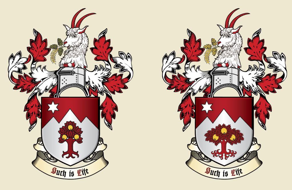
Hmm. I considered gold apples, but on a white tree, the metal-on-metal becomes very hard to see.
I think how the tree is emblazoned helps some. Some quickies that tone down the leaves a bit:
http://i64.photobucket.com/albums/h161/blackgas/jablonka3whitree2.jpg http://i64.photobucket.com/albums/h161/blackgas/jablonka3whitree.jpg
Here it is with swapped out colors. I think I prefer the mountains and sky this way, but it limits the colors I can make the tree and fruit. My concern is people thinking its a lemon or orange tree.
Swapped:
http://i64.photobucket.com/albums/h161/blackgas/jablonka3redtreewhite.jpg
And fructed Or (with barley and hops Or):
http://i64.photobucket.com/albums/h161/blackgas/jablonka3redtree.jpg
The reason I went with party per, is because it really seems like party per chevron but with three points instead of one. I could have sworn I’d seen this used as an ordinary before..
http://heraldry-armoury-and-more.com/picture_library/shields/party per chevron.jpg
Andemicael;84228 wrote:
And fructed Or (with barley and hops Or):
http://i64.photobucket.com/albums/h161/blackgas/jablonka3redtree.jpg
I really like these.
Definitely the red tree with golden fruit.
Can’t say I’m thrilled with the motto, though. Sort of resonates with Kathy’s "what-EV-er." Might as well use "so it goes" or "la-di-da."