tsmith;85126 wrote:
Jesse,
It looks like I maybe a day late and a dollar short but I wanted to say that I am a big fan of this design, including the fimbriation. The only suggestion I would make is to go with either acorns or oak leaves in the chief rather than acorns slipped and leaved. In my opinion this is a striking design.
That being said, I like the new design you posted too although I think I like the blue tongued bear better. But that is just me. I like blue. Your mileage may very!
Travis
Travis, this is actually the one I was about to go with. But as soon as I saw the new one I was immediately drawn to it. And my family preferred the new one as well so that’s why I’m sticking with it. I do love this design just as much however.
And yes, I’m sticking with the blue tongue. I’m a fan of blue as well. ![]()
Good choice on the blue:D As I said the new design is nice as well. But then, I like chevrons.
Congratulations on a nice design!
Travis
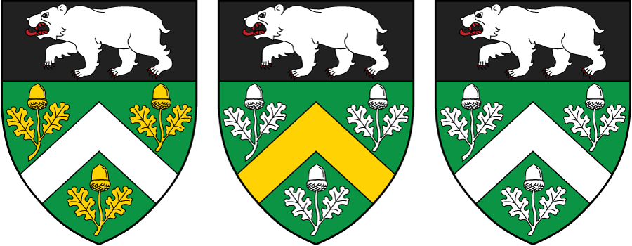
As I mentioned in a previous post, I was probably going to make some small changes to the overall design. After I came up with an idea Kenneth tweaked it and made it better. There are some variations on the design that I love and keep going back and forth on which I like best. Any thoughts?
The left one, and the middle one look too busy with the addition of the Or. The one on the right is definitely the best one.
Too busy can’t possibly be the best way to describe them since there are no additional charges than on the third, but I will grant you that both of them direct your eye to certain places on the shield making it more difficult to "view" the whole of the shield.
All white: keep it simple!
The one on the right FTW!
The thing that I still find jarring is the polar bear in the middle of the Arctic winter in chief. It will be even more jarring with a brown brown bear as the crest.
What would you think about making the chief gold or silver, and both bears (in the chief and the crest) green?
(And tell me again why the bear’s teeth are red?)
I think I’d like it better with bear, chevron, and oak leaves and acorns all Or.
To address Joe’s points, you might try making the chief gold and the bear black. Then a black bear in the crest to top it all off.
On second thought ... I think I’d really like this design if it were Or a chevron between three pairs of oak leaves fructed Vert on a chief also Vert a bear passant Or.
Joseph McMillan;85222 wrote:
The thing that I still find jarring is the polar bear in the middle of the Arctic winter in chief. It will be even more jarring with a brown brown bear as the crest.
What would you think about making the chief gold or silver, and both bears (in the chief and the crest) green?
(And tell me again why the bear’s teeth are red?)
I’m sure I’m gonna get a lot of flack for this but I don’t see a polar bear at all. Yes, the bear is white, but the shape of the bear is so different. To me, polar bear’s head is a lot flatter and the back side is a lot bigger. All I see here is a white bear. But I’m sure others see a white bear and think "polar bear".
As for the red teeth, that’s just what Kenneth did when he drew the bear. That’s his artistic interpretation. I want to at least give him a blue tongue. ![]()
Dohrman Byers;85231 wrote:
On second thought ... I think I’d really like this design if it were Or a chevron between three pairs of oak leaves fructed Vert on a chief also Vert a bear passant Or.
I played around with this idea and I must admit, the design is excellent! I’m sure someone would love to have that for their arms, just not me. The green, black, and white color scheme is pretty important to me so I want to have those three colors on the shield. The proposed color scheme pretty much gets rid of all of it.
I also played around with the various other ideas that were proposed and none of them really took hold of me the way the current one does. I do see how the brown bear in the crest could potentially clash with the shield so I would be open to changing that bear back to Sable as it was in my original avatar.
I really appreciate all of the feedback and thoughts you all have!
Kenneth Mansfield;85210 wrote:
Too busy can’t possibly be the best way to describe them since there are no additional charges than on the third, but I will grant you that both of them direct your eye to certain places on the shield making it more difficult to "view" the whole of the shield.
It looks too busy due to the addition of another tincture. The Or looks out of place in the rest of the arms, and adds busyness to the arms. Adding tinctures is almost like adding new charges because it’s just another thing to draw the eye.
Joseph McMillan;85222 wrote:
(And tell me again why the bear’s teeth are red?)
I had always made teeth white, but then I read somewhere (perhaps erroneously) that when a ferocious animal was "armed and langued X" that the teeth should also be X, I suppose to show they are covered in blood? I am more than open to making the teeth white again!
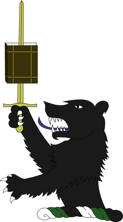
Instead of the bear resting his paw on the book, how about something a little different?
http://i127.photobucket.com/albums/p122/BrokenChainsX/BearStab-1.png