The Arms of the American Heraldry Society. I tried to make the Eagle look like a Bald Eagle whilst still keeping it somewhat stylised heraldically. The real challange with these arms to the artist is the tonal balance of the brown and the Gules. It is after all a colour, all be it in the Eagles case not an heraldic one, on colour. The easy thing would be to slap a black outline around the bird but that could deaden the whole charge, so I experimented with the Gules and chose a tone that not only complimented the brown but which allowed it to stand out.
Andrew Stewart Jamieson;89692 wrote:
The Arms of the American Heraldry Society. I tried to make the Eagle look like a Bald Eagle whilst still keeping it somewhat stylised heraldically. The real challange with these arms to the artist is the tonal balance of the brown and the Gules. It is after all a colour, all be it in the Eagles case not an heraldic one, on colour. The easy thing would be to slap a black outline around the bird but that could deaden the whole charge, so I experimented with the Gules and chose a tone that not only complimented the brown but which allowed it to stand out.
An excellent solution to the brown on red problem, probably a bit better than the way the U.S. Army solves the same problem in the Secretary’s "positional color" (a bureaucratic way of saying "personal flag"), which I’ve always thought was reasonably effective.
http://www.odcmp.org/0107/images/SiebenImg/Pres.jpg
I think we (the AHS) would have been better off if we’d reversed the colors of the field and the chief—or alternatively reversed the locations of the eagle and the escutcheons—as the bald eagle proper would have worked better on blue than on red, but that’s ancient history.
Andrew Stewart Jamieson;89692 wrote:
The Arms of the American Heraldry Society. I tried to make the Eagle look like a Bald Eagle whilst still keeping it somewhat stylised heraldically. The real challange with these arms to the artist is the tonal balance of the brown and the Gules. It is after all a colour, all be it in the Eagles case not an heraldic one, on colour. The easy thing would be to slap a black outline around the bird but that could deaden the whole charge, so I experimented with the Gules and chose a tone that not only complimented the brown but which allowed it to stand out.
[ATTACH]967[/ATTACH]
I think you succeeded admirably.
Joseph McMillan;89693 wrote:
I think we (the AHS) would have been better off if we’d reversed the colors of the field and the chief—or alternatively reversed the locations of the eagle and the escutcheons—as the bald eagle proper would have worked better on blue than on red, but that’s ancient history.
I’d have to see the blue and red reversed to be convinced it would be an improvement.
Joseph McMillan;89693 wrote:
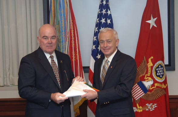
Shouldn’t the US flag be on the left (the position of precedence)? Followed by the Army flag (in the center), then the SECARMY’s flag last (on the right).
steven harris;89696 wrote:
Shouldn’t the US flag be on the left (the position of precedence)? Followed by the Army flag (in the center), then the SECARMY’s flag last (on the right).
It depends on how the flags are displayed. By Army Regulation 840-10, "When a number of flags are grouped and displayed from staffs radiating from a central point [i.e., arrayed like a fan], and no foreign flags are involved, the flag of the United States will be in the center and at the highest point of the group." If you look at the angle of the Army and Secretarial flags, it appears that this is the case in this photograph. Here’s a similar display with different flags:
http://usarmy.vo.llnwd.net/e2/c/images/2011/08/11/216240/size0.jpg
Nice job, Kenneth!
Kenneth Mansfield;89694 wrote:
I’d have to see the blue and red reversed to be convinced it would be an improvement.
The reason I think it would work better is that giving the brown a golden tinge would make the eagle show up better on an azure field, but exacerbate the contrast problem on gules.
See the detailed TIOH drawing of the most frequently seen example of a bald eagle proper on an azure field at http://www.tioh.hqda.pentagon.mil/ImageProxy.ashx?n=1&t=original&id=11832 (very large image)
Granted, the blue of the Presidential seal and flag is very, very dark, but you get an idea of what’s done to the brown of the eagle to make it work.
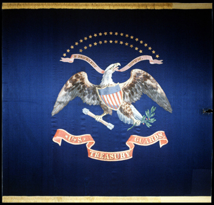
Here’s another solution from the Civil War period (the regimental color of the Treasury Guards that hung on the Presidential box at Ford’s Theater):
Please, please, PLEASE let’s not start second guessing and re-designing in our heads just because we have another new rendering! I was in on the design phase of the Society’s coat of arms and we went back and forth many times over a variety of options. Unfortunately, the process was open to too many people rather than assigning the task to one person or a small group of two or three people. The result was that a bunch a amateurs, each of whom thought he was an expert, had to compromise.
The result is the arms we have now.
It isn’t hard to see how we arrived at the design. We started with the arms of the USA, eliminated the white pallets from the field and placed the American bald eagle there then charged the chief with the white shields. It’s very simple. There was a great deal of debate about what to do with the eagle to solve the problem of a brown eagle on a red field.
In the end, this is what we decided and it has been in use for a while now. There will always be those who will want to discuss the merits of our decision just as there are many famous coats of arms from history about which one could say, "It would have looked better if they had done this…"
Fr Guy,
I know how we got to the design we chose; I was there. I don’t have any serious problem with it and am not proposing a change. As I said in bringing up the issue, "that’s ancient history."
But Andy pointed out a practical challenge with brown on red, and I think it’s worthwhile discussing how such color choices have practical consequences.
As you say, "there are many famous coats of arms from history about which one could say, ‘It would have looked better if they had done this…’" And when we run across those, why shouldn’t we discuss the issue? It beats debating whose knees look better or worse in a kilt!
I think Andy succeeded in painting the eagle in a way that still stands out against the Gules. Personally I think it shows the master that Andy truly is by figuring out a way to really make the design pop without compromising it in any way.
FWIW, I really love the Society’s arms. I can appreciate some critical discussion about the different issues that may arise from but the design, but I would hate to see a discussion to begin changing it.
Joseph McMillan;89702 wrote:
It beats debating whose knees look better or worse in a kilt!
I’m not so sure about that… ![]()
This new rendition is wonderful!
A "what if" discussion could be a useful learning tool for improving our understanding and application of the art & science to future cases.
Part of that discussion would be the artistic side that Andy has raised—i.e. how best (or at least how better, or the artistic trade-offs) to exercise artistic license to produce a better result. For example, the pro’s & con’s of making the field darker blue and the "proper" charge lighter brown (or golden-brown or whatever), or vice-versa, to achieve a better visual contrast.
Part would be anticipating such concerns during the design phase for future projects.
And part would be the balance between artistic concerns and the desired historical or symbolic references in the design itself—in perhaps overly-simple terms, the balance between "pretty" and "mine." For me, and for better or worse, a blue chief with goodies on it says "American…" where a red chief with the same goodies doesn’t.
IMO at least, for arms which have some history and have effectively portrayed a particular person, family or organization—in this case, our AHS arms—the balance tips heavily towards "identification"—the underlying purpose of arms.
Even if we were to conclude (which I’m not) that "If we had it to do over again, xxxyyy would have been be better…" I wouldn’t abandon a workable if perhaps less than perfect design that has become our recognized corporate visual identity.
And if nothing else, for those who may remember our very first quite basic rendition, our arms at least give our more accomplished artists a chance to strut their stuff. We have been blessed by first a Russian, and now an English, more inspired version— a bit of an education and and a visual joy!
In my opinion Andy’s painting holds great subtlety and a fine balance. I particularly like the Bald Eagle precisely because it also has a slight heraldic slant.
Kathy mentioned that to truly appreciate Andy’s work, one has to actually see the original to fully appreciate it. May I ask where these works are kept?
See the detailed TIOH drawing of the most frequently seen example of a bald eagle proper on an azure field at http://www.tioh.hqda.pentagon.mil/ImageProxy.ashx?n=1&t=original&id=11832 (very large image)
Does anybody noticed that the eagle is holding 14 arrows?
Joseph McMillan;89700 wrote:
See the detailed TIOH drawing of the most frequently seen example of a bald eagle proper on an azure field at http://www.tioh.hqda.pentagon.mil/ImageProxy.ashx?n=1&t=original&id=11832 (very large image)
Does anybody noticed that the eagle is holding 14 arrows?
Originally Posted by Joseph McMillan
See the detailed TIOH drawing of the most frequently seen example of a bald eagle proper on an azure field at http://www.tioh.hqda.pentagon.mil/Im…ginal&id=11832 (very large image)
Does anybody noticed that the eagle is holding 14 arrows?