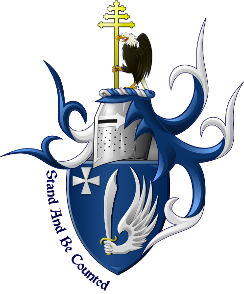
Here is the arms that I emblazoned for Mr. Fofanoff
http://i127.photobucket.com/albums/p122/BrokenChainsX/Fofanoff2.png
-Josh-
I love it Josh! That is pro! :D
I like it. All of it. Every bit of it.
Excellent!!! :cool:
Thank you very much guys. I feel I brought this to a new level
Joshua, you are definitely developing your art! Given part of my personality requires that I’m a critic of those that can achieve what I cannot - have you considered enlarging the crest a bit to be more in line with the size of the helm? The Eagle looks just a little small to me.
I was concerned that with the cross already being large, that it would mess it up, though I agree the eagle could afford to be larger. I definitely can try it though, and thanks for the suggestion. I’ll post it with a larger crest when I get home from work this evening.
Oh wow Josh! That is fantastic! I love this new style that you’re working on. I do agree with Kathy though that the eagle could be a little larger. However, I love the way the mantling looks and love how you incorporated the motto. I can’t wait to see more!
It was my first impression too ,that the eagle in the crest is a bit too small in comparison with the rest .The whole design has this 3-D appealing look that I like and only if it was up to me I’d opt for less spiky mantling .
Good to see you Josh mastering your skills ![]()
I would say much better ...it almost got classic proportions of the Gothic coat of arms ![]()
Very, very nice. I especially like the eagle.
—Guy
Yes, much better.
Regards,
Iain Boyd
Yep, You have it - and I like the sharp mantling, it’s becoming something recognizeable as yours…
J. Stolarz;92380 wrote:
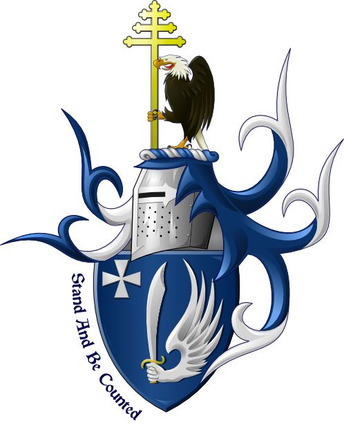
How’s this?
http://i127.photobucket.com/albums/p122/BrokenChainsX/Fofanoff3.png
The proportions look better with the larger eagle.
eploy;92396 wrote:
The proportions look better with the larger eagle.
Agreed. So, do this mean you win the $50 David was offering?