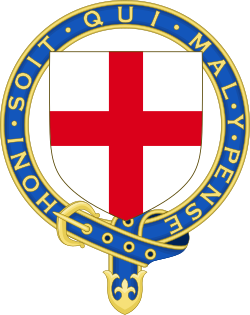
Sometimes when a badge is created by encircling the crest with a belt, the end of the belt is shown as falling over the loop and sometimes as being behind the loop of the belt.
Here are two examples from our Canadian friends (over on the left, under on the right):
Is there any significance to this orientation, or is it just artistic licence?
My understanding is that early illustrators used the Order of the Garter as a template when drawing this sort of badge, which resulted in the strap often being blue and the end of the strap being tucked through. Later usage seems to reflect the strap over top in black, in an effort to not look like a copy of the Garter…
How are the crest badges of clansmen drawn in Scotland? Is one orientation favored by Lyon?
This is the graphic from LL’s website, showing the "tucked under" version:
http://www.lyon-court.com/lordlyon/images/ll_right_crests.gif
Romilly Squire, heraldic artist and Secretary to the Standing Council of Scottish Chiefs, depicts straps in the "flopped over" style:
http://www.clanjohnstone.org/images/annandaleTransparent.gif
IMO - FWIW—artistic license, tho I personally prefer the "flopped over" style as less like the Garter. Either way, this detail certainly wouldn’t be sufficient to create two distinct badges!