j.carrasco;95628 wrote:
The two that really stand out to me are the Argent, on a cross nebuly per pale Azure and Vert an atom Argent although the atom is a little small. But I do like to overall look of the design.
This one has my vote as well. ![]()
I believe Ryan is fridge testing the nebuly cross although he says he likes several of the options so well that he has trouble narrowing it down.
Jeffrey Boyd Garrison;95633 wrote:
I believe Ryan is fridge testing the nebuly cross although he says he likes several of the options so well that he has trouble narrowing it down.
I’m curious to the future design of the atom. I just took a generic atom shape, but would making a proper atom be in store for the final design? For example, would he want a carbon atom with 6 protons, 6 neutrons, and 6 electrons? Or just a generic atom balanced out for design purposes?
If there is a motto being assumed I like:
Diu ac prospere vive ![]()
Snyder;95638 wrote:
I’m curious to the future design of the atom. I just took a generic atom shape, but would making a proper atom be in store for the final design? For example, would he want a carbon atom with 6 protons, 6 neutrons, and 6 electrons? Or just a generic atom balanced out for design purposes?
If there is a motto being assumed I like:
Diu ac prospere vive :D
We’ve talked briefly about crest and motto, though have not yet gone on the attack with those items. Currently I am to understand he’s probably going with an English language motto.
Any updates on the progress of these arms?
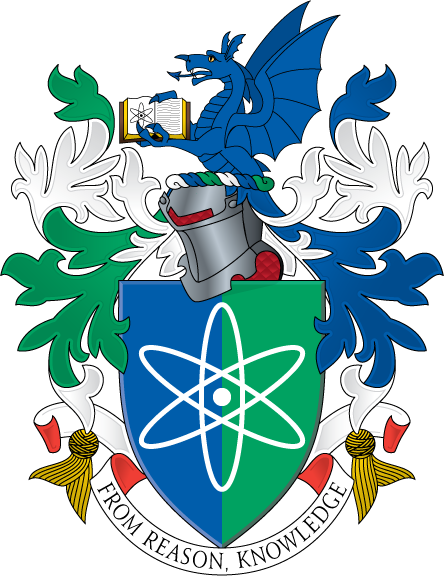
Thanks everyone who helped with this process, and special thanks to Michael for rending up the really well done examples! Nearly three quarters of a year later, Ryan has finally decided on his arms and I rendered up a quick mini-emblazonment.
Blazon: Per pale Azure and Vert an atom Argent.
Crest: Issuant from a wreath of the colors a demi dragon Azure maintaining an open book proper and on the dexter page an atom Sable.
Motto: "From Reason, Knowledge"
[ATTACH]1202[/ATTACH]
This was done on a piece of 3 x 5 office supply card cut down to baseball card size (2.5" x 3.5")... which is called "ACEO" (which stands for Artist Cards Editions / Originals) and is just a fad I’m into (people collect and trade ACEOs with each other for fun and I thought the medium would lend itself well to heraldry). I used (really cheap) acrylic paint to complete this, lol.
An excellent choice by your friend to go with the simply-parted field. And a very nice little illustration you’ve made for him. In future renderings, you might consider opposing mantling (i.e. dexter green/white and sinister blue/white) with a torse that is white/blue/green/white/blue/green.
Kenneth Mansfield;99273 wrote:
An excellent choice by your friend to go with the simply-parted field. And a very nice little illustration you’ve made for him. In future renderings, you might consider opposing mantling (i.e. dexter green/white and sinister blue/white) with a torse that is white/blue/green/white/blue/green.
Thank you very much for that excellent suggestion regarding tri-color mantling Kenneth.
Jeffrey Boyd Garrison;99275 wrote:
Thank you very much for that excellent suggestion regarding tri-color mantling Kenneth.
Sure. It might look something like this…
<div class=“bbcode_center” >
http://img824.imageshack.us/img824/7246/wernerm.png
</div>
![]()
Oh wow! Kenneth, do you mind if I send him this graphic along with your name so he might be able to make use of it?
This looks fantastic!
It took a long time, but a really nice result—simple, clean, meaningful for the bearer, easy to recognize and remember.
As an added advantage, the arms themselves should be relatively easy to craft (paint, engrave, sew & embroider etc) as shield or flag.
wonderful design!!
Though I am tempted to go Latin with the motto - “Ē Ratiōne Scientia”
steven harris;99324 wrote:
wonderful design!!
Though I am tempted to go Latin with the motto - “Ē Ratiōne Scientia”
The motto does lend itself well to latin… I’m guessing he wouldn’t be averse to it, though he prefers English.
Excellent design; clean & simple. And ya can’t go wrong with his color choices! ![]()
motx72;99332 wrote:
Excellent design; clean & simple. And ya can’t go wrong with his color choices!
Absolutely right Jared, color choices were WIN. :cool: