Louis… much "better-ish" on the second try! This way, by removing the bottom mantling, the eye does not loose sight of the lines showing the shield and is not wandering due to a sea of Or and Purpure. Much "better-ish" mate! 8)
Denny,
I hope you were not under the impression I was taking offense at anything you wrote, I was simply chiming with some ‘behind the scenes’ info.
Actually I agreed with some of what you said via PM with Loius already, in particular about the mantling.
In no way am I trying to dissuade anyone from offering constructive criticism. Sorry of my message gave anyone that impression.
-M
Oh no Mark, that’s why I said in case others did and if you did, etc. No problems mate. It’s all good. I just know that others might read it wrong, so I wanted to clear any of that up right away. That’s all.
That’s the problem with these MBs… no one can tell what you are truly saying and how you are saying it… so be it. ![]()
Louis,
I think you did not go far enough in removing the "foliage". I think you could take the hedge clippers and remove everything below the second or third row of crowns (from the top down).
Otherwise, nice work.
—Guy
Well, heck, I’ll chime in, too. Now this is nothing more than a personal taste issue: I really dislike mantling that looks like some odd, polychromed form of oak-leaf ivy. It doesn’t look at all like the tattered remnants of a cloth mantle attached to the helm and just tends to confuse people who are new to heraldry (remember Colin’s question about surrounding his wife’s shield with garlands?). I always prefer something that looks like it might have at one time been made of cloth and might have at one time hung from a helm as a mantle. But, that’s just personal taste.
Since there are several distinct types of crowns/coronets which I believe are treated as heraldically distinct, IMO you should pick one type & stick to it. While there is of course some latitude for the artist in depicting the coronets, they should still IMO be clearly of the same type no matter who draws them.
Others—Thoughts?
Guy Power wrote:
Louis,
I think you did not go far enough in removing the "foliage". I think you could take the hedge clippers and remove everything below the second or third row of crowns (from the top down).
—Guy
I concur. Something like this:
Good Father, I really like this. Louis I’d use this as a template for future designs. But, that is my personal taste on the matter.
Louis,
I need to send you a PM, but your PM box is full, could you delete some so I can send you somehting.
Thanks in advance
Done…thanks for telling me..no wonder I wasn’t getting any replies for my PMs.
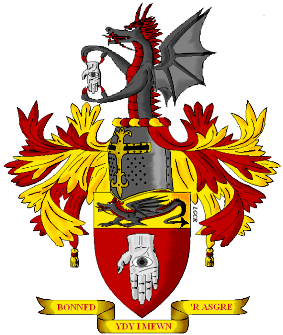
Finally I have my newest one. Mr. Patrick Williams’. I took some of your guys’ advice, and from what I can gather from them along with the armiger’s requests here’s his arms. Any comments?
http://img.photobucket.com/albums/v517/Maramalo/PatrickWilliamsArms.png
Louis, several things mate.
One, I like this amount of mantling much, much more than the previous ones. It is elegant, clear, and not too fussy. It allows the shield to remain as the core of the achievement whilst being an attractive side-kick so to speak. Much, much better mate and I think probably a great candidate for future mantling IMHO. Big bonus on that one!
Two, the cutting of the mantling is much better as it does not look so much like ‘foliage’ as the previous ones did. Now, mind you, that was fine, but for me it had too much of a baroque feel to it. This style is much closer to a cut/torn mantle one would expect to see after a battle. (P.S. the tassels nice touch as well, I like them, but no one I’ve done arms for has asked to have them).
Three, I absolutely love the richness of the Gules. It is at one time a true Gules and not a Sanguine, whilst still appearing as a Sanguine. Which, by the way if I had a say in my father and uncle’s design on our arms I would have chosen Sanguine and Argent, or at least Gules and Argent. So obviously I am biased on that, however I truly like the deep, rich color; very well done.
Four, Great job on the highlighting and shading! The shading is not so dark as to appear burnt. It makes the shield have depth and is a very nice rendition of highlight and shade techniques.
Five, I like the style of helmet. If that was Patrick’s choice - kudos to Patrick. If it was your imagination - kudos to you.
Now I can’t see any flaws yet, but that is likely because I like what I see so much now. I will try to look at it with a more critical eye tomorrow in order to see if I have any constructive criticism to provide for continued development.
Very nicely done Louis.
Hehe…...thanks! Patrick was the one who wanted either a great helm or a tilting helm, and I’ve not yet done a great helm on anybody’s arms so I chose that. Also Mr. Williams expressed that he did not like the leaf-like mantling in one of his posts in here, so I tried to move away from those.
Well….thanks again! *Anxiously waits for tommorow*
A comment from me, nice picture but I feel if I look at it that the helmet is a bit to much to the left (normal left), and as the helmet is hanging over the shield you might consider putting some shadow beneath it going over the top of the shield. It would make it look more natural as other things are also shaded.
Nice catch, forgot about that part.
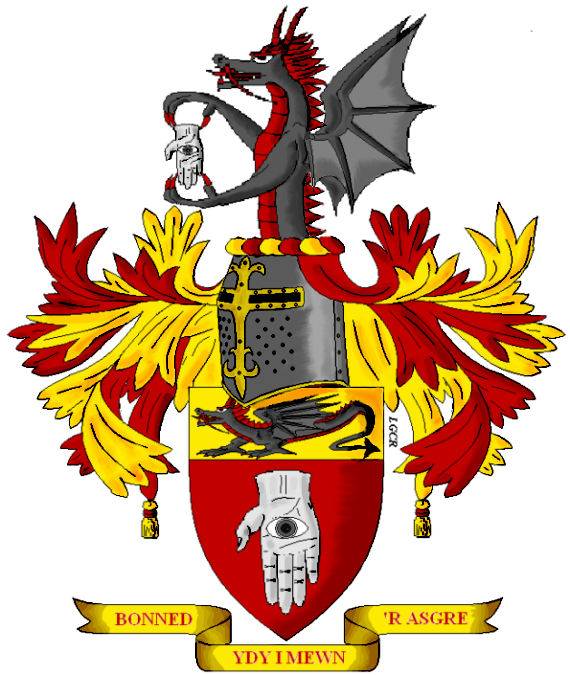
http://img.photobucket.com/albums/v517/Maramalo/PatrickWilliamsArms2.png