PBlanton;43182 wrote:
OK. Sorry I took so long, but I didn’t have much access to the computer yesterday. Here’s my rendition of what David suggested:
http://i40.photobucket.com/albums/e221/pblanton/MostellerAchievement.jpg
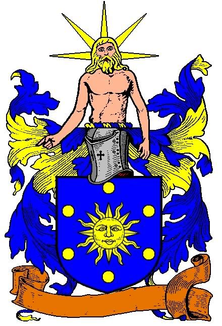
Arms: Azure, the sun in its splendor Or, within an orle of six bezants.
Crest: On a wreath Or and Azure, a demi-figure of the Titan Hyperion Proper.
David’s rationale is as follows:
The sun is in it’s most ancient form. The six bezants represent the six planets (including Earth) that were known in Roman times. All of the charges could be seen as a pun on the name Mosteller, through the Latin word stella meaning star.
Hyperion was the Greek Titan who created the heavens and his son, Helios, was the sun god.
I like it! The real question is, does Charles like it?
Take care,
I like it, somewhat. The Hyperion figure reminds me of Christ, though. That’s not a bad thing, but I think that more people would think of Christ than they would think of Hyperion, when they saw it.
I didn’t really care for the orbs/bezants, when I first glanced at it, but your explanation of what they represent makes them more interesting and appealing. I’m not sold on them, but they make me think harder on what I want to incorporate. They grow on me, as I write this, but for now, I think that including mantling and a motto scroll thing are not necessary. I don’t like that mantling, but I do like the prospect of using a figure atop the helmet.
It’s not a bad design, and I might like it more, if a different looking Hyperion figure was used. I am going to be keeping this design in mind, going forward. It grabs the eye, but I don’t like everything about it.
I like the stella pun, though. That’s humorous, but an interesting way to look at the design.
Trent;43187 wrote:
As I mentioned in a previous post, animals connected with Helios are the rooster, bull, and white horse. Doesn’t the surname have something to do with horses? Wouldn’t a horse charge kill two birds with one stone?
Just as far as charges go, I think that roosters make very nice charges. I also like eating fried chicken. <smile> I won’t rule out using a horse, and if I use one, maybe a white one will work nicely, but I still am not sold on using a horse charge. Horse charges can look really nice. But, my family line’s association with horses noted, to incorporate something about horses, I am more inclined to not make a horse aspect a primary focus. Thus, a large horse charge on the shield, for example, even if it looked nice, I am likely to not favor. No one that I know would ever associate me with horses. It would work better for one of my cousins than for myself. If I can incorporate something pertaining to horses in a passing sort of way (which may be one of the reasons that a horseshoe has some appeal to me, it’s not as straight-forward as a horse or horse head charge would be - in my eyes, at least).
Trent;43187 wrote:
What about the colors red and white? Charles wanted to express his nationality with the colors red, white, and blue.
The design is more important than the actual colors. The colors are most important insofar as I want the end design to be aesthetically appealing. Also, I don’t want the primary color scheme to be pink, although if I incorporate a flower to symbolize my wife, then I wouldn’t rule out using a pink flower, necessarily. I do, however, like the Pink Panther cartoon. <smile>
PBlanton;43200 wrote:
From Parker (emphasis mine):
Gyronny, (fr. gironné), (from the Spanish Gyron, a triangular piece of cloth sewed into a garment). The usual number of pieces is eight, but there may be six, ten, or twelve. Party per saltire has been erroneously called gyronny of four, but in English armoury one of the lines forming the pattern must be in fesse. It will be observed that the term is an ancient one. The gyron with which the tinctures begin is the uppermost upon the dexter side.
Given as an example is the arms of Acton:
Gyronny of eight, argent and gules—ACTON.
http://www.heraldsnet.org/saitou/parker/images/301a.gif
Ahhhh…I see. :D
Take care,
That’s ugly, although I think that the red and white example above it looks fairly nice.
David Pritchard;43201 wrote:
None of you should be surprised that I like the design. I am especially pleased with Phil’s fine rendering of Hyperion. In regards to Trent’s comments about the colours red, white and blue being a reference to Charles’ nationality, I do not really see the point in this reference unless Charles plans to emigrate. Most of us on this forum are US citizens who have various colours in our arms and this fact makes us none the less patriotic. In fact when I see red, white and blue arms, I do not think American first but rather French, British, Russian, Czech, Dutch, Slovene, Luxembourgian, Slovak, Serbian, Panamanian, Dominican, Cuban, Puerto Rican, Liberian, Malaysian, Taiwanese, Thai, etc., etc., etc. In other words this colour scheme is very tired.
By the way, my proposed blazon would make a great heraldic flag, which was something that Charles wanted for his house.
It would make an eye-catching heraldic flag, I agree. But, aesthetically, it is not what I want, and the mantling plays a heavy factor in that. Also, again, that Hyperion figure reminds me of Christ, and I am more partial to the Atlas/Titan figure than to the Hyperion/Titan figure, I think. Come to think of it, though, I might be more receptive to incorporating Hyperion if he was part of dual figures in the crest, even if it made the figures small by comparison.
Again, we can dispense with the red/white/blue color scheme. It is a secondary consideration, at this point, and not primary.
MohamedHossam;43202 wrote:
That’s a nice design, but I feel that the chief makes the gyronny seem a bit "squashed".
How about this design that I made:
http://i25.photobucket.com/albums/c93/mohamedhossam/arms-1.jpg
I know it may seem a bit "off", but I think it shows your American roots as well as keeps the sun symbolism.
I can always simplify it, or better it (fewer stars?). I also think you should avoid placing anything on the sun, unless of course you are in some way connected with the Air Force in which case I think a blue roundel (hurt) with a mullet argent in the center of the gyronny would do a great job of showing, in which case, the "rays" can be gules.
While others seem to not like it, and while I absolutely hate the red, Japanese-looking sun as a charge on my shield, the stars portion is actually appealing, I think. It certainly is one of the more original designs that I have encountered, thus far. I don’t mind that it may conjure up images of comic characters, since I used to read many a comic book as a kid growing up.
MohamedHossam;43202 wrote:
I also think you should avoid placing anything on the sun, unless of course you are in some way connected with the Air Force in which case I think a blue roundel (hurt) with a mullet argent in the center of the gyronny would do a great job of showing, in which case, the "rays" can be gules.
I’m not associated with the Air Force, but would not hesitate to place a charge upon the sun portion, if I liked that red sun, which I don’t.
MohamedHossam;43208 wrote:
Hmmm…..what if I deleted the stars, and made the rays Gules and Argent, made the "sun" Azure and in the center put a Mullet Azure bordered Argent? Lemme see how that would look, but be warned, my heraldic expirements have been known to induce physical illness due to their sheer ugliness!
No, don’t stop. That said, while the red and white portion doesn’t look too bad, the blue sun with the white/blue star(s) atop it sucks. That messed up the whole thing.
WBHenry;43228 wrote:
Charles, I think you may be stuck with horses!
I somehow doubt that. <smile> Incorporating horseshoes into the mantling is something that I might like. The thing that I have noticed about different mantlings, over time, is that they can really make a large difference in the overall appearance, if nicely rendered. I guess that that can be said about any part of the whole thing, but I think that it is especially true, in the case of mantling. I think that it was on the coat of arms for Canada, which I came across a while back, where they worked in maple leafs (I think that it was) into the mantling, and I thought that that portion of the coat of arms looked really nice.
Trent;43276 wrote:
I have mixed feeling about this. The rays at the bottom aren’t bad, but maybe it’s just that the thing seems unfinished.
Stephen R. Hickman;43291 wrote:
Sorry, but I’ve got to say it! It reminds me of the Vulcan I.D.I.C. Symbol! :D
I like Vulcans better than I liked that keyhole looking design of his. I like the original Star Trek series, but had not really planned on incorporating any Vulcan symbology into my coat of arms.
Live long and prosper, just the same, but may that design die an early death.
I don’t know what the specific name is of the exact shield type that I prefer. It is similar to this shield design, except the point at center top of the shield should be slightly higher than the points on either end at the top.
http://usera.imagecave.com/CharlesMosteller/Heraldry/PatrioticShield1.gif
Charles Mosteller;43355 wrote:
I like it, somewhat. The Hyperion figure reminds me of Christ, though. That’s not a bad thing, but I think that more people would think of Christ than they would think of Hyperion, when they saw it.
I didn’t really care for the orbs/bezants, when I first glanced at it, but your explanation of what they represent makes them more interesting and appealing. I’m not sold on them, but they make me think harder on what I want to incorporate. They grow on me, as I write this, but for now, I think that including mantling and a motto scroll thing are not necessary. I don’t like that mantling, but I do like the prospect of using a figure atop the helmet.
It’s not a bad design, and I might like it more, if a different looking Hyperion figure was used. I am going to be keeping this design in mind, going forward. It grabs the eye, but I don’t like everything about it.
I like the stella pun, though. That’s humorous, but an interesting way to look at the design.
Simply using a Sun was out of the question as these arms are surely already in existence in every division and sub-division of Europe. You might be curious as to why I chose the six bezant/planets known in second century Rome due to the scientific studies of the Greco-Egyptian astronomer and mathematician Ptolomey. The reasoning for choosing this number is to not only maintain the Classical theme but to avoid duplication of other numbers of bezants around a Sun on arms that may already exist. These are the most likely numbers to already be in use: eight, for the Beatitudes; nine, three times three makes a triple Trinity; twelve for the Disciples; three for the Trinity; seven for Christ, three for Heaven and four for Earth making the perfect number. Heraldicly, six is a very unusual number of charges in orle. Your concerns about the appearance of Hyperion are noted but one should not worry about this to much, Bill simply wiped up a quick Titan for your draft arms. Time and effort make a great difference in heraldic art. Surely you would not expect that much from a draft?
http://img172.imageshack.us/img172/4852/charles3dt3.th.jpg
Charles, if you have the AG clipart, like I do, why don’t you just create the design you want?
David Pritchard;43402 wrote:
Simply using a Sun was out of the question as these arms are surely already in existence in every division and sub-division of Europe. You might be curious as to why I chose the six bezant/planets known in second century Rome due to the scientific studies of the Greco-Egyptian astronomer and mathematician Ptolomey. The reasoning for choosing this number is to not only maintain the Classical theme but to avoid duplication of other numbers of bezants around a Sun on arms that may already exist. These are the most likely numbers to already be in use: eight, for the Beatitudes; nine, three times three makes a triple Trinity; twelve for the Disciples; three for the Trinity; seven for Christ, three for Heaven and four for Earth making the perfect number. Heraldicly, six is a very unusual number of charges in orle. Your concerns about the appearance of Hyperion are noted but one should not worry about this to much, Bill simply wiped up a quick Titan for your draft arms. Time and effort make a great difference in heraldic art. Surely you would not expect that much from a draft?
No, I understand that it is a draft. I merely was trying to respond to the various suggestions put forth, and commented accordingly on each one.
I don’t have to simply use a sun on the shield. That has been one of my earliest starting points, though. I want to work a sun into the scheme of things. If it doesn’t go on the shield, then in the crest would work for me. I don’t dislike your reasoning on the bezants. I don’t know if I want bezants, though. The design you put forth has more depth that the others that I have seen put forth, but again, I am in the early stages of the design.
While I am not persuaded on incorporating Hyperion, I did like the fact that the Hyperion figure in the Crest was a decent size. I could make out what it was, which is a plus in my book.
Supporters aside, is it possible to have figures below the shield?
One of the things that I liked about the concept of incorporating an Atlas figure was that, in addition to Atlas being arguably the most widely known of the Titans of mythology, the "burden" that such a figure could represent would be that my son would, alone, bear the burden of carrying on my family line. I don’t have any other children, so I thought that that made for a nice symbolic thing to represent.
Where mythology, itself, is concerned, my favorite mythology of that which I have casually studied from time to time is Norse mythology. But, that is simply an aside, I suppose, and has little bearing on things.
Trent;43410 wrote:
[IMG]http://img172.imageshack.us/img172/4852/charles3dt3.th.jpg
Charles, if you have the AG clipart, like I do, why don’t you just create the design you want?
I have fiddled with it. I am not exactly the most artistic person in the world, though, and most of what I come up with tends to look pretty crappy. <smile> I am not thoroughly versed in heraldic details, and as such, I tend to keep coming across designs I had not even imagined, before.
It is said that two heads are better than one. Thus, more heads conceive of more ideas.
Also, I tend to get lost in the Armorial Gold collection, from time to time, and can’t find what I am looking for, sometimes.