David Pritchard;44592 wrote:
I suggest for the arms on the left that the crest be Or and the torse be Argent, Or and Vert with the mantling being Vert doubled paley of Argent and Or.
Did you mean something like this?
http://i5.photobucket.com/albums/y155/jonishairy/Heraldry/Mantling.gif
JRB
Actually the proposed colours of the mantling was dependent upon the colour of the crest. Last night you told me that you wanted a bear Sable which would change everything.
<div class=“bbcode_center” >
You could use this recent grant by the College of Arms as an example for you own arms:
http://img214.imageshack.us/img214/8071/hardyyk7.jpg
</div>
The field of your arms is Vert and Argent and your proposed crest Sable. To give your arms just a bit more life, I suggest you follow the scheme used by above and have a torse Or and Vert and a mantling of the same tinctures.
I did find a nice bear sejant for you though it is facing dexter on Plate I, Figure 1 of Fairbairn’s Crests. This bear could easily hold a Shepard’s Crook Or in one paw. Maybe someone with a functional scanner could copy it for you.
This is a horrible, ugly rough sketch of what I was thinking of. Could a kind, more talented artist take a crack at this, except replace the crozier with a simple shepherd’s crook?
http://i5.photobucket.com/albums/y155/jonishairy/Heraldry/Crest.gif
Thanks,
JRB
Finally found a name for William and Phil’s "mullet of four points radiant" and you’re all going to kick yourselves when you hear it. It’s a "compass rose of eight points." Once I had a name for it, it wasn’t hard to pull up quite a few examples. It seems to be a favorite in the SCA, but I’ve seen a few examples is some Canadian heraldry and in naval heraldry.
JRB
Nice rough idea for the crest, but I was wondering on the order of the tinctures. Isn’t it usually starting with metal?
How about you try making it Argent, Vert, Or, Argent, Vert, Or,. Just a suggestion.
Cheers,
I think you’re right, Mohamed. I was trying to bash that together really quickly and didn’t take the time to look it up. Nice catch.
I was speaking with Rev. Henry about how the arms will be inherited and if there would be any differencing. Personally, I don’t care for marks of cadence, so I was thinking a common shield/crest, individual badges/mottoes. Anyway, in that vein, here’s an idea for a badge for me:
http://i5.photobucket.com/albums/y155/jonishairy/Heraldry/Badge.gif
Also, what’s the consensus opinion on the following two matters:
1) Estoiles or Compass Rose of eight points?
2) Do I need bread on the peels to differentiate them from oars?
Thanks again,
JRB
1) I prefer compass roses
2) I also prefer bread on the paddle.
I was thinking of something different to look at and I had an idea, what about the 13th, or 12th & 13th, compass rose (or estoile) actually on the paddles instead of bread. This could make for a nice effect (or it could be confusing, I don’t know)
Hmm, I like your idea for a badge, but maybe this coming from looking at it through a Middle Eastern cultural lense, it seems a tad, to me at least, disrespectful putting the cross on the pawprint. It seems, unfortunately, as if it has been stepped upon.
How about for an idea for a badge, a bear pawprint Sable, with the cross above it. Or better yet, a bear’s paw holding a cross.
Come to think of it, that would make a pretty decent crest as well. To me, it seems an American answer to the usual "old world" lion’s gamb (that’s what its called, right?) holding items.
Cheers,
MohamedHossam;44723 wrote:
I like your idea for a badge, but maybe this coming from looking at it through a Middle Eastern cultural lense, it seems a tad, to me at least, disrespectful putting the cross on the paw print. It seems, unfortunately, as if it has been stepped upon.
I agree with Mohamed on this point. I suspect that there are many other people on this forum who would react similarly.
You guys are probably right about the badge idea. I hadn’t thought of it that way. Oh well, that’s the point of posting ideas here…for the feedback.
Anyway, here’s another attempt at a crest:
http://i5.photobucket.com/albums/y155/jonishairy/Heraldry/crest2.gif
It includes a cross, which I think my father wanted to include, and the sun is alternatively the Light of Christ shining forth, and a cant on my grandfather’s nickname "Sonny." What do you guys think?
JRB
Edit: I just noticed that this is pretty close to AHS Member Arriano’s shield. Is this too close for comfort?
It’s nice…but I think a bear Sejant would be better. This one looks like its balancing precariously on the torse…
Just a friendly suggestion. BTW, don’t limit yourself to the clipart available. Design what YOU want, and then we’ll see about getting it rendered.
I have seen this often happen to me, where I don’t decide on the design on I really want for something, even if that design is very good because I can’t find a good image of it online.
You can always scan one from a book, or even draw one, I’m sure any members that have books with the image you want would be more than happy to scan them for you. Isn’t that right, guys? :D
I’d do it, but the heraldry books I have (Stephen Slater’s, and one called Looking at Heraldry by CW Scott-Giles) do not contain sejant bears. Lots of lions tho.
Cheers,
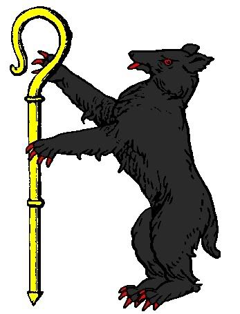
Jonathan R. Baker wrote:
Could a kind, more talented artist take a crack at this, except replace the crozier with a simple shepherd’s crook?
I’m not a better artist, but is this more like what you were thinking?
http://i40.photobucket.com/albums/e221/pblanton/BakerCrest2.jpg
I know that it is salient rather than rampant, but I’m kinda partial to having both feet set firmly on the ground.
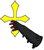
As for a badge, what about a bear’s gamb Sable clutching a cross clechée Or?
http://i40.photobucket.com/albums/e221/pblanton/BakerBadge.jpg
I also agree that the cross on bear track looks somewhat derogatory, though an interesting idea. :D
Take care,
That crook is much better, Phil. Thanks. As for the bear’s pose, I like salient much better than the rampant. It’s a much better, more natural pose for a bear.
As for the badge, that’s a good idea…I’ll definitely take it into consideration.
JRB
Edit: And just because John Duncan was so adamant about the garbs…
http://i5.photobucket.com/albums/y155/jonishairy/Heraldry/Dunk.gif
Hope that makes you happy, John:)
JRB
The banded garbs look very good in the chief. The arms would still be unique without the dovetailing. Is there a specific reason why you want this partition line?
The crest looks much better with both feet firmly on the torse. I have never been partial to crests that seem to defy gravity. The only problem that I have with the crest is the height of the crook as it seems very large in comparison to the standing bear. I think that the bear’s arms should be in the same position and height that is like the arm in your example closest to the viewer. Rather like the position of the arms of a 19th century Bavarian carved black walnut bear umbrella stand.
PBlanton;44757 wrote:
http://i40.photobucket.com/albums/e221/pblanton/BakerCrest2.jpg
I know that it is salient rather than rampant, but I’m kinda partial to having both feet set firmly on the ground.
May I suggest that the bear be armed, eyed and langued Argent/Or rather than Gules? The arms and crest already use two metals and two colours and it would be nice not to add an additional colour.