I agree, I personally like the greyhound crest better than this one.
(Nice illustration, Phil)
Good heavens, that was fast! Thanks. That’s what I had in my mind’s eye. I see what you’re saying about the mullet, but I’ll have to think about it. The greyhound with the cotton may make more sense. Can you cut and paste and it up? I have to run for a couple of hours, but I’ll be back.
You guys are great!
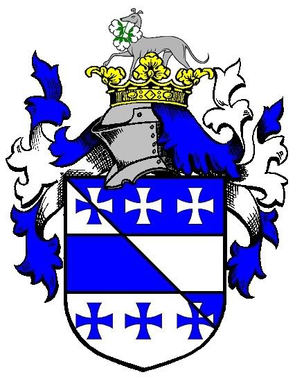
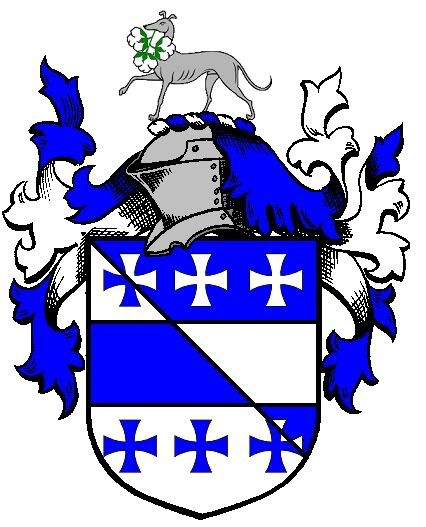
Okay, here ya go…
With coronet and without
http://i40.photobucket.com/albums/e221/pblanton/White-6.jpg http://i40.photobucket.com/albums/e221/pblanton/White-5.jpg
Take care,
PBlanton;49858 wrote:
Okay, here ya go…
With coronet and without
Definitely without—the coronet distracts from the greyhound.
—Guy
Guy Power;49861 wrote:
Definitely without—the coronet distracts from the greyhound.
—Guy
I second that.
Nicw design so far, ut (from your other thread re: Quebecois ancestry) IMO you’re missing a good "cant" if you don’t include at least one heart in the design. If you place it on the shield, possible options might include adding a heart to the fess, or substituting hearts for some or all of the crosses. In the crest,how about having the star pierced of a heart?
Just suggestions…back to the fridge…
PBlanton;49854 wrote:
Is this what you had in mind?
Essentially, what you produced is exactly right, and looks as good as or better than what I pictured. The slight differences I had in mind were
1) that the mullet’s two lower tips appear to be just barely touching the coronet, so that the whole star is visible, and the aperture in the star I imagined to be smaller.
2) that the crosses were of a slightly different shape—more or less exactly like the Iron Cross of German Army fame.
3) that the shade of blue was slightly different, either more like navy, or more like the blue of air force dress uniforms.
I realize that all of these differences are things that fall under the heading of artistic license.
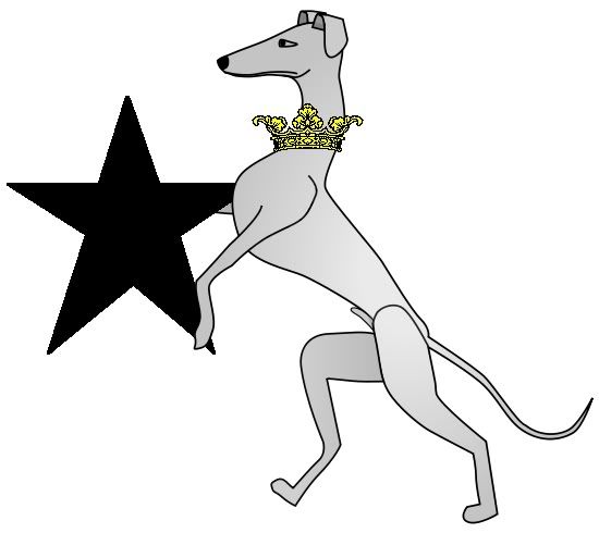
I like the greyhound idea, but the black star speaks to me on a deeper level.
I’ve kind of jerry rigged my own image of it, but without the ducal coronet because I couldn’t get it to paste and fill with yellow with enough precision. Let me see if I can use this photobucket thing and get it to show up here, all the same. You’ll notice that the mullet isn’t pierced.
http://i216.photobucket.com/albums/cc122/fwhiteiv/Arms.jpg
Any thoughts? Does the greyhound still seem preferable? Perhaps Joe’s earlier idea, a greyhound rampant engorged with a collar from which is suspended a black mullet, on a ducal coronet, would be a suitable marriage of the two.
Michael F. McCartney;49869 wrote:
Nicw design so far, ut (from your other thread re: Quebecois ancestry) IMO you’re missing a good "cant" if you don’t include at least one heart in the design. If you place it on the shield, possible options might include adding a heart to the fess, or substituting hearts for some or all of the crosses. In the crest,how about having the star pierced of a heart?
I guess when I think of hearts I think of cards, which isn’t an association I necessarily want to create, but perhaps a mullet sable pierced of a heart would look better than I imagine. With a coronet made of fleurs-de-lis, rather than the ducal coronet, it would certainly make the Quebec statement.
How about a greyhound gorged by an ancient coronet from which your mullet would be suspended?
My idea for a crest: a demi-greyhound, gorged with a ducal coronet, holding in its paws a mullet sable.
Jonathan R. Baker;49879 wrote:
My idea for a crest: a demi-greyhound, gorged with a ducal coronet, holding in its paws a mullet sable.
There we go! That sounds like a really good step towards marrying the motifs, though I think Phil’s rendering and glances at other attitudes have persuaded me that I prefer the greyhound passant. How about "a greyhound passant gorged with a ducal coronet Or, its raised front paw resting upon/holding a mullet Sable"?
PBlanton;49854 wrote:
It is also known as a ducal coronet. Per Parker, "A coronet without the cap, and shewing but three leaves, is called a Ducal coronet, and frequently a Ducal crown." Shown without the cap of maintenance it represents no rank.
Actually the ancient crest coronet and the ducal crest coronet are different, the former being composed of fleurs-de-lys or stylised trefoils and the latter being composed of strawberry leaves.
An illustration of the ancient crest coronet can be seen in Plate 128, Figure 5 of Fairbairn’s Crests of the Families of Great Britain and Ireland; on Page 117 of A Dictionary of Heraldry (1987) by Stephen Friar; in Plate 24, Figure 38 of A Dictionary of Heraldry (1889) by Charles Elvin.
The ancient coronet is described in The Heraldic Alphabet by the late J.P. Brooke-Little on Page 33 as follows: A coronet composed of four fleurs-de-lys rising from a rim is sometimes called an ‘ancient coronet’.
Doh! :oops: You are correct, David. :D I had a momentary brain fart and mentally pictured strawberry leaves when I read fleur-de-lis. ![]()
Either way, ancient or ducal could be used without insinuating rank.
Take care,
Jonathan R. Baker wrote:
My idea for a crest: a demi-greyhound, gorged with a ducal coronet, holding in its paws a mullet sable.
Something like this?
http://i40.photobucket.com/albums/e221/pblanton/WhiteCrest.jpg
I know it’s not a demi-greyhound, but why stop half-way? ![]()
Also, I like this one better than the greyhound passant.
Take care,
I think that if the crest includes the greyhound and subordinates the Habersham elements to it, there’s really no reason to change from ducal coronet(strawberry leaves) to ancient (fleurs-de-lis). The cotton bolls are fun, but I think they can go, because anything more than the coronet and the star up there with the greyhound would make the crest look cluttered.