After having read the extensive back and forth about what and where it is proper to post and/or discuss arms design ideas/suggestions, I’m unsure if I should even be posting this here?? Unfortunately, I am still trying to learn how to properly describe (Blazon) my arms design concept
I am still attempting to refine my idea(s) for my Arms. I have an early design as my avatar and have been playing with some changes to the basic idea. My problem now is how to correctly Blazon the Emblazonment!?!
As I understand it from other posts about correct blazonry…
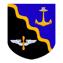
"Per Bend Sable and Azure a bendlet wavy Or, in chief an anchor erect Or the ring surmounted by a mullet reversed Argent, in base a two bladed airscrew palewise Or winged fesswise Argent."
would be the correct Blazon for this CoA.
http://i38.photobucket.com/albums/e138/gscsderby/Heraldry/derby_Per_Bend1.gif
Am I correct in my assumption? Thanks in advance and I appologize if this is posted in the wrong place.
I think, and believe me I could be wrong, that the anchor and air screw need to be specified as to their locations in chief and in base.
Such as "...in chief sinister….in base dexter…."
Those more learned will correct me if I’m wrong. Everything else with the blazon looks good to me. I am wondering about the argent mullet reversed over the Or anchor only because it’s really hard to see.
I’m not sure you need "winged fesswise Argent". I would think just "winged Argent" would be sufficient. I can’t imagine someone emblazoning the wings the other way.
I’m not sure whether it’s necessary,but I would have said "Per bend wavy a bendlet wavy" in order to make it clear that the line of partition is not straight but follows the waves of the bendlet.
It would be more precise to specify "in sinister chief" and "in dexter base", but I don’t think anyone would place the charges anywhere else if the blazon were simply "in chief" and "in base."
I think "fesswise" may be needed to describe the wings. They might just as well be represented as "elevated" or in some other position.
Because the default for two charges, one on either side of a bend, is to be "in sinister chief" and "in dexter base", I think that "a bend wavy or between [the two charges]" would be quite sufficient to accurately reproduce the emblazon.
Because the main charge is the bendlet, I would agree with blazoning the field as "Per bend wavy", as well as with the idea that it might be better to blazon the wings as "fesswise", since they would not necessarily be so emblazoned by an artist who did not have the emblazon to work from.
"Per bend wavy Sable and Azure a bendlet wavy Or between an anchor erect Or the ring surmounted by a mullet reversed Argent, and a two bladed airscrew palewise Or winged fesswise Argent."
David B. Appleton
Appleton Studios
Books on heraldry at www.appletonstudios.com/BooksandGames.htm
I just noticed: I think the blazon should be "per bend wavy Azure and Sable"—not "Sable and Azure." When the shield is partitioned per bend, the tincture in chief is named first.
I agree—though I’ve seen some variation in blazoning (which is unfortunate since it is a significant difference producing different and therefore confusing results) I believe the generally accepted approach, for arms parted per bend, is to favor (say first) chief over base, and only secondarily dexter before sinister. (See e.g. Wenzl in our Members Roll, and Ailing and Fearn in our Roll of Early American Arms)
Similarly in blazoning a gyronny coat (e.g. Campbell) one would say gyronny Or and Sable where the gold gyron is (a) the first one above the bendwise line, and (b) secondarily, to the dexter of the palar line.
The wings on the prop should be blazoned "expanded." Without this being specified, they would be emblazoned as displayed. "Fesswise" is clear enough, but not, I think, the conventional expression.
If I’m reading all of the suggestions correctly (and stacking them in correct sequence) the Blazon should read:
"Per bend wavy Azure and Sable a wavy bendlet Or between an anchor erect Or the ring surmounted by a mullet reversed Argent, and a two bladed airscrew palewise Or wings expanded Argent."
Joseph McMillan;52708 wrote:
The wings on the prop should be blazoned "expanded."
Would the difference between the terms ‘displayed’ and ‘expanded’ lead a heraldic artist or illuminator to render the wings fesswise (as indicated) versus in a more vertical position, having nothing but the Blazon and imagination to work with? Wouldn’t "... wings expanded fesswise Argent" be more accurate?
Thanks again for all the educational insight.
A point of style: One should probably say "a bendlet wavy," rather than "a wavy bendlet." (Cf. "anchor erect," "mullet reversed," "airscrew palewise")
About the wings: To simply say "wings expanded" or something like that does not seem to make clear that the wings are attached to the airscrew. "Winged" says more clearly that the wings are attached. That would give "an airscrew palewise Or winged expanded Argent." One could also say: "two wings expanded Argent conjoined to an airsrew palewise Or
If I had nothing but a blazon saying wings displayed (or extended) [Side note: Pimbley’s dictionary states these terms are synonymous. Have they developed different meanings since then?], I would probably render them something along the lines of the eagle on the US coat of arms, maybe not so curved, but somewhat curved nonetheless… maybe it’s just I don’t like rigid lines for objects in nature. I think including fesswise would be helpful for an artist if it’s really that big a deal for you. Keep in mind, however, a little variation in emblazonments is inevitable, and quite frankly in my opinion, desirable. I’m far from an expert at this, but to me it doesn’t seem to be that big of a deal if one artist illustrates the wings curved more along the lines of eagle in the US coat of arms while another illustrates them straight more along lines of what you have chosen to display. In both cases the charge is clean and the same.
I agree with the airscrew… winged… instead of airscrew… wings…
Dcgb7f;52731 wrote:
Keep in mind, however, a little variation in emblazonments is inevitable, and quite frankly in my opinion, desirable. ... I agree with the airscrew… winged… instead of airscrew… wings…
As nature abhors a straight line, I agree that a slight upward curve in the wings is desirable and will look just as good IMO as they do now. I was just trying to figure out the correct way to pass on the most information and follow the general guideline (rules) for blazonry.
Again, thanks for the thoughts, opinions, and suggested variations for properly blazoning this rendition.
Jim,
First let me welcome you to the AHS! :D
This is also how my own arms are blazoned and illustrated.
Just my 2¢.
Take care,
PBlanton;52792 wrote:
Jim,
First let me welcome you to the AHS! :D
This is also how my own arms are blazoned and illustrated.
Just my 2¢.
Take care,
Philip,
Thanks for the welcome and the additional clarification of terms. Looking at your arms I like the look of the ‘Expansed’ i.e. slight downward curve as compared the the more rigid straight line of the wing that I currently have drafted into the design.
Now based on this information an artistic difference between displayed (wings curved in an upward arc) versus expansed (wings more fesswise and/or with a slight downward curve). The interchangeable nature of varying terns is why I need the assistance of everyone here!
If the old axiom about learning something new every day is really true, I’ll be here an awful lot! No wasted time for me!
Thanks again.
PBlanton;52792 wrote:
Jim,
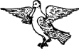
Although Pimbley and Parker both state that expansed and displayed are interchangable, I’ve always pictured expansed as wings opened fesswise. To illustrate, here is a picture from Parker’s entry on wings labeled as "expansed":
http://www.heraldsnet.org/saitou/parker/images/624a.gif
This is also how my own arms are blazoned and illustrated.
This is starting too look like a perfect candidate for "as are in the margin hereof more clearly depicted." :p
Dcgb7f;52813 wrote:
This is starting too look like a perfect candidate for "as are in the margin hereof more clearly depicted." :p
That is TOO True! But still, I’m enjoying the learning process.