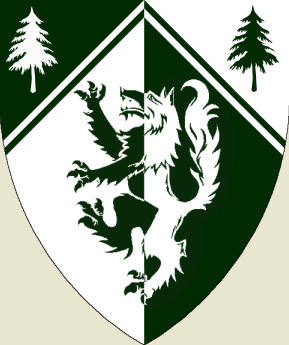
I’ve been tampering with trying to come up with a final coat of arms for myself for over a year now off and on, and I think I’m finally getting close to being done, I’m still working on the rest of it (motto, mantle, ect.), but now what I’d like help with is the blazon for the shield I’ve come up with…opinions are welcome as well ![]()
Nice, but, if I may, I would recommend killing the thin whatchacallit edging on your per chevron partition line. It’s busy and sort of fundamentally non-heraldic; makes your shield look a bit like the kind of faux* heraldry favored by advertising companies as a way of showing "class."
Also, as some others know, I’m not a big fan of Celtic crosses in heraldry, but to each his own.
_______________
* Apologies for using this word twice within 24 hours. I will try to ration myself in future.
Well I had the Chevron without the divider bars for a long time, but whenever I looked at it, I couldn’t help but think it looked kind of flat. My goal is to have some of the traditional style in the coat of arms, holding to all the heraldic rules…but yet bringing some of my artistic element to it, I don’t want something entirely traditional.
Oh, and why the dislike for the Celtic Cross? Just don’t like the style or is their something more?
AILD;68840 wrote:
Oh, and why the dislike for the Celtic Cross? Just don’t like the style or is their something more?
For some rerason not understandable to me, large numbers of persons of Irish descent feel compeled to make a statement about their ethnicity using this very tired and much overused symbol. Surely Ireland has many more symbols than the Celtic cross from which to draw.
On top of its over use, the Celtic cross may been seen tatooed on loud drunken Irishmen at pubs and sporting events through out the world. Most ‘lace curtain Irishmen’ would find some distance from the ‘shanty Iriishmen’ comforting rather than identifying directly with them on their coat-of-arms.
I agree with Joseph about the un-needed complication of the "thin whatchacallit edging on your per chevron partition line".
I suppose I see where you’re coming from regarding the Celtic Cross…mainly I wanted the cross included as a sign of my faith, and the celtic style is my personal favorite style. That being said, I’ve been playing with the idea today of putting a white tree in the green part, instead of the cross. So basically just having two trees of opposite colors in the top part, and the wolf under the main chevron.
*Shrugs* Don’t really understand what you guys dislike so much about artistic element on the chevron. Really I’m just trying to do something different.
Alright, I have to admit the two trees are starting to grow on me. I also changed them to pine trees instead of a maple. I tried looking at it with a standard Chevron, but it starts looking somewhat typical…I’m not sure how to put it.
http://i127.photobucket.com/albums/p122/BrokenChainsX/CoatTry.png
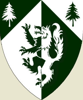
For me there is a feeling of it being slightly cluttered due to the extra partition. I tried removing it and only having a partition per chevron, which in my eyes are an improvement. I think that have arms as clear as possible is desirable, but then I am from Scandinavia, and we use the modified version of the "fridge-test"... :p
http://americanheraldry.org/forums/attachment.php?attachmentid=594&stc=1&d=1241285734
Well if you want to be picky, the chevron should look like this in my opinion, going all the way to the top of the shield.
http://i127.photobucket.com/albums/p122/BrokenChainsX/CoatTry2.png
I’m somewhat torn…because I feel having the dividing chevron adds to it, since I’m trying to have a design that isn’t like anybody elses. But if the masses hate it, then I just feel stupid keeping it ![]()
Arms are supposed to be unique, but not in a "no one ever thought of doing that before" kind of way. That’s the path that leads to charges overlapping the edges of the shield and doves with wings transforming into rainbow-colored rays of light. Whenever possible, they should look (in my opinion) as if they wouldn’t be out of place carried by a medieval knight.
I had started writing an answer that explained my dislike for the Celtic cross as a heraldic charge and got sidetracked into the asymmetry of the charges in chief, and was about to suggest replacing the cross with a second tree, so I applaud your openness to that.
As to where the chevron’s point ends, it’s up to you.
By the way, I would suggest lightening the green a shade. RGB 0:42:0 is almost black, and one of the cardinal rules of emblazonment is that the tinctures should be unmistakable.
I apologize for the very dark green coloration, it’s just been the one I’ve been using since I’ve been printing some of these examples out, and when it comes out of my printer, the coloration is pretty much the way you have it in the image you just posted…haha…even though it looks so dark on my computer.
Actually, I don’t think we ever addressed your original question, which was about the blazon. In the latest form, it would be something like
Per chevron throughout and per pale Vert and Argent a wolf rampant and in chief two pine trees eradicated counterchanged.
or
Per pale Argent and Vert chapé a wolf rampant and in chief two pine trees eradicated counterchanged.
<i></i>
And probably several other variants. The whatchamacallit dividing line would probably quadruple the length of the blazon.
Amazing how one dividing line could make things so much more difficult haha. I appreciate your opinion on the blazon, I was kind of wondering who’d finally come around to my original question haha.
Regarding colours, the Swedish State Herald has an excellent homepage with recommended heraldic colours, complete with Pantone-colours.
But it’s all in Swedish. The nerve! ![]()
arriano;68852 wrote:
But it’s all in Swedish. The nerve!
Key:
Guld = Or
Silver = Argent
Rött = Gules
Blått = Azure
Svart = Sable
Grönt = Vert
Purpur = Purpure
I wouldn’t say I hate the previous chevron, but I think that the last image above looks somehow cleaner. I also prefer the double trees over the Celtic cross, but not because I have anything against Celtic crosses. Overall, I find the arms quite attractive.