Claus K Berntsen;68844 wrote:
For me there is a feeling of it being slightly cluttered due to the extra partition. I tried removing it and only having a partition per chevron, which in my eyes are an improvement. I think that have arms as clear as possible is desirable, but then I am from Scandinavia, and we use the modified version of the "fridge-test"... :p
http://americanheraldry.org/forums/attachment.php?attachmentid=594&stc=1&d=1241285734
I agree wholeheartedly. This is getting much, much better. Simple, clear, easy to "read", and elegant.
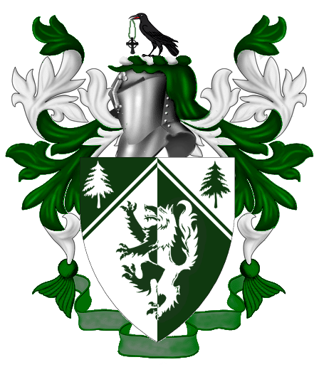
Well I’m not sure I yet agree with you guys about the Chevron, but I had a thought the other day on my way to pick up my fiance at work as to how to work in a cross, and what to use as my crest. I’ve tried it out and it looks good to have a Raven on the crest with a necklace hanging from his mouth, with a cross on the end of it. The reasoning behind the Raven seemed painfully obvious to me after it struck me. For me the Raven would be a sign of friendship and teamwork, due to the Ravens natural connection to wolves. Ravens and wolves for some reason have developed a strange relationship together in the natural world.
Here’s what I’m envisioning…in spite of the fact that it’s just art pasted together haha.
http://i127.photobucket.com/albums/p122/BrokenChainsX/CoatOfArms22.png
The cross being held by the raven is definitely better (although artistically the whole crest, raven and cross alike, should probably be at least half again as big).
So you think I should make the Raven and Cross larger?
Yes, the spectators at a tournament would have to use binoculars to see them. Definitely bigger on the raven/cross. You may also want to consider having the raven in a different position. Wings expanded, rising, reguardant - and so on…
I was considering that…however trying to avoid it looking like the nazi eagle ![]()
Yes larger! As for the wings, I would want to look at a number of positions before I could say what looks the best. They are turning out nicely! ![]()
My first thought when I saw your proposed crest was that the raven had just collected a shiny trinket from the corpse of a decaying Irish monk after the latest wave of the Black Death. A very Edgar Allen Poe themed crest indeed!
Joseph McMillan;68848 wrote:
Actually, I don’t think we ever addressed your original question, which was about the blazon. In the latest form, it would be something like
Per chevron throughout and per pale Vert and Argent a wolf rampant and in chief two pine trees eradicated counterchanged.
or
Per pale Argent and Vert chapé a wolf rampant and in chief two pine trees eradicated counterchanged.
</i>
I think that either "per chevron throughout" or "chapé" would strike the sides of the shield lower down than what has been shown.
Without the chevronel, I would suggestion the blazon:
<i>Per pale Argent and Vert a Wolf rampant counterchanged the field chaperonné charged with two pine trees also counterchanged.
I don’t know if I agree with your chaperonné, Fr. Dohrman, because of where it’s lower edges terminate. From what I understand of the chaperonné, the lower portion would terminate below the fess line of the shield, whereas this chevronel terminates roughly on the fess line. I think that perhaps per pale and per chevron enhanced Vert and Argent a chevronel enhanced between two pine trees and a wolf rampant all counterchanged would describe what is emblazoned a bit more clearly.
BTW, Joshua, I personally like your shield with the counterchanged chevronel.
Take care,
PBlanton;68920 wrote:
I don’t know if I agree with your chaperonné, Fr. Dohrman, because of where it’s lower edges terminate. From what I understand of the chaperonné, the lower portion would terminate below the fess line of the shield, whereas this chevronel terminates roughly on the fess line. I think that perhaps per pale and per chevron enhanced Vert and Argent a chevronel enhanced between two pine trees and a wolf rampant all counterchanged would describe what is emblazoned a bit more clearly.
The blazon I suggested using chaperonné did not include the chevronel. If one includes the chevronel, I think your blazon is correct. I wonder, though, whether one needs to add "per chevron enhanced throughout" to get the partition lines to touch the top of the shield at the center.
As for chaperonné: I believe that the diagonal lines of chapé terminate below the fess line, while for chaperonné they terminate at or above the fess line.
Chaperonné (Fr.) : Similar to the chapé but with the diagonal lines meeting the sides of the shield at fess
David Pritchard;68900 wrote:
My first thought when I saw your proposed crest was that the raven had just collected a shiny trinket from the corpse of a decaying Irish monk after the latest wave of the Black Death. A very Edgar Allen Poe themed crest indeed!
My, you do have a dark side don’t you? :D
What if the cross were made large, like one of the great stone crosses of Ireland? The raven could stand beside it, supporting it with one raised claw—or even a wing (as in the arms of the CoA). Just a thought.