So as most of you know, I’ve been using a counter charged style shield for awhile, and I am honestly very happy with it. But if you know me, you know once in awhile I just keep tweaking things and like trying out different designs. So I was messing around with the different styles of my shield since I don’t really have anything set in stone yet, and I came up with something. I want your honest opinion to which you think is the more solid design. Both have elements I like…and one minute I’ll look at one and like it better than the other…then five minutes later I’ll switch again. It really is a punishment to the mind ![]()
Hrrrm. . .
Ultimately I still like the first design more because the tinctures are more unified.
The benefit of the second design is that it’s easier to distinguish the main charge, which is always a good thing.
I believe both designs would be impoved by removing the chevronnels and simply having a line of division "per chevron."
http://img36.imageshack.us/img36/4375/shieldagainmck.png
http://img42.imageshack.us/img42/5959/shieldnewermck.png
Comparing these two versions, I lean more toward the sable.
Ultimately simpler designs are more recognizable, more powerful, and more distinctive even if they may be less "ornamental."
...Except you have sable touching vert. So then that isn’t a possibility.
AILD;71326 wrote:
...Except you have sable touching vert. So then that isn’t a possibility.
In my understanding, the contrast rule doesn’t apply in this case. With a field division (as opposed to a bend, chevron, or other charge) it’s often acceptable to have two colours in contact. Granted, your example is not exactly "per chevron," but the rule isn’t hard and fast anyway.
Just glancing at the member’s armorial. . . .
http://americanheraldry.org/pages/uploads/Armorial/roe04.jpg
http://americanheraldry.org/pages/uploads/Armorial/Boven_ahs_l3.jpg
And a bit further afield, (no pun intended) the very first emblazon in the online excerpt of the German Roll of Arms:
http://www.familie-greve.de/modules/wappenindex/h/ho/hog.gif
Well now I’m just confused haha.
I think the Sable version is interesting, but still prefer your original.
I agree that the counterchanged shield looks much better without the chevronnel. It creates a much simpler, cleaner design and allows the main charge to be enlarged.
I quite like the argent and vert version without the counterchanging that you posted a day or two ago. Though with this design I’d probably eliminate the chevronnel altogether and just have the field "per chevron enhanced".
http://i127.photobucket.com/albums/p122/BrokenChainsX/Shield-1.png
True it is a bit less distinctive, but it is much more recognizable when smaller (e.g., at a distance). When the shield is smaller the counterchanging prevents the wolf from being easily identified.
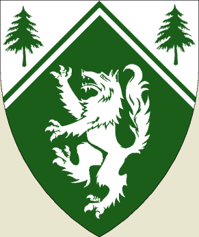
Truth be told the image that keeps coming back to me when I see your shield is an adaptation of Fr. Guy’s arms…..Vert a wolf rampant Argent; a chief parted per fir trees argent… I’m not suggesting copying from Fr. Guy so much as indicating that I keep "seeing" a simplified version of your shield. The longer I surf this board, and read heraldry books the more I appreciate less and less clutter.
Dale Challener Roe;71337 wrote:
I’m not suggesting copying from Fr. Guy so much as indicating that I keep "seeing" a simplified version of your shield. The longer I surf this board, and read heraldry books the more I appreciate less and less clutter.
I agree, In the design process of my arms I new I wanted to be as simple as possible within the design constraints which I had placed on myself, and have never regretted it. I would drop the chevronel unless it has a special meaning to you.
Having seen both versions I prefer the sable non countercharged. Just my humble opinion.
Oh by the way, I feel that the sable against the vert is perfectly acceptable under the tincturing rule as I understand it.
My self I like the original the best, but I’m just a beginer at this. I asked my son, an artist for his "eye" and he feels as I do the original .
Dave
I’d like to see the wolf enlarged without the chevronnel in either the Argent/Vert version or the Vert/Sable version - I think enlarging the wolf would drive me towards losing the chevronnel and the countercharge.
I’m also thinking the Sable would combine nicely with your crest which includes a raven if memory serves
Don’t think that I’m not heeding your suggestions by the way…I’ve been keeping a close eye on this topic…and spending a lot of time in my graphics program because of it…looking at my options haha.
Now…I know that everybody here has a far superior idea of what is actually good heraldic design, but I decided to try and get some outside opinions from some people I know…and some people I don’t know all that well. So far there’s about 12 votes for Design #1, and surprisingly only 3 votes for Design #2. Interesting observation…but anyway…back to my graphics program haha.
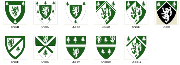
*Grumbles*...I think I’ve turned my mind to mush, because now I keep coming up with stuff…some of which I don’t even remotely like haha. Here are just some examples
http://i127.photobucket.com/albums/p122/BrokenChainsX/Issues.png
I like #5 and #6 the most. However, #8 has a familiar quality I just can’t put my finger on….
kimon;71362 wrote:
I like #5 and #6 the most. However, #8 has a familiar quality I just can’t put my finger on….
:D
Overall,#5 for me please.
I also like 2 & 3. The bordures definitely give them a Scottish feel to my eye.
Number 1 is probably more graphically successful than 2 or 3. You’ve got a dark color to contrast any white space around the shield - this could be important depending on how you display your arms. However, something about a *green* wolf strikes me as a bit odd. Then again, my arms have a blue bear, so I shouldn’t talk. Maybe try a black wolf?
Between 9 & 10, 9 is a lot more organized and distinctive - 10 just looks cluttered. I am not a fan of fimbriation and other fussy borders for ordinaries, but you probably knew that.
As a final random suggestion, perhaps try version 9 but put the wolf in chief, passant, (slinky) and the trees, or a single tree, in base?
Thanks for letting us vicariously experiment - it’s fun.
J
Which graphics program do you use, btw?
Oddly, I’ve found that fireworks, a web graphics program, is just about perfect for heraldry. The objects are vector, but render in the screen as raster. It sounds weird but it works well.