kimon;71362 wrote:
I like #5 and #6 the most. However, #8 has a familiar quality I just can’t put my finger on….
Haha…yes yes, I admit I was looking at your arms when I did #8. I figured I’d try it out since your arms has always been one of my favorites I’ve seen around here.
John Mck;71364 wrote:
Which graphics program do you use, btw?
Oddly, I’ve found that fireworks, a web graphics program, is just about perfect for heraldry. The objects are vector, but render in the screen as raster. It sounds weird but it works well.
I use Jasc Paint Shop Pro 8, I’ve been using it for many years. I’ve never even heard of Fireworks haha. I do have Photoshop Elements 7, but I’m not very practiced with it.
I think I like the one from the other thread best. And you’ve stuck to your guns thus far on the chevronnels, and in the face of so much opposition. I think you are required to include them at this point. ![]()
Well I do really like the look the chevronnels give…and I have tried other things but when I look at them, they’re just…kinda there if you know what I mean. So I think I will ultimately stick with the chevronnels…just don’t know what color scheme to go with anymore haha. Thanks for the support though ![]()
I think I’m going to attempt the fridge tactic haha.
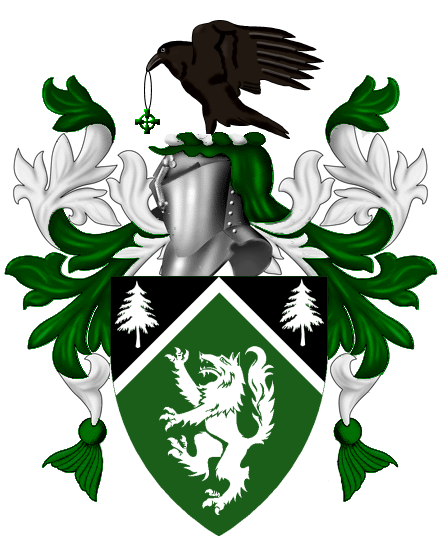
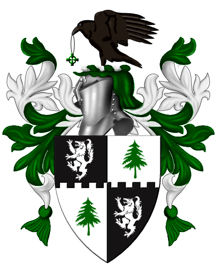
Another thing is…when you actually put it on the coat of arms…the black does set off the raven. Yes on this example I flipped the vert and the sable.
http://i127.photobucket.com/albums/p122/BrokenChainsX/WolfRaven.png
You are right about the sable in the ful achievement - it works well.
I’m sure you’ve tried this - can we see the sable and vert reversed in the full achievement?
AILD;71355 wrote:
I’ve turned my mind to mush…....
http://i127.photobucket.com/albums/p122/BrokenChainsX/Issues.png
No one will be arguing that point with you. Why do you keep posting about your arms, I thought that you had decided and settled upon the ugly one of your own formulation rather than two excellent examples offered by the membership. Smply decide which of the poor designs you are going to keep and stop torturing us.
Could this thread be locked please?
David Pritchard;71375 wrote:
No one will be arguing that point with you. Why do you keep posting about your arms, I thought that you had decided and settled upon the ugly one of your own formulation rather than two excellent examples offered by the membership. Smply decide which of the poor designs you are going to keep and stop torturing us.
Could this thread be locked please?
You know what, drop the attitude. If you feel like viewing these are a waste of your time, then stop looking at my topics…and skip over any post I make in the future. Trust me, I’d much be completely ignored by you than deal with your poor attitude. Even if you had the best opinion in the world…and everybody agreed with you, I still wouldn’t listen to you because of what a snob you are with me.
I’ll get the other version of the coat of arms up shortly, I have family over so I can’t at the moment.
Given that you are now willing to consider giving up the chevronnels. I would suggest giving up the chevron as well. I know it’s just me, but I prefer green trees on white rather than the opposite.
One thing to keep in mind is that changing the field to sable would customarily change the mantling as well.
That said, Kenneth’s second shield is probably the best one that I’ve seen yet.
I think losing the chevronnel may be a good idea, but I kind of like the sable over vert/vert over sable with all three charges argent.
Try the shields from posts 20/24 without the chevronnel..
Kathy McClurg;71385 wrote:
I think losing the chevronnel may be a good idea, but I kind of like the sable over vert/vert over sable with all three charges argent.
Try the shields from posts 20/24 without the chevronnel..
The thing is…I think especially when you pair the sable and vert together, it just doesn’t look right, and almost needs to be broken up by the white chevronnel. For me the problem I am having with eliminating the chevronnel is the shield begins to look flat to my eyes…why, I can’t put my finger on however. Also, I know I’m just missing something…but I’m not really understanding how doing this isn’t a violation of the tincture rule…a little help in understand that would be of great help ![]()
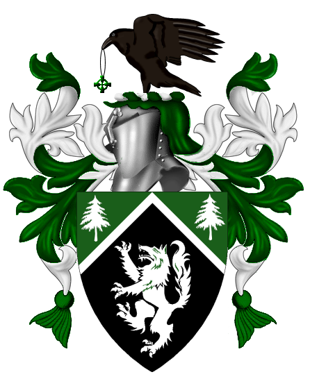
The best designs you’ve considered were weeks ago. It’s possible for black and green to work together, but tricky. What you’ve got now makes me think irresistibly of the Wicked Witch of the West.
What was wrong with green trees on white, a white lion on green, and no little chevronel to busy up the composition (i.e., Kenneth’s first suggestion above)?
Joseph McMillan;71388 wrote:
The best designs you’ve considered were weeks ago. It’s possible for black and green to work together, but tricky. What you’ve got now makes me think irresistibly of the Wicked Witch of the West.
What was wrong with green trees on white, a white lion on green, and no little chevronel to busy up the composition (i.e., Kenneth’s first suggestion above)?
I can’t put my finger on what I don’t like about it…it’s almost not striking enough.
Trying something a little different…not sure, this is actually one of the ones that has struck me in awhile.
http://i127.photobucket.com/albums/p122/BrokenChainsX/1Tested.png
http://i127.photobucket.com/albums/p122/BrokenChainsX/GreenBorder.png
Probably too much, but I figured what the hey.
http://i127.photobucket.com/albums/p122/BrokenChainsX/WolfRavenAgain.png
The thing is…In my opinion you almost need the green and white mantling to set off the black and make it pop properly.
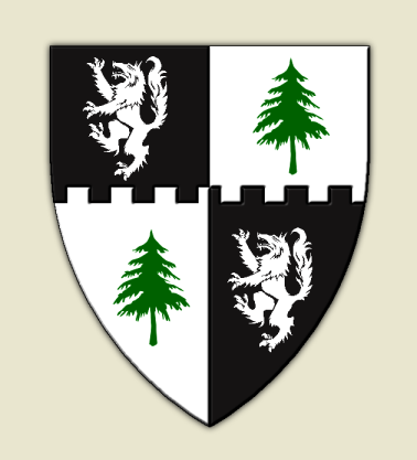
Sorry, but you’re getting farther and farther off track.
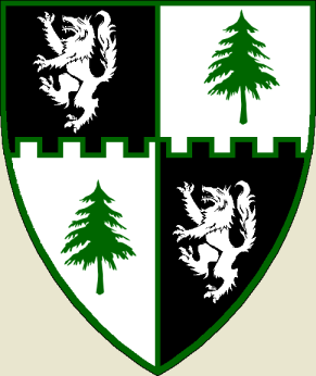
The green fimbriation line around everything is totally not heraldry, and please don’t create a quartered original coat of arms. Yes, I see that the fesswise quartering line is embattled—this is appropriate for turning marshalled arms into a unified coat, not for when you’re starting from scratch.