Greetings!
My name is Travis James Smith and I am a new member of the Society. I have been interested in heraldry since high school (I am now a 29 year old lawyer) and tried my hand at designing a coat of arms with clipart back in high school, and essentially ended up with an inelegant quartered "lucky charm" design that I never really used.
Know that I am older and wiser ![]() , I have been working with artist Matthew Alderman to design a suitable and correct coat of arms to assume and use. Through the process of consulting we have narrowed things down to 3 or 4 blazons and Matthew has done 3 preliminary sketches (I will post the preliminary sketches if somebody would kindly advise me as to the best way to post images to the forum). I am interested in getting opinions from the many experts here on the various designs to further guide the selection process.
, I have been working with artist Matthew Alderman to design a suitable and correct coat of arms to assume and use. Through the process of consulting we have narrowed things down to 3 or 4 blazons and Matthew has done 3 preliminary sketches (I will post the preliminary sketches if somebody would kindly advise me as to the best way to post images to the forum). I am interested in getting opinions from the many experts here on the various designs to further guide the selection process.
Here are the blazons (any help correcting the blazons for style, clarity, and correctness is greatly appreciated as are comments on how to improve the designs):
Crest:
A demi-gryphon with the foreparts of a peregrine falcon proper holding a cross crosslet fitchy Or.
(If people think it is absolutely absurd to have a gryphon with the foreparts of a peregrine falcon (which I recognize is really some different imaginary beast), I am open other possibilities including simply having a peregrine falcon proper holding the cross, an American Kestrel, a red-tailed hawk, or some other animal characteristic of the American prairies. Please let me hear your suggestions)
Shield:
1. Erminois a gryphon segreant bleu celeste armed and languered gules holding a portcullis gules a chief semee of roses (or snowflakes) argent.
2. Per fess pean and erminois a gryphon segreant counterchanged Or and sable armed and languered gules holding a portcullis argent two roses argent in chief a rose in point gules.
3. Bleu celeste a gryphon erminois holding a portcullis argent, a chief Or semee of roses gules (or some series of three objects: fleur-de-lys bleu celeste, roses gules, etc. in chief).
4. Vert a gryphon Or a chief barry-wavy of azure and argent parted per fir trees.
I realize that design #3 is essentially a tincture reversal of design 1 but I included it in the list nonetheless to see whether people like it better than #1.
Motto:
Plenitudo ergo legis est dilectio. Translation: Love is the fulfillment of the law. Romans 13:10.
A little background information: as I said above, I am a 29 year old lawyer and work as a prosecutor. I am a devout Roman Catholic. I am the oldest and only son and have one sister. My father is of mixed ancestory- Dutch, some English, Scottish (Scotch-Irish) (my Scottish ancestors came by way of Canada), maybe a little Irish by adoption. My mother is 100% German. My primary interests could be best classified in three groups: all things relating to my Catholic faith, history (especially that of late medieval through Tudor England), and nature (hunting, camping, botany - especially of the tallgrass prairie, wildlife - including preparing and collecting animal skulls and bones). I was born and raised on the windswept prairies of the far southwest corner of Minnesota.
I look to St. Thomas More as the model for my life as a lawyer and, God willing, as a husband and father.
Some brief notes about how Matthew and I selected some of the charges featured in these designs. The gryphon was selected because I like that it includes the attributes of both the lion and the eagle, is used in Christian art to symbolize the two natures - divine and human - of Christ, and in a way combines symbols associated with the US, England, & Germany.
The portcullis was selected because (1) I like it, (2) it can be taken as an oblique cant on my first name, which comes from a last name associated with bridge and gate-keepers, and (3) could be said to symbolize (at least in my mind) the law, i.e. as protection and obstruction.
Roses are incorporated in the various designs to show devotion to the BVM, as well as my interest in botany, with the prairie rose being a common plant in my area.
Bleu celeste is a reference to my skyward aspirations and to Minnesota- Dakota for Land of Sky-blue Waters. Snowflakes would be another reference to Minnesota and the outdoors. The same with the division line per fir trees.
Variations of ermine are included mostly because I like the look of that particular fur.
Well, sorry about the long first post, but that should give people enough to work with. I look forward to your responses and appreciate any help that people are willing to offer! Thanks for your time!
All the best,
Travis
Regarding the crest, are you saying you’d like the Gryphon to colored like a Peregrine Falcon or that you’d like what is part Eagle to be replaced with part Peregrine Falcon? If it is the latter, then I would suggest you go with "a Peregrine Falcon".
As to the shields:
1) All those colors. Yikes.
2) I tried it. It’s awfully busy and the only thing I can think of to make it less so is to drop the roses to allow the other charges to be larger. If you’re concerned that isn’t unique enough, put a fleur-de-lys in base?
3) Again, just too busy.
4) Lose the fir-tree partition and we could be talking. Much less busy than the others. This could be a winner. He can even have his toy back.
<div class=“bbcode_center” >
http://img828.imageshack.us/img828/5291/smithtravis.png
</div>
So as to keep the number of charges down, why not show your devotion to the BVM by changing the cross in the crest to a cross flory?
I think that there are three good conventions in heraldic design. The first is to keep the number of tinctures down, the second is to not over-do the allusions. If element X represents an allusion, don’t have element Y do it as well, the third is, wherever possible, keep it simple.
The gryphon is good because it refers to your heritage and faith. Demi-griffins are also borne by the Lords Carrington (original surname Smith) so you even have a Smith beast :D
The portcullis is good because it refers to your surname and is a Tudor badge.
That leaves a need for allusions to Minnesota and the BVM. I would suggest for the former snowflakes in chief and I like Kenneth’s idea of the crest cross being flory for the latter. If there is a US equivalent of the Black Grouse of Britain for the crest then you could even get in a reference to Thomas More, whose arms had three Moorcocks = Black Grouse.
I would therefore suggest
Azure a gryphon sergeant holding a portcullis and in chief three snowflakes Argent
Crest: a bird holding a cross flory
I deliberately have said Azure rather than Bleu Celeste as a tincture since in 100 years time who (without access to the written blazon) knows Bleu Celeste from a faded Azure. There have been arguments about examples where Argent may have tarnished to Sable and Sable faded to Azure in heraldry for centuries now and I’m personally no fan of creating more.
James
First, Kenneth and James thank you both for your input.
As to Kenneth’s question, yes we were considering replacing the eagle part with a peregrine falcon part.
James, I have debated whether to go with azure or bleu celeste. I will keep your suggestion in mind. In the blazon you proposed, were you suggesting that the the gryphon and portcullis would be argent as well?
Thanks for the input so far! Keep it coming.
Travis
One more question for James, would a gryphon erminois work with the blazon you suggested? Or does that destroy the simplicity you were going for?
Another question for every one, is there a way to simplify design #1 to eliminate the tincture and busyness issues but still keep the general design. What about starting with this:
Erminois a gryphon segreant bleu celeste (or azure) armed and languered gules holding a portcullis gules three snowflakes argent on a chief bleu celeste (or azure).
If somebody has a suggestion to eliminate the gules (especially for the portcullis) in this design and still have it read clearly I am all for it. Could the portcullis be changed to argent to match the snowflakes?
Mainly, as far as tinctures go, I am interested in keeping the erminois in some way and some variant of blue.
Thanks!
Travis
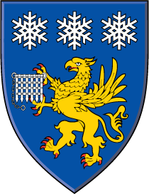
If I may be so bold as to answer for James - yes. What he has blazoned has all the charges being white. Blue shield; white charges.
<div class=“bbcode_center” >
http://img35.imageshack.us/img35/5194/smithtravisdempster.png
</div>
I do like some contrast, though, particularly when an animal is holding something, so I might keep the Gryphon Or. And I don’t have any problem with adding additional color for beasties (armed and langued X).
<div class=“bbcode_center” >
http://img6.imageshack.us/img6/4721/smithtravisdempsterme.png
</div>
As to some other questions, there are many examples of animals being semy of this or that. I have seen it mostly in supporters, though. But I think in this case it would really detract from the overall design. Unlike a stag or boar, the gryphon is quite a busy creature by herself, what with all those feathers and stuff. That is part of the reason that an erminois or pean field also appears extra busy in this case. As to the color of the portcullis, I think you could skate by on a technicality. I don’t believe items that a charge is holding necessarily fall under the tincture "rule".
Your suggestion:
<div class=“bbcode_center” >
http://img638.imageshack.us/img638/8196/smithtravishis.png
</div>
Travis, you’re getting some excellent advice here and the only thing I can add is to take your time. Also, remember that a shield is not your biography
I think this proposal is a very good one and takes into account what you want expressed on the shield.
Kenneth Mansfield;77836 wrote:
<div class=“bbcode_center” >
http://img6.imageshack.us/img6/4721/smithtravisdempsterme.png
</div>
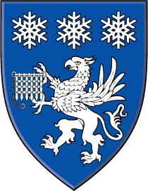
This one, for some reason, is growing on me. It looks like something that might actually come from the CHA these days. Minnesota’s up near Canada, eh? I think I’d stick with the demi-Gryphon for the crest, though. Something like this:
<div class=“bbcode_center” >
http://img707.imageshack.us/img707/8196/smithtravishis.png
</div>
Kenneth- Thanks for the emblazons you posted. When you posted the emblazon of my suggestion I was immediately drawn to it. I looked at it a few times throughout the day and I like it very much. I also agree that it looks like something that might actually come from CHA and that has a certain appeal to me, maybe because - as you say- Minnesota is so close to Canada ![]() Thank you for sending the full achievement in the private message It really helps to see it in color. I greatly appreciate the time you have put in to making the images and helping me out!
Thank you for sending the full achievement in the private message It really helps to see it in color. I greatly appreciate the time you have put in to making the images and helping me out!
What do others think about the design in Kenneth’s last post? Is this good heraldry, if maybe a bit busy with the gryphon on the erminois background? Does it fit generally within either the English or Scottish design traditions?
I am still unsure about what to do with the crest. I like the demi-gryphon but I also really like the CHA’s tendency to use native animals proper. One possibility that occurred to me is the thirteen-lined ground squirrel, better known as the "Minnesota Gopher." I also like the Peregrine falcon, American Kestrel, and Red-tailed Hawk. I imagine that any of these animals could be holding a cross flory, a rose, or a fleur-de-lys. Thoughts from others?
Thanks again for all of your input!
Travis
I think the griffin on erminois is fine; the erminois with the snowflakes, however, seems a bit much. If you’re wedded to ermine spots, how about a plain gold field for the griffin and replace the center snowflake with a white ermine spot?
Joseph McMillan;77850 wrote:
...the erminois with the snowflakes, however, seems a bit much.
Let me put that in perspective for you, Joe. :p
<div class=“bbcode_center” >
http://img190.imageshack.us/img190/879/smithtravisjoe.png
</div>
I guess that another possibility, if one wanted to keep the semy of snowflakes, would be to abandon the erminois in favor of Or. Would there be a good place for a single ermine spot then? Perhaps in base?
Travis
Uh oh.
I think the semy of snowflakes doesn’t play well at a distance. If you did want to do that, you could do what you’ve suggested, but I’m afraid the single ermine spot somewhere other than as a primary charge would look like some kind of cadency mark.
Kenneth- I agree 100%. I really do like the simplicity of the three snowflakes. I am not inclined to go back to the semy as I am really liking the three snowflakes along with the erminois field behind the gryphon. But I am still open to other suggestions.
Travis
Travis,
Welcome to the Society.
Personally, I find the Griffin on the Erminois field rather busy. It makes the Griffin difficult to distinguish and the portcullis all but impossible. It might, and I stress might, be easier if the field was something other than Bleu Celeste.
Just my 2¢.
Dale
Dale Challener Roe;77856 wrote:
Personally, I find the Griffin on the Erminois field rather busy. It makes the Griffin difficult to distinguish and the portcullis all but impossible. It might, and I stress might, be easier if the field was something other than Bleu Celeste.
Get this man some coffee stat! What you’ve just said makes no sense. :p