I think red or gold would look nice, but then with black and white, just about anything could work.
<div class=“bbcode_center” >
http://a.imageshack.us/img338/6835/smithtravishis4c.png
</div>
I’m a fan of red and black, so I prefer that one. I like that design better than the original ones proposed. Nice and simple, but striking.
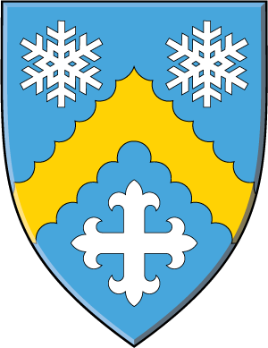
I am likely to be in the minority, but I like the blue/gold/white version. I like the idea of the portcullis being in the achievement somewhere as reference to your job and think that would be something the griffin could be holding in the crest. If you want the cross fleury, perhaps replace the bottom snowflake with one? Not near my software or I’d mock it up.
Kenneth Mansfield;78022 wrote:
I am likely to be in the minority, but I like the blue/gold/white version. I like the idea of the portcullis being in the achievement somewhere as reference to your job and think that would be something the griffin could be holding in the crest. If you want the cross fleury, perhaps replace the bottom snowflake with one? Not near my software or I’d mock it up.
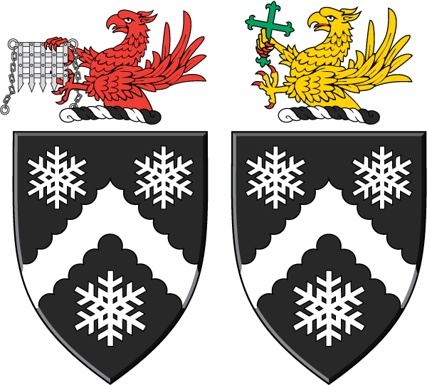
I like this idea and I also want the portcullis in the achievement somewhere. If you would mock it up with the greek cross fleury replacing the bottom snowflake when you have a chance that would be great! This design is definitely going to be a contender.
Thanks for all the help!
Travis
Little random, but what software do you usually use to whip these up so quickly? Seems like it takes me three times the amount of time it takes you to get the same results ![]()
tsmith;78023 wrote:
I like this idea and I also want the portcullis in the achievement somewhere. If you would mock it up with the greek cross fleury replacing the bottom snowflake when you have a chance that would be great! This design is definitely going to be a contender.
<div class=“bbcode_center” >
http://a.imageshack.us/img802/7714/smithtravishis4cross.png
http://a.imageshack.us/img409/4735/smithtravishis4bcross.png
</div>
AILD;78024 wrote:
Little random, but what software do you usually use to whip these up so quickly? Seems like it takes me three times the amount of time it takes you to get the same results
I use Adobe Illustrator.
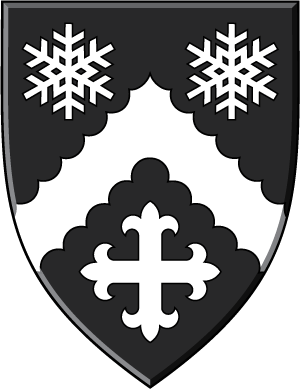
I’m really liking the sable and argent version! ![]()
I really like the sable and argent version as well. I like the cross on the bottom.
AILD;78045 wrote:
I really like the sable and argent version as well. I like the cross on the bottom.
Yes, the cross is a nice feature, indeed!
What’s nice is that it sets off the snow flakes on the top, but stilll compliments there shape nicely.
I agree, Joshua.
Sable and Argent does have one major advantage: You can print the arms on a good laser printer and they will look very, very good!
Well that’s pretty true. You don’t have to worry about ajusting the colors for the most part ![]() . It’s part of the reason I abandoned using a black wolf in my coat of arms or crest.
. It’s part of the reason I abandoned using a black wolf in my coat of arms or crest.
That being said I still really like the sable and argent shield.
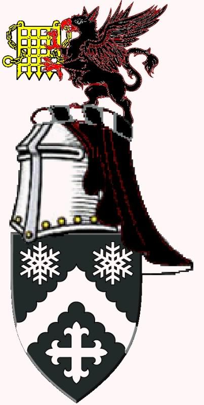
http://i52.photobucket.com/albums/g29/PaddyW_photos/blkgrif.jpg
It’s a crude attempt, but it’s an attempt.
By now, to do a proper refrigerator test you’ll need to rent the kitchen section of a large appliance store!
A number of very nice options. Comments in no particular order:
In Patrick’s otherwise quite nice rendition, the red outlines of the black-on-black griffin crest would IMO better be white outlines—better contrast.
The (perhaps by now abandoned) per fess fir tree (is thgat how we shold say it?) between three snowflakes counterchanged, would IMO be better in blue & white or black & white—yellow snow isn’t IMO a particularly attractive image. ![]()
In the various designs involving the chevron engrailed, IMO three snowflakes is better than two flakes in chief and whatever else in base—though in the black & white version, the cross flory does look quite nice. Don’t know why it doesn’t look as nice—to me at least—on the light blue field.
Black & white has the advantage that even a B&W drawing is, miraculously, in full living color! Also, it does IMO look better than light blue, at least in these designs.
As noted, my views only, others may vary.
Perhaps the best development is that Travis is now hopefully at the point of picking the top few, post them on the fridge (or wherever), and stop designing yet more versions for awhile—let the creative mind rest & the subconscious quietly mull over the options for awhile.
If one design gradually comes to seem "natural" for Travis & the other related Smiths, great! If not, then restart the creative juices but guided by what the subconscious will have told you about the plusses & minuses of the other designs.