Hugh Brady;78223 wrote:
As a quick aside, bleu celeste is sanctioned by the English heralds now, so that argument is over as well.
Hmmm…the practice of the English heralds now guides what we can and should do? Or is that only when they’re being permissive rather than restrictive?
Look, my real argument on orange/tenny isn’t that it can’t be used, but that it should be used with great caution and good reason, and that serious heraldists should recognize that it is a less authentic heraldic color than those in the classic palette.
This is a different argument than the one about light azure/bleu celeste. The parallel with heresy, while a bit tongue in cheek, is valid, I think. It’s heretical to introduce different blazon terms for different shades of the same color, because the heraldic dogma is that shades don’t matter: blue is blue, red is red, gold is gold, etc. In my view, the English heralds erred by admitting bleu celeste as a tincture in its own right. I don’t think Garter King of Arms is infallible.
I have no problem whatsoever with using light blue in a coat of arms. My problem is with treating it as a different tincture from azure.
Let me revise my previous statement. Orange is not a standard heraldic color.
Merriam-Webster wrote:
Main Entry: standard
Function: adjective
Date: 1567
1 a: constituting or conforming to a standard especially as established by law or custom (standard weight)
2 a: regularly and widely used, available, or supplied (standard automobile equipment) b: well-established and very familiar (the standard opera)
3 : having recognized and permanent value (a standard reference work)
4 : substantially uniform and well established by usage in the speech and writing of the educated and widely recognized as acceptable (standard pronunciation is subject to regional variations)
Taking into consideration Hugh’s examples of the University of Texas and Princeton University, I can see where one might argue that Orange has a recognized value (def #3), but I think that is a stretch. I don’t have a problem with Orange being used where it is appropriate or attractive. Certainly in the arms of Princeton, its use allowed for what would otherwise likely not be a unique coat of arms. And again, with the arms of Princeton, the issue comes up, is it a metal or a color? I think Orange is too ambiguous to be taken seriously as part of the heraldic pallet.
Are y’all sure this isn’t more about SEC football than heraldry?
Donnchadh;78212 wrote:
not very good heraldic artists then. or perhaps their scanners/cameras are inferior (my case) but while i am an average heraldic artist even i would not use an orange that appears gold. there are many shades of orange, and yellow, to use to make orange and gold. not to mention mixing them to make the color you’d like. but, i would suggest that if anyone who commissions a blazon/emblazon where the gold actually looks orange, or, the orange actually looks gold, should seek some remedy from the artist.
again, as Joe said, it can be (especially over time as all media break down with time). but, not right off the bat imo.
unless, of course, they specifically want "spanish gold" which in most paints and inks i’ve seen has a very deep, almost orange color to it, but that’s it.
I’m not sure I’ve seen a convincing actual gold painted to be honest…it either looks yellow, a little orangey, or even a little coppery in color. That really wasn’t my point though, my point was if you stray from just using straight yellow in the painting, and we DID consider orange as a heraldic color, it would be difficult to tell the difference between the two.
Also, green doesn’t look like blue unless you stray into the teal realm.
Hugh Brady;78237 wrote:
Are y’all sure this isn’t more about SEC football than heraldry?
I’m from ACC-centric North Carolina where we don’t really recognize intercollegiate sports until basketball season starts.
blue and green aren’t that close? they’re only close so long as it’s "teal"? are you both serious? have you ever taken an art class where a color wheel was used? been to the home depot and looked at a color wheel in the paint section?
blue and green are right next to each other on the color wheel just as orange and red and orange and yellow are!!!!!!!!!!!! holy cow men! blue and green are very much the same in their relationship with each other as red and orange and yellow and orange!!! i could just as easily say that orange and red aren’t really close to each other, or, they’re only as close as orange-red or orange-yellow. but that would be ridiculous…just as saying they aren’t close to each other or are only so in as much as the color "teal" comes into play!
i know i may be acting like an arrogant artistic jack you know what on this, and i’m sorry cuz i don’t wanna be that guy, but dangit if you’re going to assert that red and orange or yellow and orange are too close together and can be mixed up, or misread, then you better be honest and say the same for blue and green. and you better not say they aren’t close or that they are only as close as a mixture of the two, ala "teal". otherwise you’re being either ignorant of basic color wheels, or, intentionally misleading people. since i like and know both of you i reject both…but i have no clue as to why you would both then assert what you did above.
this, the color wheel and thereby the relationship between colors, is the very first thing i taught the kids i was teaching last year (grades 1-8 ). every art teacher should and every one i ever had did even up into college. and i dare say that if anyone is going to dabble in heraldry either as a spectator or in the practice of design and execution they should familiarize themselves with not only the color wheel, but basic color theory.
i’m sorry if i’m coming off as a horses patoot on this fellas cuz i don’t wanna and i think of you all as heraldry and "e" friends, but for me (perhaps as an artist or just a crazy irishman i don’t know) it is a serious thing to assert that basic color wheel and color theory no longer exist. for an artist the color wheel (prism is best btw) is the bible, or field manual, on EVERYTHING you do as an artist and it shouldn’t be ignored. sorry for the rant mods. please delete if outta line. and Kenneth and Joshua please note this isn’t personal…only something i am very, very passionate about…again being an artist.
here’s a very basic color wheel…i prefer the color prism, but then i’m a weird artist i guess…
Denny,
I have in my hand right now (okay, not right now - I put it down to type) my Pantone color fan. The spectrum of greens that are truly distinguishable from blue on the one side and yellow on the other is seriously twice as large as the spectrum of oranges that are truly distinguishable from red on the one side and yellow on the other. While green and orange may both be secondary colors, the much wider range on the yellow end of green makes it a much, much, much larger pallet than orange. And you know that. You’re just being defensive now. ![]()
Hugh Brady;78237 wrote:
Are y’all sure this isn’t more about SEC football than heraldry?
All really important issues—football, whiskey, religion, heraldry—are connected at the top.
some basics i think most people might like and many who might be lurking might enjoy especially if they are lurking to get ideas on designing their own arms.
primary colors: yellow (metal for us), red and blue. called such because you can make any other color in the world by mixing them together.
secondary colors: green, orange and purple. called such because you can only get them by mixing some combination of primary colors.
tertiary colors: the over, or under, mixing of the primary colors, or, the mixing of primary and secondary colors. this is where one starts to get into the "teals" etc.
mixing equal amounts of red and yellow together will give you orange, which is why i agree with Joe that orange can be seen as either yellow or red. but, i also reject the idea that they always are. either the artist did not mix them properly, or, the image as viewable on the internet is not perfect, or, they were intentionally muddied for a specific reason(s) as in the example Kenneth provided from the civic heraldry site.
just as the above is the case, so to can one over, or under, mix blue and yellow and not get a proper green.
and so on with purple.
difference in warm and cool colors is summed up easily as well. although the color wheel i gave above flips them, the traditional red-yellow-blue color wheel has the warm colors on the left and the cool on the right.
anyway warm, violent, passionate, inspiring colors are on the left side of the wheel (right in the wheel above’s case), which are the colors of yellow from the orangish (sp?) side of yellow counterclockwise through orange and red and into the reddish side of purple.
cool, calm, settling, relaxing inspiring colors are on the right side (left in the wheel above’s case) of the wheel, which are the colors of yellow from the greenish side of yellow clockwise through the greens and blues and into the bluish (sp?) side of purple.
and for the record, because no one seems to understand this when you first tell them, and certainly none of the kids i taught last year did because they grew up with these as colors thanks to Crayola, but white and black are in fact not colors at all. they are the absence of color.
Kenneth Mansfield;78242 wrote:
...While green and orange may both be secondary colors, the much wider range on the yellow end of green makes it a much, much, much larger pallet than orange. And you know that. You’re just being defensive now.
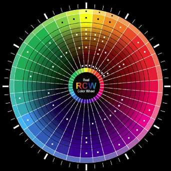
http://a.imageshack.us/img44/9008/colorwheelclock.jpg
Interestingly, this is the exact image I was going to use to prove my point. If you were to superimpose a clock over top of it, I think most people (your average man-on-the-street) would agree that
Or runs from about 11:45-12:30
Gules runs from about 1:30-2:45
Purpure runs from about 4:00-5:15
Azure (including what some call Bleu Celeste) runs from about 5:30-8:00
Vert runs from about 8:45-11:15
That leaves from about 12:30-1:30 to comprise orange, which clearly is a much smaller space than is occupied by what people recognize as green.
As to whether Orange is a color or metal, I don’t know and it’s a good question. I would say that it’s a color and that Texas’s use is correct. ![]() There is some evidence that the French disregarded the rule of tinctures at times, and so I would say that Princeton’s use and the example cited from Rietstap’s fall there.
There is some evidence that the French disregarded the rule of tinctures at times, and so I would say that Princeton’s use and the example cited from Rietstap’s fall there.
So, let me get this straight. The French occasionally abandon the so-called tincture rule and yet we still dismiss out of hand that that is an acceptable practice, insisting as good heraldists that metals should not be put on metals and colors should not be placed on colors. But because a very small handful of respectable institutions have used Orange or Tenné, that practice should now be codified into heraldic custom.
:confused:
Hugh Brady;78268 wrote:
There is some evidence that the French disregarded the rule of tinctures at times….
When, where, and how? I’ve looked into some of these and most are the results of interpretive differences similar to the difference between the Finnish and English interpretation of whether color next to color is permissible. For example, the French will frankly blazon a shield as D’azur au bande de Gueules, which, as "Azure a bend Gules" an English-speaking herald would deem a tincture violation. But if we reblazon the same arms as "Tierced per bend Azure and Gules," then we call it a parted field and treat it as all right, if unusual.
That plus things like green mounts, or rose bushes with red blooms, on blue fields seems to comprise most of the French violations from the classical period (i.e., 1700 and before). I just browsed through the first 100 pages of volume I of the Armorial General d’Hozier (Alsace), which at roughly 5 coats per page is close to 500 shields, and only found one truly egregious tincture violation (gold star on argent field). There were some unfortunate instances where an object or animal was shown against a non-contrasting (in some cases even same colored) field, but all of these could be rationalized as cases of "proper."
When we consider that the d’Hoziers were in the business of recording what they found in use (even arms consisting entirely of the owner’s initials on a field), and not designing arms for granting, I would say the degree of compliance with the rule of tincture is remarkable.
Of course this is not a random sample, but it makes me question just how widespread violations were in French heraldry—certainly it leaves me dubious that this can somehow disprove the existence of the rule.
The online images from the Alsace volume start at http://gallica.bnf.fr/ark:/12148/bpt6k1105860.image.f4.langFR for those who’d like a look.
Ken wrote:
Interestingly, this is the exact image I was going to use to prove my point. If you were to superimpose a clock over top of it, I think most people (your average man-on-the-street) would agree that
Or runs from about 11:45-12:30
Gules runs from about 1:30-2:45
Purpure runs from about 4:00-5:15
Azure (including what some call Bleu Celeste) runs from about 5:30-8:00
Vert runs from about 8:45-11:15
That leaves from about 12:30-1:30 to comprise orange, which clearly is a much smaller space than is occupied by what people recognize as green.
<hr class=“bbcode_rule” >
(1) I’ve read of blazoning by jewels and celestial objects—but have never seen a blazon by the clock! Let’s see:
Noon, a stag trippant 2:00 attired somewhere between 6:00 & 8:00, on a border of the last an orle of saltires couped—uh—hmmm…no time for Argent! Oh well…
(2) Color wheels & all are an interesting way to make a point, but IMO color is more art than science—as a Supreme Court Justice is said to have said, "I can’t define it, but I know it when I see it." Well, OK, he wasn’t talking about arms, unless they were strategically crossed to hide the goods, but the idea is the same.
Practically speaking, Orange is difficult heraldically because it could be perceived as representing either red or yellow, depending on the shade, rather than as its own color (or metal?—depends on whether the adjacent areas are color or metal, I guess.
On the other hand, if carefully chosen, orange can be attractive and perceptually distinct—e.g. the Texas school. IMO it boils down to a matter of taste. Some like it, some don’t. I wouldn’t recommend it to a newbie designing arms, but I don’t think I could in all honesty say that it’s irredeemably "wrong."