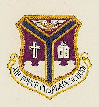
From Wikimedia Commons the Arms of the USAF Chaplains School:
http://upload.wikimedia.org/wikipedia/commons/2/2a/USAF_Chaplain_School_seal_Hebrew_letters.jpg
Shown are the insignia of Christian and Jewish Chaplains.
Marcus K;90113 wrote:
From Wikimedia Commons the Arms of the USAF Chaplains School:
Marcus,
I believe this is obsolete (and think the color of the field is wrong as well, although I’m less certain about that).
This institution is now the Air Force Chaplain Corps College:
Someone (H. L. Mencken? Mark Twain?) once wrote that the progression of U.S. Presidents from Washington to Grant disproved Darwin’s theory of natural selection. The same seems to be true of USAF heraldry.
Well the Wikimedia Commons source mentioned that the Picture was a scan from a 1987 USAF Chaplain School professional education graduation certificate. But I guess that the colours could be wrong anyway, but I dosen’t see why it should be on an official document.
I agree with you Joseph, that the new Arms are an example of bad Heraldry.
Marcus K;90125 wrote:
Well the Wikimedia Commons source mentioned that the Picture was a scan from a 1987 USAF Chaplain School professional education graduation certificate. But I guess that the colours could be wrong anyway, but I dosen’t see why it should be on an official document.
It’s the purplish-red (murrey? sanguine?) field that looks wrong to me. Many dark blue dyes fade to this kind of purplish color over time, although I can’t explain why the pallium didn’t do the same thing. I’d have to find an old Chaplains School coat of arms to know for sure.
?? There’s a special school for old chaplains??—Our tax dollars at work!
Agree that the new COA is a loser; but the old one, while considerably better and most appropriate in earlier times, is fatally out of date in specifically including the emblems of two religions and by implication excluding all others.
Joseph McMillan;90127 wrote:
It’s the purplish-red (murrey? sanguine?) field that looks wrong to me. Many dark blue dyes fade to this kind of purplish color over time, although I can’t explain why the pallium didn’t do the same thing. I’d have to find an old Chaplains School coat of arms to know for sure.
Ok, I see your point. Hopfully your search will give the answer of the Colour of the Field.
Michael F. McCartney;90139 wrote:
?? There’s a special school for old chaplains??—Our tax dollars at work!
Agree that the new COA is a loser; but the old one, while considerably better and most appropriate in earlier times, is fatally out of date in specifically including the emblems of two religions and by implication excluding all others.
Yes the USAF (and other US Armed Services) has since gained Chaplains of other Faiths so the Old design was outdated. But they should been able to come up with something more heraldicly pleasing.
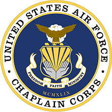
The USAF Chaplain Corps arms are much better:
although I don’t care for the two shades of blue (everyone knows my dislike of bleu celeste, I think).
The USN Chaplain Corps device is, I think, more creative:
http://www.specialforces.com/image/data/A0/A02963-large1.jpg
The compass rose strikes me as an apt way of symbolizing guidance in a nautical profession. This replaces an earlier emblem with the anchor between a Latin cross and the tablets of Moses, which was followed by one that put the anchor and compass rose behind a blue shield with a Latin cross, tablets, and increscent, all gold.
And the arms of the U.S. Army Chaplain Corps:
http://www.calguard.ca.gov/RRB/OR/PublishingImages/Army Chaplain Corps Crest.jpg
In Christian iconography, the dove descending is a clear allusion to the Holy Ghost, but I suppose with the olive branch and no halo it can merely signify peace.
The Army version is usefully ambiguous—suggestive in different ways to different faith traditions but not so specific as to visibly exclude anyone.
Artistically and symbolically (IMO anyway—I don’t mind a little bleu celeste) the USAF Chaplains Corp arms appeal to me the best of the lot.
Do we know if they are a TIOH design?