My friend Ryan Richard Werner (of Florida) wants to assume arms. He gave me this graphic which he created and asked me to critique it.
[ATTACH]1144[/ATTACH]
I told him there was a problem or two with this but that I would rustle up some recommendations for him that he might be interested in considering. I explained to him the tincture rule so he now knows the atom sable is currently breaking that rule.
His design rational he gave thus far is that the field party azure and vert represents the qualities of truth, loyalty (azure) and hope (vert).
the chief nebuly is tinctured argent for peace, I’m not quite sure if he’s alluding to clouds because they are peaceful?
The atom represents his reverence of science.
I queried him on the priority of the traits and ideas he wanted to symbolize (in case we needed to pair down some of the design elements) and he said in order:
<ol class=“bbcode_list”>
<li>science</li>
<li>truth</li>
<li>hope</li>
<li>peace</li>
</ol>
My first idea is to remove the chief and make the palar division line nebuly, and then change the atom’s tincture to argent. My only question, is an atom the best charge to symbolize science with… are there other options?
I guess if you wanted to keep it as true to the original as possible, you could go with something like:
Per fess nebuly, 1: Argent an atom Sable 2: per pale Azure and Vert
I’m sure the blazon is off on that, but you get the idea.
There are many areas of science. Does he have a particular interest which drove him to the atom?
Could be we could find something a bit more traditional representing someone or something connected with a particular field of study?
If this is an idea that he came up with on his own and it resonates with him, change the atom to gold and be done with it. I’m not a fan of using modern symbols like atoms, but there isn’t anything inherently wrong with it. The rest is just improving the artwork.
Kenneth Mansfield;95547 wrote:
If this is an idea that he came up with on his own and it resonates with him, change the atom to gold and be done with it.
Atom, resonate. Good one!
I’m wondering if a single tincture, Azure, for the field and the atom Or would be a better display. However I see a potential problem with the design looking corporate and impersonal. I’m wondering Mr. Werner has conducted any family research. According to Rietstap’s Armorial Général there are 18 coats of arms accredited to this family name.
Ljubodrag Grugic has written an article on a similar badge design.
Jeffrey Boyd Garrison;95540 wrote:
My first idea is to remove the chief and make the palar division line nebuly, and then change the atom’s tincture to argent. My only question, is an atom the best charge to symbolize science with… are there other options?
I second the above and also agree with Richard’s comment about it having a bit of a corporate/impersonal feel to it.
With science having such a broad definition and the atom playing so many roles in different fields, I feel that it steps away from being about the individual and more about science in general. Adding a charge to the atom would help personalize the design.
(Edit) The atom has 4 electrons making it carbon, silicon, germanium, tin or lead—is that relevant or just part of the design?
I’m with Ken & Joe—make the atom gold (or silver) and call it good—or at least good enough.
RE: per pale (or per fess) nebuly—IMO this would be nice if the two parts of the field were metal and color and there were two atoms counterchanged. A varied partition line loses visual clarity if both sides are metal or both sides color, though this can be mitigated to some degree by fimbration. Thats’s why IMO the chief nebuly "works" here—since it’s Argent it contrasts nicely with the other colors and is visually clean.
But whatever the field colors, with or without fimbration, laying the one atom [or whatever charge other than a simple fess or bend] over the partition line muddies the image and loses visual clarity.
My opinions of course, others may visualize it differently.
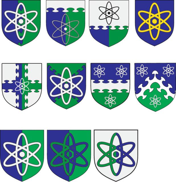
MsPaint strikes again…
[ATTACH]1145[/ATTACH] [ATTACH]1146[/ATTACH] [ATTACH]1147[/ATTACH] [ATTACH]1148[/ATTACH]
Richard, thanks for posting that link! (http://www.ljubodraggrujic.com/Gallery/Badges/Kozas.htm)
I have another link to a TIOH coa for 10th Ordance batt. which might support one way to emblazon such a charge: http://www.tioh.hqda.pentagon.mil/Heraldry/ArmyDUISSICOA/ArmyHeraldryUnit.aspx?u=4005
Anyhow, I wish I had better drafts to throw up, but hopefully you folks get the idea. Looking at them, I really like all your solutions (except my own for reasons Mike was able to visualize beforehand). I especially like Richard’s coat… while his reservations of this appearing as a logo are sound, I like its simplicity more than i dislike the logo-ishness.
Finally, to answer Kathy’s question, I queried Ryan about various symbols and he had thought maybe a beaker would work but then changed his mind. He feels the atom really is the best symbol for the universal pursuit of knowledge using rational thought and scientific method and all that other hoo-ha I myself failed to absorb in school. I was unable to come up with a more apt symbol myself (and to Kevin, the number of electrons and type of atom probably don’t matter so I guess would leave it out of the blazon).
Anyone step up with some drafts to best my mad MsPaint skills? Any further ideas?
I updated your MS Paint and added a few ideas of my own.
Personally, I like the Per saltire nebulee Azure and Vert. From a design standpoint it feels the most dynamic with the atom, especially with the points of the saltire at the center of the atom. Second to that would be per pale.
http://i18.photobucket.com/albums/b146/Snydercrew/Untitled-1-1.jpg
Welll done Michael. Some interesting designs there.
Wow Michael, thanks for rendering those up! If you don’t mind, I’m going to email the graphic to Ryan so he can see these ideas better. ![]()
I dont mind at all. ![]() Happy I could help. Im curious to see how this all turns out.
Happy I could help. Im curious to see how this all turns out.
Unless "nebulee" is important, the gold atom on blue is very striking—but also likely to duplicate something already in use by others, at least as a logo.
The atom parted green & blue on a white field is IMO also quite nice, and more likely unique. As is the white atom on a parted field, but to me a bit less visually striking—but that’s just me, and it’s nearly a photo-finish.
The two that really stand out to me are the Argent, on a cross nebuly per pale Azure and Vert an atom Argent although the atom is a little small. But I do like to overall look of the design.
And Argent an atom per pale Vert and Azure