Ok I have been thinking about this for a while and I have some time to work on it.
I am wanting to make a COA for The TVSS. We are located in Huntsville Alabama but have members all over the state as well as parts of southern Tennessee.
I would like to hear some objective and from outside our group ideas for this project.
What is it? TVSS = Tennessee Valley Scottish Society?
Yes sorry I should have made that clear in the post as well as the title.
Nothing particularly original, but nothing that would immediately raise Lyon’s mane (like for example a double tressure would).
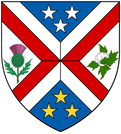
Azure on a saltire cantoned by three stars in chief and flanks Argent an iris Purpure all within a bordure (open in chief) of the second.
Saltire = Scotland
Three stars off the state flag
State flower
Bordure = the Tennessee Valley (if you get the shield shape right)
James
Or a saltire cotised flory outwards Gules surmounted by on a bar wavy Azure a barrulet wavy Argent.
Saltire cotised flory = state flag + royal arms of Scotland.
Bar/barrulet = Tennesee River + colors of the flag of St. Andrew.
James,
The geographical name can be misleading; as Harold’s describing it, this society draws its members mainly although not exclusively from Alabama (more of the length of the Tennessee River is actually in Alabama than in Tennessee).
So some way needs to be found to include both states in the symbolism—hence David’s suggestion of the saltire Gules for Alabama.
It seems to me, though, that cotising a saltire would be a little busy.
How about Or a saltire Gules cantoned by two thistles and two irises all Purpure slipped Vert?
Other possibilities would be a heart or hearts for Alabama (popular symbol from the nickname "Heart of Dixie"), hickory leaf or leaves for Tennessee.
Unfortunately, Alabama’s state flower (camellia) doesn’t lend itself to heraldic applications very effectively.
Per fess Azure and Argent a saltire per fess Argent and Gules between in chief three stars 2 and 1 Argent and in base a thistle proper.
Kenneth, I like this idea. Is there something that could be put in the other spaces of the cross? They seem a little dead to me.
Per saltire Argent and barry wavy Argent and Azure a Saltire Gules between in chief on a hurt three mullets Argent and in base a thistle Proper?
Per fess wavy Azure and Argent a saltire per fess Argent and Gules between in chief three stars 2 and 1 Argent and in base a thistle proper?
This would allude to the flowing Tennessee River and provide a little "life"on the sides of the saltire without adding additional charges…
All of these are sounding like good ideas. I will just have to mock them up and see which really works well.
"Too many notes, Herr Mozart."
Details please. These have meaning behind the parts as well I have found if you go too simple you run into the "already taken problem".
Here is what it would look like in banner form.
http://farm8.staticflickr.com/7284/8779643042_87daa2c336_o.png
harold cannon;98942 wrote:
Details please. These have meaning behind the parts as well I have found if you go too simple you run into the "already taken problem".
I understand that they have meaning. I’m sure you could put in even more stuff to add more meaning. I find the design an eyesore—it hurts my eyes.
It’s hard to believe that any of the designs suggested earlier in the thread duplicates existing arms. The idea that everything simple is already taken is simply not true.
Simple designs run a higher risk of being already used just as everyone thought David Pope’s arms were good to go, only to find out that they were too similar to another set of arms for his taste. You should have three points of difference from another set of arms to truly set them apart. This provides a good buffer. Also something to remember is that since heraldry is a world wide art there is more of a chance than you think of the arms being already used.
Now please only constructive suggestions on changes that would make them better, instead of comments that can seem harsh and non-educational in typed format.