http://img10.imageshack.us/img10/2104/xefy.jpg
Well done! Any thought as to a crest and a motto?
As far as badges are concerned, I have just the one as shown in my avatar (which is completely district from my arms), and I don’t see the benefit/need to assume more than one. Perhaps someone here who has more than one badge could highlight the rationale there.
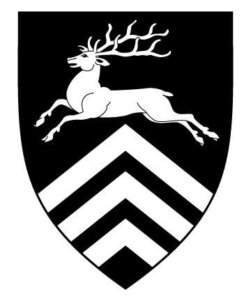
Well, I guess I’ll be the one to cast a shadow.
I’m really disappointed that such a great opportunity for a canting coat of arms was lost because I showed the reverse of an image in illustrating how to set it up for etching. Not to take away from the good design, which it is, but the black hart was a really nice allusion and if it was presented as such to the family, I can’t comprehend why they’d have passed on that opportunity.
I mean if the surname were Whitard, sure. Oh, well.
steven harris;100586 wrote:
As far as badges are concerned, I have just the one as shown in my avatar (which is completely district from my arms), and I don’t see the benefit/need to assume more than one.
I wouldn’t go out of my way to recommend acquiring ANY badges, let alone more than one… unless there were a use. ![]()
Under normal circumstances, the crest serves well enough as a badge in a pinch. So too does an escutcheon of one’s arms on a field of some variation of the liveries do for a badge without having to create one.
Still, the option is always there and there’s no good reason not to if one has a desire for one or more… in the same way a corporation can trademark as many logos as it wishes? We don’t necessarily know the rationale beyond the most unimpeachable raison d’etre, but it still stands: "because we can." :cool:
Kenneth Mansfield;100587 wrote:
Well, I guess I’ll be the one to cast a shadow.
I’m really disappointed that such a great opportunity for a canting coat of arms was lost because I showed the reverse of an image in illustrating how to set it up for etching. Not to take away from the good design, which it is, but the black hart was a really nice allusion and if it was presented as such to the family, I can’t comprehend why they’d have passed on that opportunity.
I mean if the surname were Whitard, sure. Oh, well.
I agree.
Kenneth Mansfield;100587 wrote:
Well, I guess I’ll be the one to cast a shadow.
I’m really disappointed that such a great opportunity for a canting coat of arms was lost because I showed the reverse of an image in illustrating how to set it up for etching. Not to take away from the good design, which it is, but the black hart was a really nice allusion and if it was presented as such to the family, I can’t comprehend why they’d have passed on that opportunity.
I mean if the surname were Whitard, sure. Oh, well.
That’s why I was asking if it was the white stag over black or black stag over white.
It’s a fantastic design overall so ultimately you can’t go wrong, but having a canting set of arms would be very nice.
Not that it matters, but I also prefer the black stag on white due to the canting. That, and that no one will mistake you for Richard II…:)
For the crest, perhaps a hart’s head erased sable? I think it always looks nice when a motif from the arms is repeated in the crest.
David Pope;100591 wrote:
Not that it matters, but I also prefer the black stag on white due to the canting. That, and that no one will mistake you for Richard II…:)
Kenneth Mansfield;100587 wrote:
Well, I guess I’ll be the one to cast a shadow.
I’m really disappointed that such a great opportunity for a canting coat of arms was lost because I showed the reverse of an image in illustrating how to set it up for etching. Not to take away from the good design, which it is, but the black hart was a really nice allusion and if it was presented as such to the family, I can’t comprehend why they’d have passed on that opportunity.
I mean if the surname were Whitard, sure. Oh, well.
You know what, you have a good point there… Therefore, I explained and showed the other to the family and ironically talking about it for a few minute’s, they like the white background with a black hart. All around great point that everyone have been talking about. The glass is still half full I feel. ![]()
David Pope;100591 wrote:
For the crest, perhaps a hart’s head erased sable? I think it always looks nice when a motif from the arms is repeated in the crest.
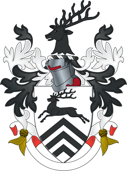
Is there a way that you can show me…i’m a visual person….sorry. ![]()
David Pope;100591 wrote:
For the crest, perhaps a hart’s head erased sable? I think it always looks nice when a motif from the arms is repeated in the crest.
Robert Blackard;100594 wrote:
Is there a way that you can show me…i’m a visual person….sorry.
</div>
Robert Blackard;100594 wrote:
Is there a way that you can show me…i’m a visual person….sorry.
Kenneth Mansfield;100597 wrote:
<div class=“bbcode_center” >
http://img9.imageshack.us/img9/4909/h6qp.png
</div>
-Throwing money at the screen!- :shock:
So what program do you use to make these renditions?
I believe Matthew Smith uses some CAD software (marketed mostly to architect types I think). I draw mine in Adobe Illustrator. Others here opt for the free Inkscape (an Open Source vector drawing program).
Kenneth Mansfield;100597 wrote:
<div class=“bbcode_center” >
http://img9.imageshack.us/img9/4909/h6qp.png
</div>
As usualy, Kenneth’s artwork is amazing! That said, I think that the crest should be connected to the torse in some manner. Thinking historically, we’d have Sir Robert de Blackard entering the lists with his crest magically floating a few inches above his helm??