For a while now I have wanted to compose a post which traced the origin and evolution of my personal coat of arms. I had some free time this past weekend so I began to put it together. The artwork displayed in this post is rough and mostly drawn freehand so excuse the lack of refinement, please. I have not concerned myself with the overall achievement. At first I bore a crest on a torse with no helm or mantling. Later I used just a shield and motto. Later still I eventually adopted the priest’s galero after my ordination. This post deals with the design on the shield.
When I was 19 years old and my interest in heraldry was just beginning to turn from a passing fancy to an earnest pursuit I did what I think most people like us do: I designed a coat of arms for myself. It was amateurish, clumsy, not very attractive as I look at it now and too busy. I made the mistake everyone does. I tried to create a pictorial curriculum vitae. As I look back on it now I’m really rather embarrassed by it but back then I thought it was nifty
http://img42.imageshack.us/img42/2027/snapshot20110515143647.png
1983-1986
MOTTO: "Fiat"
Hideous, isn’t it? I blazoned it as:
"Argent, in base two barrulets wavy Azure, issuing therefrom on a mound Vert a fir tree Proper between two trefoils Vert; on a chief Argent on a pale Murrey a cross of Canterbury Or between to dexter the masks of Comedy & Tragedy and to sinister the Franciscan Tau all Gules."
Here’s the (lame) rationale:
The tree is a reference to the name "Selvester" (originally Silvestri) which means woodsman or forest dweller. That is on my Italian side. The trefoils or shamrocks paid homage to the Irish side. All this is set above the depiction of an island because I was born on Long Island, NY. I prefer silver to gold so the field is Argent. The chief tries to approximate my school colors which were white and maroon, hence the murrey and argent. I was interested and active in school drama. I was then a member of the Secular Franciscan Order (what used to be called Third Order Franciscans) which is a group of lay affiliates to the Franciscans. My University was run by Franciscans. The cross in the center was there simply as a mark of my Christian faith. I don’t know why I chose a Canterbury cross. I suppose I just liked it.
The motto is the first word of Mary’s response to the archangel Gabriel in the gospel of Luke (Fiat Volutuas Tua) meaning, "Let It Be".
After I graduated from University I entered the novitiate of the Order of St. Benedict at St. Vincent in Pennsylvania. I then modified the arms to:
http://img40.imageshack.us/img40/6136/snapshot20110515143658.png
1986-1987
MOTTO: "Fiat"
I blazoned this as:
"Argent, in base three barrulets wavy Azure, issuing therefrom on a mound Sable a fir tree Vert between two trefoils Vert; on a chief Argent on a pale Gules a cross Or between to dexter the masks of Comedy & Tragedy in bend and to sinister issuing from a trimound a patriarchal cross all Gules."
I had read a bit more and decided I needed to clean this design up. (I should have thrown in out!). The school colors I loved so much were most often depicted as red and white so I abandoned Murrey in favor of using all red. By entering a religious order (the Benedictines) I gave up my place in the Franciscan group so I used the principal charge from the arms of the Order of St. Benedict. I also decided the dramatic masks looked too slapdash so I placed them "in bend" as I thought this was "more heraldic". I can’t recall why I decided the island should be black but I do recall wanting the tree to be all one color instead of looking like a landscape. So, perhaps I thought an all-green tree on a green mound was too much. Anyway, it’s still far too busy and trying to "do too much" on one shield.
I did, however, make an attempt to have the charges be less anemic and to fill up the field better.
As I learned more and more about heraldry and had the chance to see much more in the way of good composition and design I was very interested in simplifying my own arms. So the first major change came in this form:
http://img820.imageshack.us/img820/6434/snapshot20110515143711.png
1987-1988
MOTTO: "Ad Maiorem Natus Sum"
This is blazoned as:
"Argent in base two barrulets wavy Azure issuing therefrom on a mound Vert a fir tree Vert, the trunk Sable; overall on a fess Sable three plates those to dexter and sinister charged with a trefoil Vert and the one in the center charged with a cross patee Gules."
Here I went for a simplified design while retaining some of the basic elements. I was still tied to the single tree, the island, the field Argent and including the shamrocks. However, the only other reference now is to my membership in the Benedictine Order. For this I borrowed from the arms of the abbey to which I belonged. St. Vincent’s coat of arms includes a reversed chevron (forming the letter "V") with three plates charged with black crosses. This was taken from the arms of William Penn which has a sable fess charged with three plates. So I returned to the fess and charged with plates with my symbols including a cross patee which is often used in "benedictine" heraldry.
The motto, suggested by my Novice Master means "For Greater Things I Was Born" and is not as conceited as it sounds. It is a quote from Tertullian referring to the call of a Christian to cast off his old sinful self.
But things were about to change drastically…
SEE PART II
EVOLUTION: Part Two
http://img215.imageshack.us/img215/4517/snapshot20110515143725.png
1988-1991
MOTTO: "Ad Maiorem Natus Sum"
Blazon: "Or a fir tree eradicated Vert between in chief two patriarchal crosses Gules."
The reason for the change is simple. At this point I came under the tutelage of the late Dr. Geza Grosschmid. He was a friend and collaborator of Bruno Heim and he basically taught me a great deal of what I know. I remained a sort of apprentice to him until his untimely death in 1993. We began our "lessons" at my own request by redesigning my own arms. His suggestion was to abandon the Argent field as too sterile and cold. This was a good lesson for me: what works best for the design is paramount regardless of what "I like". He also liked the fir tree but told me to ditch the island. That was fine because by then it had been quite a while since I had left Long Island. His motivation was to cut down the number of colors used to three at most. He wanted me to bear just the tree eradicated (a nice way of alluding to my family "roots"). I insisted on something to represent the Benedictines. So we compromised and I returned to the cross from the Order’s arms and he suggested Gules for no better reason than it was a good color combination and, as he said, "every coat of arms should have something red in it". Not an opinion he could back up very well but a rule of thumb I still follow whenever I can. At this point I also learned something else: the use of color as part of the allusions in a coat of arms. The tree represented my Italian side. What about the Irish? The use of green and gold, colors associated with Ireland, became sufficient.
I probably would have kept these arms for the rest of my life except in 1991 I decided to leave monastic life to pursue the diocesan (or secular) priesthood. So, I no longer wanted the crosses from the arms of the Benedictines. I changed my arms to:
http://img215.imageshack.us/img215/5259/snapshot20110515143734.png
1991-1993
MOTTO: "Ad Maiorem Natus Sum"
Blazon: "Or a fir tree eradicated Vert between in chief two crosses fleury Gules."
Here the design I developed with Dr. Grosschmid is retained and I’ve simply changed the crosses. I liked these crosses because they allude to a) the faith b) the Virgin Mary (often symbolized with a fleur-de-lis) and the Trinity (again symbolized by a fleur-de-lis). I love it when one charge signifies many things. I also tried to draw the roots a bit smaller without them looking like a Christmas tree stand. So this is what I settled on. Sometimes, I look back and regret moving away from the version with the double-barred crosses. That same cross also is a symbol of St. Sylvester so they could have continued to serve me well after my departure from the Benedictines. But, if I had not changed to the crosses fleury then I doubt very much I ever would have made the next major change which turned out to be the final one.
I was sitting in my apartment one day looking up at the coat of arms which I had framed on the wall. For some reason I just wasn’t happy with it. I had been doing some more reading and I had heard about some innovative division lines being employed in places like Finland and Canada. In addition, I wanted to give the cross a central place in the design. I also wanted to find a way to depict a true forest instead of simply one tree.
Then it hit me to use the line sapiné and make the cross the one large charge. I toyed with the idea of a field Vert with a chief Or (to make the green trees stick up into a golden "sky") but I also kind of liked the unlikely juxtaposition of the green being the "reversed" trees while the ones pointing upwards were gold. Plus, this enabled me to keep the cross in red which I really thought was a warmer, better composition overall. So, I ended up with:
http://img713.imageshack.us/img713/6537/snapshot20110515143747.png
1993-present
MOTTO: "Guide Me Lord"
Blazon: "Or a Greek cross fleury Gules; a chief sapiné Vert."
I really liked this last modification. Unfortunately, Dr. Grosschmid passed away before he got to see it. I also changed the motto to "Guide Me Lord" because I got tired of explaining the seemingly conceited other one and I liked that the word "Guide" is what my given name "Guy" means. I should point out here that this had not been a factor before since in the monastic life I had stopped using the name Guy and adopted a monastic name. Now that I was back to using my given name I thought the little pun in the motto was a nice idea. Plus, I like the sentiment it expresses.
Now I had arms I could be proud of. Its a simple, striking, unique design. Its good heraldry and it has all the allusions and symbolism I like: family, ethnicity, faith. I was able to sit with this design for almost four more years before ordination so by the time that came I was sure I liked it and was not interested in changing it any further. So, in 1997 I assumed these arms upon my ordination to the priesthood. As I looked back over these designs while I was creating the sketches for these posts it seems hard to believe that I ended up with what I have now when you look at where I started. The tree and the cross have remained a part of these designs all the way through the process but the changes have always reflected refinement born out of increased knowledge. The more I learned the more the design had to change.
I share this with all of you partly because I am always interested to see how a design evolves. I hope some of you find this evolution interesting and, perhaps, informative. I also hope that it serves to encourage those just beginning this process to be open to changes and to live with an evolving design for a while before settling on anything final. It took me ten years to get through this process. Hopefully, it won’t be such an odyssey for all of you but taking your time is always a good idea.
Excellent post!
Very interesting, Father Guy. Thanks for the insights.
Thanks, very informative and instructive. Glad you settled on the arms you have now. They’re lovely.
Thanks all. I forgot to mention one other thing I learned during this process. The more I refined and streamlined the design, that is to say the better and more heraldically correct the design got the shorter the blazon got. That may be a good thing to keep in mind when designing new arms. If the blazon winds up being really long then maybe the design needs some more tweaking.
interesting
Besides the lucky charms incorporated into the first few examples you have been very consistent with many of the elements. The classical theater masks were an amusing inclusion into your first two designs. Thank you for posting this unusual armorial history. Your present arms are by far the best of the designs.
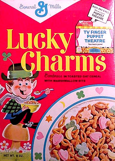
will someone explain to me what "lucky charms" means in this context? i’ve read every so often in the two pluse years i’ve been here, but frankly i do not understand the intent. thank you.
Trefoils, i.e. shamrocks also have the appearance of clover which (in their four-leafed variety) are carried by people as good luck charms. In addition, shamrocks often make up one of the charms carried on a charm bracelet. Finally, I suppose there’s no way around the reference to the breakfast cereal of the same name with its leprechaun mascot that has among the lucky charm marshmallows a shamrock. It is a perfectly good heraldic symbol as a badge representing St. Patrick. It even makes up part of the compartment of the royal arms of Elizabeth II. Nevertheless, some like to refer to it by its more pedestrian associations.
I always understood "Lucky Charms" to be a slightly derogatory term meaning a variety of shapes and/or colors thrown together that those of us who don’t have an extensive background in heraldry tend to put together in our first attempts at creating arms.
The allusion seems to be to pink hearts, yellow moons, orange stars, green clovers, blue diamonds, purple horseshoes and red balloons (yes, I had to look all those up) from the Lucky Charms cereal dumped from a box onto a shield in an effort to create what a "pictorial C.V.". The result is many small charges of differing colors forced into a design. A tree, an island, shamrocks, comedy and tragedy and two different crosses, with five colors (or more, depending on how you count) between them is what I think David was getting at.
hmm. ok. i will side with the good Father in that the trefoil is a perfectly good heraldic charge either as a badge, or in arms, etc.
thanks to your two posts i can see now what david means, as there was a combinaiton of all sorts of symbols to make up a pictorial statement.
i was just thinking the cereal and i could not understand what the cereal had to do with this all. ok…so i am slow on some things. ![]()
Fr. Guy,
Thank you very much for being brave enough to share with us your early iterations of what eventually became a beautiful coat of arms. Looking at past attempts of armorial creation is akin to going back and reading one’s undergraduate term papers—you sort of wince in pain and wonder, "how did I ever get a passing grade on this!
Anent Lucky Charms .... they’re "magically delicious!"
Father Guy,
Thank you for sharing your "heraldic history" with all of us. It is reassuring to me because I progressed through a similar number of versions, although none depicted as well as yours!
It does function as a sort of primer for those new to armory - and I agree with your praise of short and succinct blazons.
What a beautiful way to illustrate the intimate relationship between one’s self and one’s arms!
Joseph
Very cool post, Fr. Guy. You all should have seen the arms I "designed" for myself. They were what I’d like to call delusions of grandeur (ermine mantle, lion supporters, royal crown, even an order I made up). I was suffering from Hutt River-itis at the time, though. :p Though that was when I was only around 13…..:D
Cheers,