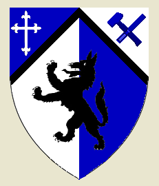
Alright so apparently my first draft was to in depth and detailed, and had to many things going on. So in this one I tried to cut back considerably. The only part on this one I question is the carpenter tools (a hammer and wood chissel) in the upper right hand corner. Doesn’t look quite right, but I’m kind of stuck with that.
http://i103.photobucket.com/albums/m144/KenrakenOkwaho/WolfCoat.png
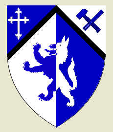
There’s also this one…but I’m not sure if I like that better or not.
http://i103.photobucket.com/albums/m144/KenrakenOkwaho/WolfCoat4.png
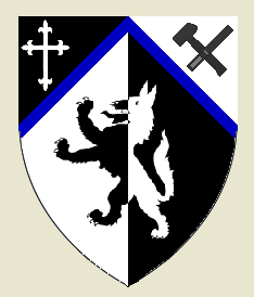
And this one I like the look of the wolf divided better…but it’s starting to get away from my color theme.
http://i103.photobucket.com/albums/m144/KenrakenOkwaho/WolfCoat3.png
Alright, now to explain the meaning behind this.
The cross in the upper left corner is a symbol for my Christian faith, and it it done in almost a fleur-de-lys style as a symbol to my french heritage. The carpentry tools in the upper right corner stand for the meaning of my last name, which means "Carpenter". The wolf symbolizes my belief in a strong family, loyalty to one partner, persistance, as well as my love for nature.
So, what’s your opinion? Try to not get to detailed so this topic doesn’t get locked too. If you want to give me further advice (which you’re more than welcome to do) just PM me. Thanks
God Bless,
Josh
The sable wolf is a violation of the color on color rule. It would need to be divided argent/azure, not argent sable.
Even tho this is toned down, it’s still a complicated blazon. Try not to capture too many things all at the same time. Arms take a good deal of time to design and they shouldn’t be rushed.
Search the forums for the history behind Fr. Guy’s arms. If I recall correctly, it was well over 10 years before he settled on a final design.
I also recommend picking up a few books on the subject so you can get a feel for heraldry as a whole. Slater is a particularly good start for a beginner.
I question how much that is even a rule anymore. That rule is violated almost all the time. Just saying. I have it changed in the other two.
Josh, in terms of rules like no color on color, it is certainly the case that they are violated, but to what end? Designing a coat of arms is like writing haiku: A combination of words may succeed as poetry in some sense, but without the right number of syllables, you don’t have haiku. Likewise, for a heraldic design to succeed on heraldry’s own terms (rather than on larger aesthetic terms, which may be perfectly valid but are not necessarily relevant), it has to follow the rules.
One thing that strikes me about the drafts you’ve presented is that they are indeed handsome, but they seem to participate in the genre of unit patches in the army—an offshoot of heraldry—rather than the living tradition of heraldry itself. Do unit patches happen to be in your mind’s eye when you’re working through the design? If so, it might be worthwhile to think more in terms of actual painted shields on the medieval field of battle.
That guidance worked for me.
Andrew J Vidal;51852 wrote:
The sable wolf is a violation of the color on color rule. It would need to be divided argent/azure, not argent sable.
I don’t see the tincture violation. Would you please clue me in?
Fred White;51857 wrote:
Josh, in terms of rules like no color on color, it is certainly the case that they are violated, but to what end? Designing a coat of arms is like writing haiku: A combination of words may succeed as poetry in some sense, but without the right number of syllables, you don’t have haiku. Likewise, for a heraldic design to succeed on heraldry’s own terms (rather than on larger aesthetic terms, which may be perfectly valid but are not necessarily relevant), it has to follow the rules.
One thing that strikes me about the drafts you’ve presented is that they are indeed handsome, but they seem to participate in the genre of unit patches in the army—an offshoot of heraldry—rather than the living tradition of heraldry itself. Do unit patches happen to be in your mind’s eye when you’re working through the design? If so, it might be worthwhile to think more in terms of actual painted shields on the medieval field of battle.
That guidance worked for me.
I know the first one is a violation, but are the next two violations to the color on color rule?
Painted shields? Sorry to be ignorant but what exactly do you mean? Could you give me one or two visual examples?
Daniel C. Boyer;51858 wrote:
I don’t see the tincture violation. Would you please clue me in?
I think he’s talking about the first version with the black wolf on the blue tincture.
Sable wolf on an Azure field.
And yes Josh the tincture violation rules are very much still in effect. They have been for the better part of the last 700 years and only a small number of arms were ever "granted" that were clear violations (Arms of Jeruselum for example).
Andrew J Vidal;51862 wrote:
Sable wolf on an Azure field.
And yes Josh the tincture violation rules are very much still in effect. They have been for the better part of the last 700 years and only a small number of arms were ever "granted" that were clear violations (Arms of Jeruselum for example).
And, aren’t the second two drafts that I presented not in violation of that rule?
Hi Joshua.
IMHO if you are trying to follow a Polish tradition as much as possible, as well as the important elements for a carpenter and the wolf and the cross, why not keep it to two colors (Azure and Argent) and use the wolf, the cross, and a fess the base of which is indented to mimic a saw and still stay true to good heraldic form?
As an example…
Blazon
Arms: Azure, on a fess the base indented between two wolves passant Argent, a cross fleury Azure.
Crest: A demi-wolf rampant Sable, holding between his paws a hammer Argent.
This way you have only two colors (one metal, one tincture) on the shield and still have a ref to a carpenter as well as the cross and then with the black for the wolf in the crest would satisfy your desire for black and throwing the hammer in there again alludes to carpenter.
Plus, if you make the mantling split of Sable and Azure and lined with Argent, you will ahve that color combination without ever coming close to a violation of color-color/metal-metal rule.
The fess Argent indented on its base looks like the teeth of a saw and does not clutter the overall design up with too many charges.
Always remember K.I.S.S. (keep it simple stupid) - not that you are stupid…that’s just the saying. I try my best to hold to K.I.S.S. when designing arms for a new client and it has always served me and the client well. Two colors and less commotion on the field can do this and with the example blazon above you can still hit all the elements that are important to you without looking, as they tend to call it around here, lucky-charms-like. But, it doesn’t have to be the example blazon above, as this is just an example.
AILD;51863 wrote:
And, aren’t the second two drafts that I presented not in violation of that rule?
A coloured charge on a parted field is not a violation of the rule of tincture.
"The exceptions to the rule of tincture are charges tinctured "proper" (their natural colours), parts of plants and animals (if different from the main tincture of the plant or animal), party-coloured (of a metal and colour) charges on a metal or coloured field, and likewise single tinctured charges on a party-coloured (or divided) field. "
Of course, there are exceptions to the exceptions, (i.e., these are basically annoying UK exceptions and in saner corners of the world people have more sense).
http://www.houghtonkeep.com/heraldry/images/sable.jpg
Blazon: Per pale sable and sable, a wolf sable.
And this one:
http://www.sca.org/heraldry/primer/perfessengrailed.gif
Blazon: Per fess engrailed argent and sable, in chief a nude woman rampant argent and in base a nude mermaid rampant sable. Oooh la la. 8-)
Michael Swanson;51874 wrote:
Of course, there are exceptions to the exceptions, (i.e., these are basically annoying UK exceptions and in saner corners of the world people have more sense).
Blazon: Per pale sable and sable, a wolf counterchanged.
And this one:
Blazon: Per fess engrailed argent and sable, in chief a nude woman rampant argent and in base a nude mermaid rampant sable. Oooh la la.
These are hardly "exceptions to the exceptions". In the first one, per pale sable and sable would hardly be considered a parted field, and in the second one, neither charge is on a parted field (being only on one part of the parted field).
Now, if you had "Per fess Argent and Sable, a topless woman of the first", this would technically not violate the tincture rule, but all you’d see would be a white pair of legs (and the clothes they are in).
And I don’t think a woman can be rampant. (ETA: And a gentleman would never suggest the term "displayed".)
Madalch;51875 wrote:
Now, if you had "Per fess Argent and Sable, a topless woman of the first", this would technically not violate the tincture rule, but all you’d see would be a white pair of legs (and the clothes they are in).
Thanks for proving my point. So I would include Canada in my ‘less sane’ list.
Madalch;51875 wrote:
And I don’t think a woman can be rampant.
Well…
Josh,
While this attempt is a much better version than your previous one, It still could use some work. Hopefully your membership goes through soon and we can work on design a little more in the member’s area Design thread.
If you are going to try for the Polish style (and I would recommend it) it’s entirely possible you’ll have/want to put some of the symbols in your Crest.
I do not find any of your offerings here to be attractive, certanly not more attractive then your heraldic avatar. Why are you dropping the reference to the Porsche arms/logo?
I am certain that George Lucki could assist you in designing Polish style arms which incorporate the horse rampant
Darren is correct. A charge placed on a parted field as in Per fess Azure and Argent a wolf sable overall. This still leads IMHO to poor contrast and should be avoided. Notheless no foul on that count.
See David Cvet’s Canadian grant as an example.
http://www.heraldry.ca/arms/c/cvet_300h_full.jpg
Now the next issue will likely surprise. In Little Poland and in Austrian Galician and Lodomeria there is no tincture violation by placing Sable on Azure. Sable is ambivalent and can be treated as though a metal or a tincture - as ametal I guess as iron - so if you look at the arms of the 19th century Austrian arms of the Kingdom of Galicia and Lodomeria or Pope John Paul II’s earlier arms as archbishop of Krakow. Boniecki notes this quality of sable in his late 19th century 16 volume armorial "Herbarz Polski". That said it is uncommon in Polish heraldry and whetehr sanctioned or not represents poor contrast.
I like all of the suggestions to simplify designs that remain far too busy for my taste.