werewolves;53332 wrote:
I like this one more than the whole tierce myself.
Kyle=
werewolves;53330 wrote:
I would have to respectfully disagree. I personally don’t find asymmetry in any way visually displeasing, or off-putting. It’s also sure to avoid duplication of a fairly simple design.
Well, I meant "off-putting" in the way that it makes me immediately wonder why it is asymmetrical, not that it bothered me in any way. Somehow having the whole tierce one color seems to add this effect. The revised version with the barrulets or what not in place of the tierce I think looks quite a bit better and more pleasing to the eye. That might be a good way to go, or some other way to "break up" the tierce.
Did someone suggest checky for that?
I have to definitely agree about the uniqueness though—and that is one thing I really LIKE about the tierce!
Kyle=
Thank you all for your comments, direction and ideas. I will attempt to put into graphic form your suggestions and post them up.
werewolves;53332 wrote:
Gotta say, I like this one quite a bit.
I like this one too. A lot better then the tierce. It has more balance and in my mind flow.
werewolves;53332 wrote:
Gotta say, I like this one quite a bit.
As a fellow fan of symmetry, I would suggest making the sinister the mirror image of the dexter, but that’s just me.
I only have a 2 done, but I thought I would post them.
The first one is a suggestion from Fr. Byers - thank you. I believe I got what you were saying ![]()
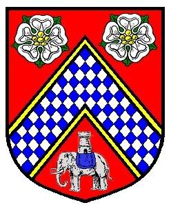
Philip - I am still working on your suggestion. Thank you for the ideas. The chequey inside the chevron is giving me issues on alignment.
Terry;53343 wrote:
Thank you all for your comments, direction and ideas. I will attempt to put into graphic form your suggestions and post them up.
I like this one too. A lot better then the tierce. It has more balance and in my mind flow.
I am still wondering about the blazon here. Maybe:
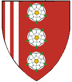
Gules, the dexter tierce charged with two palets Argent, over all three roses in Pale also Argent barbed and seeded proper
Note: I am of course an idiot as I have been blazoning palets as bars the entire day ![]()
Regarding the blazon of the version with two vertical stripes, I would suggest either: Gules three roses in pale Argent barbed and seeded proper and in dexter two pallets Argent, or: Gules three roses in pale Argent barbed and seeded proper a dexter tierce paly of four Gules and Argent.
Linusboarder;53325 wrote:
What about using Chequeflauches?
There, that’s what I really meant (and I like the flauches)
Terry wrote:
Philip - I am still working on your suggestion. Thank you for the ideas. The chequey inside the chevron is giving me issues on alignment.
Terry,
Here’s what I was thinking:
http://i40.photobucket.com/albums/e221/pblanton/Sarros.jpg
Take care,
<div class=“bbcode_center” >
http://omega1.us/personal/new/vert-or.gif
This design for a coat-of-arms is surely a mistake.
http://omega1.us/personal/new/Flaunches.jpg
This is a very fine design but is it a duplication of extant arms? If not then it would look great with the elephant and tower as a crest.
</div>
<div class=“bbcode_center” >
http://i40.photobucket.com/albums/e221/pblanton/Sarros.jpg
Too cluttered! A flamming torch or and open book could be added to these arms and we could start an online community college.
http://www.hectorcito.com/heraldry/Terry1.jpg
An acceptable design. Very Late Tudor in style.
</div>
Here are a few more ideas. Not a big fan of the bordure, but I really like the flaunches….
http://www.hectorcito.com/heraldry/Terry2.jpg
Linusboarder;53392 wrote:
This is what I had in mind:
Technically acceptable but possibly too vibrant for some tastes. I am assuming that the roses are supposed to be blazoned as seeded and barbed Proper.