It has occurred to me that my proposal is rather like the ancient arms of de Clare, Or, three chevronels Gules. Perhaps with the tincture change and with a different name not that strong an objection.
Thanks so much for all the great observations and critiques so far. I guess the easiest additional "difference of line"(is that phrased correctly?) would be to engrail the two chevrons, but I rather like the "counterchanged" design idea that Dohrman (Rev. Byers, Father Byers?, don’t mean to offend) suggested, so here’s some quick scribbles. As an aside, is there a good heraldry software program that will run on my Mac? It would be nice to get some instant gratification when different ideas pop into my head.
With chevrons, which I drew a little too "chunky":
http://farm6.static.flickr.com/5050/5382181822_37ded497c8.jpg
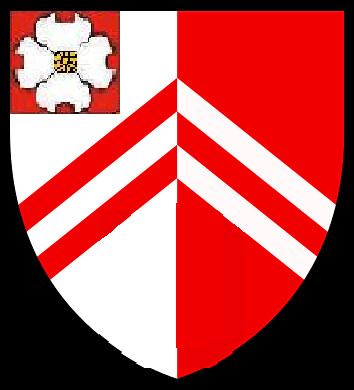
With chevronels, which seem a little less "busy", given the counterchange:
http://farm6.static.flickr.com/5049/5381587617_84c9e866c5.jpg
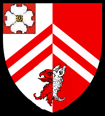
A bit of fun using the counterchanged griffin’s head from the arms of Sir Thomas Pope, although this may be a bit busy:
http://farm6.static.flickr.com/5167/5382181886_2909bd6718.jpg
Joseph McMillan;81260 wrote:
Hello, Cousin David!*
A point to keep in mind as you head down this road is that English heraldic design typically does not follow the Scottish approach of deriving all arms of a given name with the stem arms of that name. The English don’t assume the kind of fictive kinship among all Popes that the Scots would assume among all MacMillans.
In fact, the early 20th century English heraldic scholar Horace Round was blisteringly critical of the kings of arms for their past practice of sometimes granting arms that falsely implied a relationship with some eminent person of the same name, and modern English heralds have occasionally criticized the Scottish principle of "indeterminate cadency."
Just something to think about.
Joe
________
*David and I met at a St. Andrews Society lecture by Lord Lyon here in Alexandria a few months ago, initially brought together by by spotting his MacMillan kilt. We soon discovered that we had a common ancestor in William Pope, who was in Isle of Wight County, Va, by the early 1660s.
Joe, hello to you as well, cousin, and point well taken. So, even under English heraldic traditions I could just "start from scratch" concerning the design of my arms since I can’t show a bloodline connection to any of the Popes previously granted arms? That being said, I’m hard pressed to believe that all of the English Pope grants featuring this general design are as a result of blood relations. Did you stick with the Scottish tradition of starting with the arms of the chief and then differencing from that since your surname is Scottish? I’m a traditionalist at heart, so even though I’m not bound to particular rules as an American, it sort of makes sense to use English heraldic customs if the arms are for an English surname.
Kenneth Mansfield;81263 wrote:
My G-G-G-G-Grandfather George W. Fowler resided in Union County in the mid-1800s. Any Fowlers in that tree?
Kenneth, no Fowlers that I’m related to AFAIK, but there is a large extended family of Fowlers who live near us. I suspect that you’re related to them. Nice folks…
Charles E. Drake;81269 wrote:
David is likely to be a cousin of mine also, as my Drakes were from Isle of Wight and Southampton Counties, Virginia. There were a number of Drake and Pope intermarriages there, although I don’t have a Pope in my ancestry AFAIK.
I like the first design the best, but I think the preference is that there should be at least two "line differences," meaning not just tincture changes. How about three chevronels, instead of two, and keep the red canton with the dogwood?
Charles, no known Drakes in my tree, although three of my families (Pope, Mangum, and Hayes) all were originally in Nansemond/Isle of Wight/ Southampton County VA before moving south and west. I’ve started assembling a small library of genealogical source books for this area of Virginia, so let me know if I can be of help in looking up deed or will abstracts.
Bold chevrons look best. Bold always looks best. There should be nothing timid about heraldry.
You’re right—the griffin’s head is unnecessary (with the griffin in the crest) and busy.
And…no concern over titles. "Father" would be correct, but in this forum "Dohrman" will do just fine.
David Pope;81278 wrote:
Joe,...[snip].... Did you stick with the Scottish tradition of starting with the arms of the chief and then differencing from that since your surname is Scottish?
You have to look in the archives to find the answer, but Joe’s arms, crest and motto are nothing short of brilliant IMO. He obviously put a lot of thought into it. Out of curiosity, Joe, how long did you ruminate on the elements before settling on the final result?
Quote:
This is a version of the arms of MacMillan of MacMillan and Knap differenced for indeterminate cadetship, i.e., I have the same last name as the chief of the clan, but don’t know how (or even if) I am related to him. I don’t know whether Lyon Court would consider the differencing sufficient, excessive or what, which is why I’d appreciate reactions from those familiar with this subject.
The chief’s arms are:
Or a lion rampant sable in chief three mullets azure. For crest, two hands grasping a broadsword bendwise proper. Motto: Miseris succurrere disco (I learn to comfort the distressed).
My provisional arms are:
Or a lion passant sable, in chief three mullets azure voided argent and in base a bar wavy azure charged with a barrulet wavy silver. For crest, a dexter hand grasping a Creek Indian atassa (war club) gules. Motto: Caelum non anima mutant (They change their skies but not their souls).
Explanation:
Voiding the blue stars in chief with argent alludes to my father’s service with the US Army Air Forces and US Air Force in three wars; a white star on a blue disk was the early WWII insignia of the USAAF. The blue and white wavy bar in base alludes to Tallassahatchee Creek in Talladega County, Alabama, on which my great-great-great grandfather settled in the late 1830s. Interpreted as a "sea" instead of a "creek", it can also allude to the motto.
The weapon in the chief, an atassa, was the characteristic weapon of the Creek Indians who previously inhabited Talladega County. There is some evidence to suggest that my ancestor participated in the Creek Wars of the 1830s; even if he didn’t, it’s an appropriate symbol of the area where he made his home. According to several sources, these clubs were typically painted red. They came in several forms; I’ve chosen the one shown here as the most distinctive.
The motto, "Caelum non anima mutant," comes from a verse by Horace that means, in full, "Those who travel across the seas change their skies but not their souls." This seems an appropriate way to express continued spiritual attachment to the original homeland in Scotland. In light of this motto, the lion passant above water can be interpreted as travelling across the seas.
David Pope;81277 wrote:
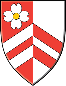
http://farm6.static.flickr.com/5050/5382181822_37ded497c8.jpg
This is the best so far. My only thought is to suggest flip-flopping the Argent and Gules field (i.e., make it "Per pale Gules and Argent…) and put the dogwood blossom in dexter chief but without needing a canton.
I agree with Dohrman, bigger is better, although I would still blazon these as chevronels. I buy the theory that you can’t put two of the same ordinary (pales, fesses, chevrons, chiefs, etc.) into the same coat of arms.
Joseph McMillan;81283 wrote:
My only thought is to suggest flip-flopping the Argent and Gules field (i.e., make it "Per pale Gules and Argent…) and put the dogwood blossom in dexter chief but without needing a canton.
Damn you, McMillan. You beat me to it!
<div class=“bbcode_center” >
http://img15.imageshack.us/img15/2787/popedavid00.png
</div>
I like this a lot.
Kenneth Mansfield;81282 wrote:
Out of curiosity, Joe, how long did you ruminate on the elements before settling on the final result?
I don’t recall exactly. I hashed it out on the old Heraldry Society of Scotland forum that Anthony Maxwell hosted before the big spat between him and the HSS board, and which is no longer on line. I can find the index page for the relevant period (spring-summer 2004) on the Internet Archive wayback machine, but the links to the postings are dead.
Anyway, I think it was a period of several months, and then another good long period before I decided that what I had tentatively settled on was the final design. I remember starting with the lion rampant and doing variations on charges in chief and base. At one point I used three roundels Azure charged with stars Argent, for my father’s USAAF/USAF service; the Scottish members’ view, however was that white stars on blue implied a Murray connection. I think I also experimented with semy of blue stars for a few moments. For the base I can remember a mound Gules (red clay hills of NE Alabama), same charged with a bar wavy Argent-Azure-Argent, and a base per fess of various colors and Argent (the subterranean white for the marble for which my father’s home town of Sylacauga is known). I don’t recall at what point I shifted the lion to passant, but I think the present design stabilized shortly after that.
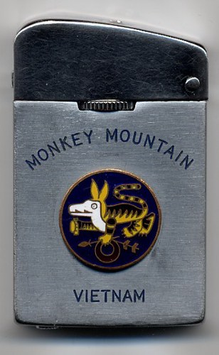
I was always inclined to follow the chiefly model of a hand or hands holding weapon or weapons for the crest—one version that I still like very much was two hands each holding a bayonet, the bayonets crossed in saltire. This was for my gg-grandfather and his brother who served in the 10th Alabama Infantry (X = 10, saltire also for Confederacy and Alabama). I also experimented with two designs representing my dad’s Air Force career, one with three USAF squadron guidons representing his three independent squadron commands, and another using the "wooly-booger" from the badge of his squadron in Vietnam, either passant with a sprig of holly in his paw, or issuant with the holly in his mouth.
http://www.ljmilitaria.com/usafsosaircontrolarrsarefs/4c0c34f40.jpg
I have some of the sketches on the other computer which I’ll share once the Steelers finish off the Jets.
(And thanks to Kenneth for his kind words about my arms. I’ve since realized that the differencing of the chief’s stars can also allude to the "change their skies" part of the motto.)
Joseph McMillan;81283 wrote:
This is the best so far. My only thought is to suggest flip-flopping the Argent and Gules field (i.e., make it "Per pale Gules and Argent…) and put the dogwood blossom in dexter chief but without needing a canton.
I agree with Dohrman, bigger is better, although I would still blazon these as chevronels. I buy the theory that you can’t put two of the same ordinary (pales, fesses, chevrons, chiefs, etc.) into the same coat of arms.
Kenneth Mansfield;81284 wrote:
Damn you, McMillan. You beat me to it!
<div class=“bbcode_center” >
http://img15.imageshack.us/img15/2787/popedavid00.png
</div>
I like this a lot.
Guys, thanks for the assist. This will be one that goes on the refrigerator for review. Very nice.
Kenneth, What program did you use to create this image? Did it have a dogwood flower as clip art already?
David Pope;81286 wrote:
Kenneth, What program did you use to create this image? Did it have a dogwood flower as clip art already?
Other than a few images that I’ve swiped from Wikimedia Commons for design mock-ups, I draw most everything in Adobe Illustrator. I had the Dogwood flower because I drew it up for an early badge idea. The original had the seeds and everything, but I seem to have trashed it. I used this simplified version in a mock-up of Stephen Wood’s (aka Deer Sniper) arms a while back. If I can’t find the original, I’ll redraw it and send you a high res version for your fridge test. PM me with your email address.
Kenneth Mansfield;81287 wrote:
Other than a few images that I’ve swiped from Wikimedia Commons for design mock-ups, I draw most everything in Adobe Illustrator. I had the Dogwood flower because I drew it up for an early badge idea. The original had the seeds and everything, but I seem to have trashed it. I used this simplified version in a mock-up of Stephen Wood’s (aka Deer Sniper) arms a while back. If I can’t find the original, I’ll redraw it and send you a high res version for your fridge test. PM me with your email address.
Done.
Joseph McMillan;81285 wrote:
I don’t recall exactly. I hashed it out on the old Heraldry Society of Scotland forum that Anthony Maxwell hosted before the big spat between him and the HSS board, and which is no longer on line. I can find the index page for the relevant period (spring-summer 2004) on the Internet Archive wayback machine, but the links to the postings are dead.
Anyway, I think it was a period of several months, and then another good long period before I decided that what I had tentatively settled on was the final design.
I see looking at our archives that it wasn’t until November 2004 that I posted the message Kenneth quoted above, and even then I was still thinking of the arms as "provisional." I applied to have them recorded by the NEHGS-COH some time in spring 2005, and they were accepted in June of that year. So something over a year altogether.
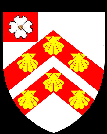
Here’s the other candidate for the second round of refrigerator testing, based on a suggestion by Fr. Dohrman:
http://farm6.static.flickr.com/5215/5384295461_6115e97c97.jpg
There are two non-tincture differences from the base arms (1-escallop moved from canton to charges on the chevrons, 2-dogwood flower on the canton instead) and this allows me to incorporate the escallop, a charge my wife really likes. Once again, the illustration is hashed together.
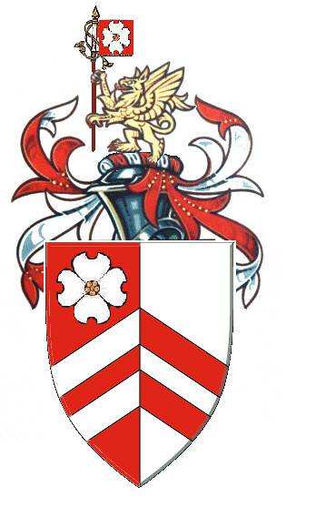
Here’s the first one, suggested by Fr. Dohrman, Joe, and Kenneth, that’s in the running:
http://farm6.static.flickr.com/5213/5384955062_8905bcfea1_z.jpg
David
David, don’t be afraid to let the canton overlap the other elements. If you notice the original you cite from the Fenwick roll, the canton covers half of the top chevron and is the size of a quarter. You might also consider other charges. There are a few Pope arms that have mullets on the canton, too.
<div class=“bbcode_center” >
http://img87.imageshack.us/img87/7927/popedavid01.png
</div>
This was another suggestion. I think it may be straying too far from the original concept, but it’s still quite nice.
<div class=“bbcode_center” >
http://img600.imageshack.us/img600/4294/popedavid02.png
</div>
Kenneth Mansfield;81292 wrote:
David, don’t be afraid to let the canton overlap the other elements. If you notice the original you cite from the Fenwick roll, the canton covers half of the top chevron and is the size of a quarter.
Kenneth,
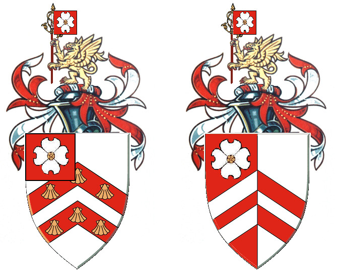
Thanks for the good advice and thanks for all your help. I’ll ruminate on these for a couple months and then ask for one final round of critiques. Here’s a side-by-side comparison with the larger canton:
http://farm6.static.flickr.com/5212/5387072585_3599d681b5_b.jpg