It is intentional, yes. My grandfather’s arms have the Argent and Orange mantling. Mine uses Argent and Vert.
I have dabbled with a tri-color torse/mantling and actually like it a lot. But these are the "official" versions.
Another one for fun. Fictional seal of the American Heraldry Society inspired by seal of the NEHGS Committee on Heraldry.
Ink converted to vector again.
http://www.americanheraldry.org/forums/attachment.php?attachmentid=1290&stc=1&d=1380850542
http://www.americanheraldry.org/forums/attachment.php?attachmentid=1291&stc=1&d=1380850573
Very nice, Jeremy. I’ll give you my three points of criticism, though.
<ol class=“bbcode_list”>
<li>The Is in American and Society are too wide. Not all letters are created equal.</li>
<li>The lines in the shields in chief make them look a little too much like leaves to me.</li>
<li>The eagle on the left sleeve appears to be facing sinister.</li>
</ol>
On the whole these are outweighed by the things that are good, but I thought them worth mentioning.
Thank you!
Kenneth Mansfield;100804 wrote:
The eagle on the left sleeve appears to be facing sinister.
That would be because I didn’t color the beak correctly in the color version. It’s also shaped a bit differently than the beak on the main eagle.
Jeremy Keith Hammond;100800 wrote:
Another one for fun. Fictional seal of the American Heraldry Society inspired by seal of the NEHGS Committee on Heraldry.
Ink converted to vector again.
http://www.americanheraldry.org/forums/attachment.php?attachmentid=1290&stc=1&d=1380850542
http://www.americanheraldry.org/forums/attachment.php?attachmentid=1291&stc=1&d=1380850573
Aside from the comments by Kenneth… if this were made into a car sticker, magnet or provided for digital reproduction—I’d be happy to have it find it’s place on mug or bumpersticker via zazzle or something—just a thought…
What’s the etiquette on members selling AHS branded stuff?
Well, our brand is our brand as a society. But I’d be very reluctant to do anything with this design, or have our name on anything commercial derived from it. It’s too blatant a ripoff of the NEHGS Committee’s seal, even though the arms are different.
I think it’s great, just for fun and nice freehand work. I am not a big fan of diluting identity with variations on logos. The one posted at the top of our webpages is the one I "identify" with AHS.
It really was just for fun, I wouldn’t advocate diluting the brand either.
You know, given the availability of inexpensively producing such things… and the fact that lapel pins don’t appeal to and aren’t consistently in use by all of us… maybe some consideration should be made to an AHS controlled Zazzle or Cafe Press presence.
Kathy McClurg;100820 wrote:
You know, given the availability of inexpensively producing such things… and the fact that lapel pins don’t appeal to and aren’t consistently in use by all of us… maybe some consideration should be made to an AHS controlled Zazzle or Cafe Press presence.
I agree with Kathy!!
Great job Jeremy!!
My opinion FWIW (io.e. this & a nickel will get you 5 cents in change)—for a member, or anyone else not authorized by our BOD, to sell items bearing the AHS arms for personal profit, however drawn or redrawn, is not OK. (In fairness, however, I didn’t read the original question as suggesting this.)
On the other hand, sor the society (or a commercial vendor on our behalf) to do so, with a mutually agreeable cut for the society’s coffers, seems fine to me. (Which I suspect was the intent of the original quastion.)
RE: the eagle on the left sleeve—it seems to me (personal opinion, not researched) that the eagle’s head on both sleeves should face to the wearer’s front, on the same principle that a charge on both sides of a banner should face the hoist. even though this makes one side facing sinister. Whether this is actually how it’s done on e.g. the tabards of the English & Scottish heralds, I don’t know but will see if I can find a photo on-line to confirm or correct me.
Michael F. McCartney;100834 wrote:
RE: the eagle on the left sleeve—it seems to me (personal opinion, not researched) that the eagle’s head on both sleeves should face to the wearer’s front, on the same principle that a charge on both sides of a banner should face the hoist.
I had the same observation.
Michael F. McCartney;100834 wrote:
RE: the eagle on the left sleeve—it seems to me (personal opinion, not researched) that the eagle’s head on both sleeves should face to the wearer’s front, on the same principle that a charge on both sides of a banner should face the hoist. even though this makes one side facing sinister. Whether this is actually how it’s done on e.g. the tabards of the English & Scottish heralds, I don’t know but will see if I can find a photo on-line to confirm or correct me.
Nope.
http://www.nam.ac.uk/images/online/jubilee-60-years-sovereign-her-soldiers/images/95687.jpg
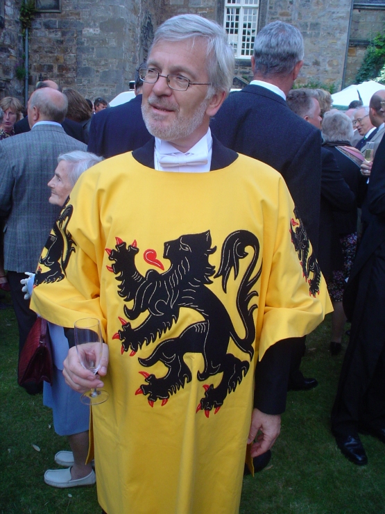
Nor on the tabard of the head (whatever his title is) of the Flemish heraldic authority in Belgium.
http://exarandorum.files.wordpress.com/2013/06/standrewsflanders.jpg
I stand corrected! (tho’ FWIW I still think the charges "should" face front—FWIW…apparently not that much!)