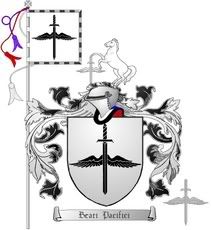
Since the AHS forum was offline for a week, I decided to take the time to draw-up a new and improved emblazonment of my arms to replace the current rendition in the member’s roll-of-arms.
http://i40.photobucket.com/albums/e221/pblanton/Heraldry/phil3.jpg
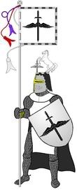
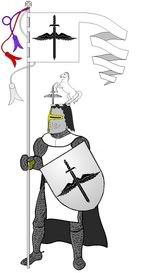
While I was in the artistic mood, I thought I’d try to tackle a form of artwork that I truly love, but is rarely seen in modern heraldry—that of the arms in their originally intended use on a shield with the man-at-arms, his banner, and sometimes even his mount with heraldic trapper. This is what I came up with:
http://i40.photobucket.com/albums/e221/pblanton/Heraldry/knight.jpg http://i40.photobucket.com/albums/e221/pblanton/Heraldry/Schwenkel.jpg
The only difference being the fringe used around the first banner and the schwenkel used in the second.
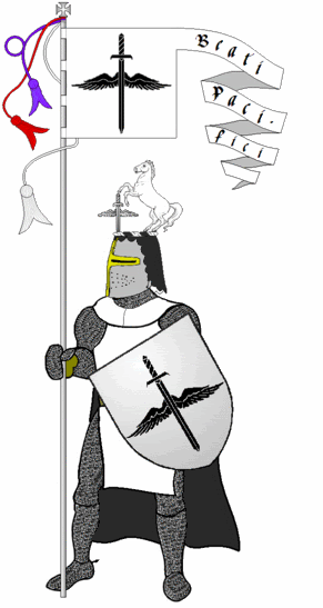
I was thinking of placing the motto on the schwenkel, but didn’t know if there was any historical precedence for this. Any ideas?
Quote:
I was thinking of placing the motto on the schwenkel, but didn’t know if there was any historical precedence for this. Any ideas?
I think you should go for it Philip.
Quote:
I think you should go for it Philip.
I second that.
Phil I like it. It is simple, clean and attractive.
Looks good amigo
I like them all. Sure wish I knew how to do all this stuff. Some of the renderings I see from our members is really fantastic! It just goes to show the diversity we all like to celebrate through heraldry. Keep ‘em coming!
Ah Chap,
I see your using your 3D rendering of your Shield on your avatar….It has come out really well and has a nice affect, what program did you use? I think you told us before but I have forgotten.
How are you doing John, I used a combination of Maya 6 and Photoshop7. I am still learning of course and it could have turned out better in my opinion but the best way for me to learn is to do.
I figure in about 2 years time I will be shelling out masterpieces.
It did come out nice Chap.
Thanks Donnchadh, I’ll hone it in I’m sure
Thanks for the encouraging comments, guys. ![]()
I kinda like it!
Chapulin - I really like your avatar, too! Some day I’d like to learn how to do that same kind of 3D imaging.
(Edited so you could actually see the motto)
Take care,
Phil I like the motto like this. I’d keep it.
Philip, I really like your setup as well, a nice presentation indeed.
I like it to Philip but I would suggest changing the font to something not quite so fancy. I feel that by using a plainer font it would make the motto easier to read and it would stand out more.
Very nice and very impressive! I do agree with John above, that a plainer font would be a bit easier to read however, if you were to make a serious painting out of it, with a background scene like a jousting tournement going on in the background, I would leave it as is.
May I suggest that you provide a compartment of some sort for the knight to stand on - I am not fond of figures floating in mid-air - other than angels.
Otherwise, a great representation of your arms.
Regards,
Iain Boyd
OK, I see the problem with the font, so let’s try this one:
http://i40.photobucket.com/albums/e221/pblanton/Heraldry/Schwenkel3.gif
I like the idea of a compartment also, I’ll play with it and see what I can do.
Thanks for the ideas, guys.
Take care,