Guy Power wrote:
The shield is too large for the Helm/Crest. The helm should be in proportion to the shield.
Try making your helm and crest about 50% larger—maybe more.
Oh, and what—prithee—is the "Guy-treatment"?
I just cocked the shield at an angle, like in your arms.
Jonathan,
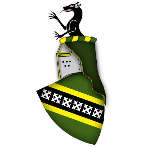
I think the angle on the arms in your particular case is to acute, it makes the cross, crosslets more like fancy X’s due to them almost being in a strait line on the bendy.
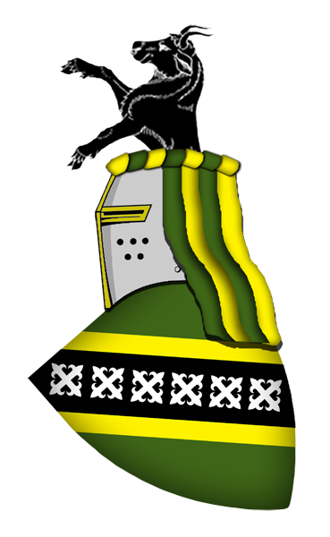
The demi bull for me is the best so far.
I like the demi-bull too, but I think a demi-rat is just right for me.
http://i6.photobucket.com/albums/y249/loaba/RampantRatpainting.png
About the angle of the arms - how would you correct that? I really like the look. I guess I could adjust it up a bit, but I don’t want to alter the arraingment more than needs be.
The norm is usually around 30 deg. slant but try 25 see how it looks. In the arms gallery to give you some idea mine are on a 30deg slant.
http://www.heraldrysociety.us/MemberArmPages/images/Duncan_ahs_l.jpg
J Duncan of Sketraw wrote:
The norm is usually around 30 deg. slant but try 25 see how it looks. In the arms gallery to give you some idea mine is on a 30deg slant.
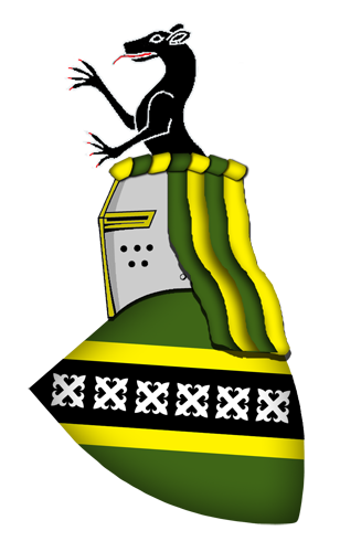
http://i6.photobucket.com/albums/y249/loaba/RampantRat25Adj3.png
This is the 25. And your arms are simply outstanding.
Move the helm back a bit more sinister Jonathan that will make the slope look greater than it is. Not to much!
Thanks for the compliment, Arms ain’t easy to design as you find this out when you start to do them and we have all had the same dilemmas.
J Duncan of Sketraw wrote:
Move the helm back a bit more sinister Jonathan that will make the slope look greater than it is. Not to much!
Thanks for the compliment, Arms ain’t easy to design as you find this out when you start to do them and we have all had the same dilemmas.
http://i6.photobucket.com/albums/y249/loaba/RampantRat25Adj.png
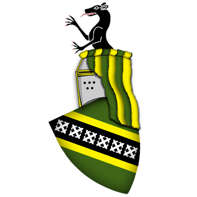
I’ll need to adjust the mantling at this point, but overall it still looks acceptable.
Yes, this was the hardest thing to nail down, especially when you have so many options (that all mean one thing or another).
Bring the mantling further forward at the top ‘Dexter ‘and slope the mantling to ‘Sinister’ at the bottom. This will again make the shield look like it has more of a slant. And makes the mantling not so strait up and down as it now looks since the adjustment. Trial and error I am afraid!
You could also start the mantling from the second Or loop in the torse so it would be Or then Vert and loose the last Or loop on sinister end of the torse. This will make the torse narrower (think its a bit to wide anyway) and gives you the slant on the mantling you might need.
http://i6.photobucket.com/albums/y249/loaba/RampantRat25Adj3.png
Adjusting the mantling is both easy and difficult. Really it is just time comsuming. Thoughts? I’d say you were right on.
Edit: per another suggestion, I added a bit more mantling. I really need to clean it up now, but not tonight! It’s the wee morning hours and I might have to work tomorrow.
Also, reduce your torse sections from seven to six. Six is the "blueprint" standard; and the first section is traditionally metal, which makes the last twist ending up being a tincture. Dunno why 6 instead of 7 or 8. Again, 6 is a modern parameter and hasn’t always been of that number; but, them’s the roolz now. :D
Also, your lambrequin—in the Scotto-Germanic style depicted—should be a single color on the outside, lined by a single color. Remember that the lambrequin was a sun shield to protect the helm (and wearer) from the effects of the sun. Not saying that a crusader couldn’t have a parti-colored lambrequin made from a striped tent ....
Although not often depicted this way, imagine that the torse is used to secure the lambrequin to the helm—sort of the way the Arabic keffiyeh head covering is secured by the agal. Well .... that was the origin of it (headcovering, not keffiyeh ...then again, who knows!). Perhaps the agal could be the origin of the torse.
The torse became an artistic construct which has today morphed into the multi-sectional sausage (I think that term is copyright by Big Mike McCartney) ![]()
Cheers,
—Guy
Guy - so thanks for the info. I’ll reduce the torse, but I have a question in regards to the lambrequin. Am I pretty much barred from using a stripped on like what I have depicted? If so, why?
http://i6.photobucket.com/albums/y249/loaba/RampantRat25Adj4.png
Here is a rough knockout
You have several options to depict the lambrequines
see:
Guy arms
http://www.heraldrysociety.us/MemberArmPages/images/Power_ahs_l5.jpg
and the one in his avatar
Denny rendition of an Irish CoA
[url=“http://www.heraldrysociety.us/forums/showthread.php?t=2390” class=“bbcode_url”]http://www.heraldrysociety.us/forums/showthread.php?t=2390
Mike arms
http://www.heraldrysociety.us/MemberArmPages/images/McCartney_ahs_l2.jpg
Ikkon Yamashita has some different lambrequines too
http://www.ikkon.net/italiano/galleria-en/galleria2.htm
I particulary like Cav. Truzzi and Baron Von Dellingshausen as a different way to depict mantles
I think I’ve never seen a mantle like the one you were proposing and it does not mean but that (I’ve never seen one). Joseph, Guy or John surly have way more experience than me and probably they’d know of something similar.
Lambrequines in the Spanish tradition are very generous, almost floral. Just to let you know ![]()
AVD wrote:
Lambrequines in the Spanish tradition are very generous, almos floral. Just to let you know
Aye, I did notice that, they’re not unlike the leaves of a geranium. lol I guess it’s for that reason that I don’t quite like that style. Looking at what I have now, what style is that?