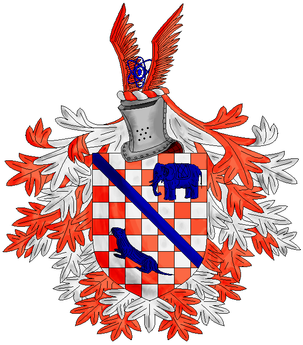
Here be the next arms I made, Linusboarder’s. Critiscisms away.
http://img.photobucket.com/albums/v517/Maramalo/LinusBoarderArms.png
Louis, nice overall. Couple of points however.
The Argent and Tenne in these arms is so vivid that it gets lost in the continuous shredded mantling. So, try to remove the mantling below the shield so the definition of the shield and the charges on it are not lost in the sea of Argent and Tenne mantling.
Next thing is that the Azure is a little too dark and the definitions of and on the charges gets lost in the darkness. The hue is fine, but if you’re going this dark lighten the black lines up by using white highlights on them - this way you can see definitions of the animals better.
And finally I would make the helmet afrontee, for placing it in profile makes the crest appear less uniformed; by this I mean the atom is not in line with the angle of either the helmet or the wings. Instead it looks like it is afrontee and the helmet and the wings are in profile.
Just some suggestions. But good job Louis. Always nice to see a fellow artist doing well. ![]()
Thanks Louis.
I really like them, my only critique would be the same as Denny’s, that the black highlights in the blue are difficult to see.
Other than that I think you did a fantastic job, and would like to get this in the members area soon.
I would second Denny’s comments, both re: white lines on the bodies of the beastiies rather than black, and some pruning of the manteling (nice as it is standing alone, but rather overpowering around the checky field)
Indeed there is another option on the Azure Louis; namely that you use “blue scale”. Using a color to "scale" is simply using varying shades of the same color. If you don’t like the Argent lines (which I would prefer myself) you cold use a lighter shade of the Azure for the base and darker shades as lines only to outline the details. You can see how I did this with “black scale” on the Japanese Fire Dragon crest of our own Patrick Williams. The same for the color blue by Daniel de Bruin in the arms of our member Justin Swanstrom.
Sorry if this is all weird, as I am on meds for my kidney that make me very foggy…if it makes no sense ignore it… ![]()
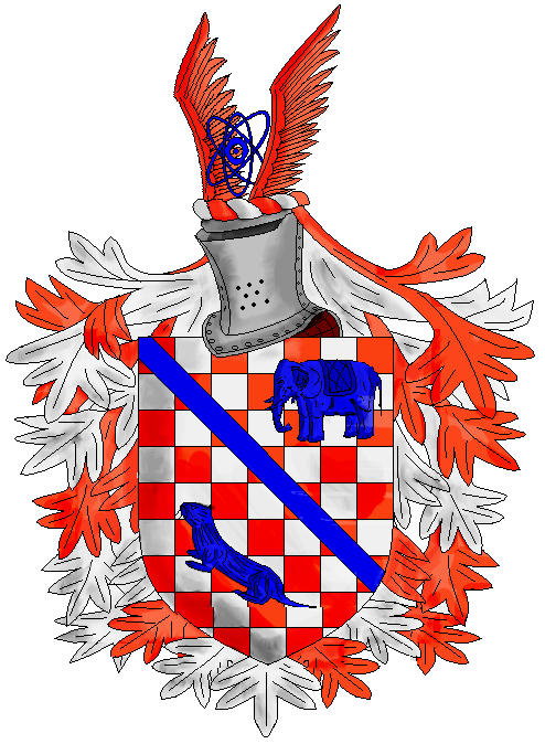
Okay, thanks for the input guys! Here’s two revised versions. Both, I tilted the atom a bit to fit the in-profile helm, and both I lightened up the little critters. One however, has less mantling, and the other has the same amount.
http://img.photobucket.com/albums/v517/Maramalo/LinusBoarderArms-trimmed.png
http://img.photobucket.com/albums/v517/Maramalo/LinusBoarderArms2.png
Louis,
One more recommendation for you. I noticed that you shade the armorial achievement on the dexter side. Traditionally the shading should be on the sinister side. As if you have the light emanating from somewhere on the dexter side or the viewers left.
Nice job.
much better on the Azure, but can you put in a white lines on every left/right partition line and down the left lines about a third to give highlights? if not it is ok this way as well.
ok on the atom…i think i’d like it all afrontee anyway, so….
as for the mantling, well, try to remove the mantling on the bottom third of the shield. the problem is the eye can’t register the difference between the Argent and Tenne checkered field of the shield and the Argent and Tenne mantling. if you remove the mantling from the bottom third of the shield it will look more like mantling and show a clearer break between the field/shield and the mantling.
overall good job Louis. I’m sure Colin will be happy.
also, one more thing, try to switch the checkers from Tenne and Argent (beginning with the upper most left checker being Argent instead of Tenne), ‘cuz if you do this you will see that the bendlet should only cover Argent checkers (tiles) and that will make that particular charge stand out better and still keep the Argent and Tenne theme.
Thanks Kelisli! I’ll keep that in mind on my next work.
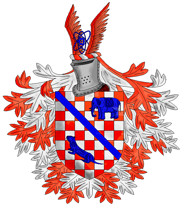
Here’s the parted version. The argent/tenne checkers thing (which I based on Linus’s avatar), I can’t change without having to start over, so ....yeah. The partitions, thing, I honestly have no clue what you’re talking about :D
Ok… think of there being a light to the upper left of the achievement. Then think what that light would do to the achievement – in each part and in total. One, there would be white highlight lines along the top of every line and down along the left lines of every piece of a charge and two there would be darker and/or gray lines on the other side.
So, for example, on the saddle of the elephant look at the saddle on its back. See the top line going left to right and the front of the line, which is the left downward running line. There should be a white highlight line running along both making an upside down “L”. Each line differentiating something (the saddle, the tusks, the back of the elephant, the front of the legs, etc is a partition line for lighting purposes because it partitions the charge from either the field (tusk, head, legs, etc) or from some part of the charge (saddle, where the tusk comes out of the elephant, etc).
The same holds true for the bendlet and the otter and the wings of the crest and the atom and the shield itself. Now on the checkered shield you would use a duller white for the Argent and highlight it with a brighter white (remember this is coloring to “scale” within one color).
Conversely the shading should be on the opposite of the highlights. So, as Hassan was saying the right side of the shield, and therefore the charges and everything mentioned above should have shading. Now on Argent this is done by using light grays and for the shield a light, but darker than on the field gray and the same for the crest. On the colored charges this is usually done using darker shades of the color used.
I hope that helps.
P.S. The cleaned up mantling looks a lot better.
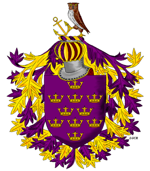
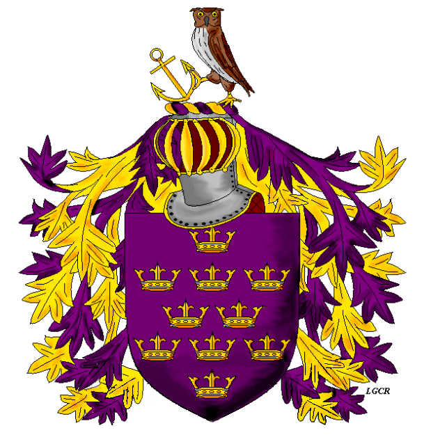
I tried highlighting on this one, I can’t do it….well…I can, in a way….but it worsens rather than improves the picture so hehe…I scratched it. Well…anyway, here’s Mark Olivo’s arms. Criticisms Away!
http://img.photobucket.com/albums/v517/Maramalo/MarkOlivoArms.png
Hi Louis.
Likes (very much a major like!):
I like how you use the barred helm that would be a norm, or at least a legit option, in Iberian arms; including cultural elements like this is always nice to my mind anyway.
Dislikes (all rather minor):
The owl and anchor are a little small (height and width) for the overall size.
The style of crown is a problem for me… I can’t place it exactly… but I’d like to see a different one.
Finally, the bottom of the shield with the mantling. Of course it is only my personal preference, but when there is this much mantling, as one sees a lot with older arms, the mantling begins to distract from the shield, which of everything is the most important part of an achievement – IMHO – so I’d just remove the mantling from the bottom third of the shield so as to let the eye follow the shape of the shield to distinguish it from the background.
Kudos Louis. 8)
One thing I told Louis when he asked was that he did not have to stick with ‘eastern crowns’ if he felt as an artist that something else would fit better, but only that they must be inornate and not have any jewels etc. on them.
I’m personally very pleased and grateful for this! Thanks!
Mark, I think you may misunderstand me and if not maybe others do. So, please let me clarify my points.
One, and directly to your post, I did not, nor do not, criticize the use of non-eastern crowns. Rather, I’m not sure I like this form. That’s all. And that is merely a personal perspective, which is why I said ‘minor’ when I mentioned my dislikes. In fact none of them were ‘serious’ at all.
Two, my comment on the crest is merely a comment that the crest should be a bit larger; the scale is a wee bit too small for the helm, which I love, as cultural elements in heraldry are, to me anyway, very important.
Three, my comment on the mantling is merely an observation on the way the eye processes color. When there is too much of it the eye looses sight of clearly defined lines and it begins to wander. So, that’s why I suggested to remove the bottom third of the mantling form the shield. Frankly, I think it looks absolutely great that way (his second try). In this version one can see the clearly distinctive lines of the shield; very much better this way.
And in truth your pleasure with the final product is absolutely the most important thing… from an artist’s perspective anyway… I’m sure heraldic ‘purists’ might have a different opinion, but I’ve always viewed it in such a way that the main objective of anything that an artist can provide for his/her client is their pleasure with the final product.
I think Louis is a good artist and his work has been nice. I am happy to see that he is taking to this art form. I expect good things form him in the future. So, in no way were my comments a means of belittling his work. Now, I know you didn’t say, or suggest that, but in case anyone else viewed it this way I wanted to lay it out more clearly. I know Louis knows I mean only constructive criticism; in fact we’ve PM’d several times on several different issues related to this art form. I just want to make sure no one else thinks it anything more than what it is… that has happened enough in the past here… ![]()