OK after a day to digest it a bit here’s some ideas:
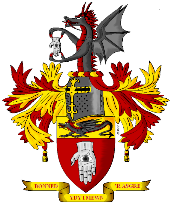
One, try to lighten up the gold in the bar on the helm a bit. It should be about as bright as you have on the mantling. As it is now, it sort of appears to have the shading in it only because it is darker. So, since the gold bar is out front it would reflect the light coming form the upper left, so lighten it up a bit.
Two, if you can try to show the red (or whatever color you or your client chooses) lining of the helm in the breathing holes, as this will give your helmet a little more ‘depth’ in appearance so it doesn’t looks as single dimensional.
Neither of those are ‘biggies’ but they may go far to help in the over all appearance of the achievement.
Again Louis good job.
Great colors
Yeah, they it does look better lighter.
http://img.photobucket.com/albums/v517/Maramalo/PatrickWilliamsArms3.png
As for the holes, I do it only on helms with considerably big holes, like on the Iberian-style ones, but as for small holes I just make them black, because that’s what I think they show in reality (unless you stuck a light bulb inside). Then there’s always my shading, even with the fairly see-able color, my shading makes it black, or something close to it.
This is good Louis. It makes the helmet appear to be coming forward and in the round more so than when the bar was darker. Good job.
I understand on the breathing holes.
I like them there tassels as well
Thanks you two!
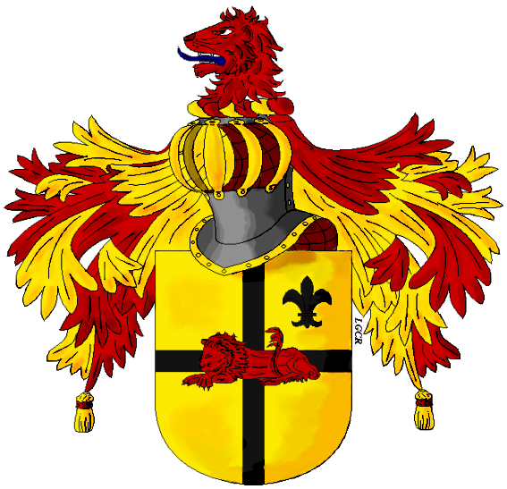
Seeing that I did not have much modifications to do, and its a 3-day weekend for me (Nevada Day) I was able to speed up on my next work. It is Mr. Mark Olivo’s wife’s father’s arms. Mrs. Olivo’s I will also present seeing its the same except for an ermine spot as difference, but I’m still inquiring Mr. Olivo whether or not to make it as a lozenge rather than a shield.
http://img.photobucket.com/albums/v517/Maramalo/DeniseOlivo1.png
Louis, I know I already repied to you privately, but I’d just like to publicly thank you for the fine rendition! It’s quite lovely.
I think that one of the most fun parts of all this is to see your achievement rendered by different artists-it’s like seeing a portrait of yourself as seen by someone else’s eyes. I never realized how good looking I was. :D
It was my pleasure ![]()
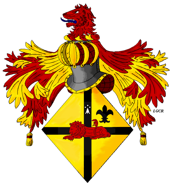
Here’s Mrs. Olivo’s, nothing different except the lozenge and the ermine spot.
http://img.photobucket.com/albums/v517/Maramalo/DeniseOlivo3.png
Comments on the two anyone?
beautiful work! i think i like the lozenge for femanine, it helps to seperate the two. very nicely done!
Good job Louis. ![]()
Donnchadh wrote:
Remove the shading from the left of the shield. Save shading for only the right side of the achievement. Remember that the light comes from the upper left, so highlights on the left and shading on the right of the shield.
I have read this a couple of times now on this forum, but this is the only place I have ever read it. I can’t imagine that this is any type of an artistic rule. I think shading or not shading, shading on the right, bottom, top, or left is completely up to the artist.
I have to agree with the Good Father. I’ve always taken shading and the like as the artists own personal touch, and not a rule. Take a look at the different styles of shading on the College of Arms website, under recent grants. There’s a variety of artsistic style and shading there. I know on my own personal arms there is no shading at all.
Donnchadh wrote:
Also shading is under every charge that is upon a charge. So, under the cross beams you’d have darker gold and on the right of the up beam of the cross you’d have shading. And under the lion there’d be some shading. And under and to the right of the fleur-de-lis there’d be some shading.
This is also not true. I do believe someone made these shading rules up and they are being passed on as somehow heraldic. The artist is free to do as he/she pleases, just so long as they follow the blazon.
I can’t remember where I read it (possibly one of von Volbborth’s books),but I am pretty sure that shading in armorial bearings is always on the sinister side of the achievement. Light emanates from the dexter or upper dexter to be exact. I will look it up, but for now, look at any of the artists from around the world, you will always find shading on sinister side. I would appreciate any input to correct me if I am wrong. Meanwhile, will look up reference on the matter. I don’t know whether it is rule or custom, but if there is to be shading, it is consistently observed that light comes from dexter side and shade is on sinister side. Could that be from dexter being associated with good and sinister with darkness and evil, I really have no idea.
I also don’t believe that if women’s arms are displayed on lozenges, that a crest is appropriate. I believe that is the case in English tradition, at least. I could be wrong or they could have modernized their rules, but I have seem lozenges either ensigned with coronets or nothing, but I haven’t seen them ensigned with helmets or crests. Again, open to stand corrected.
Cheers,
Hassan