Alright I see what you’re saying. That wolf is better, though he looks like he should cut back on the brownies a little bit :D. I like the look of that one though…
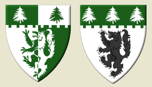
With the outlining of the wolf, it seems only right to give outlines to the other charges on the shield. And why not get rid of that pesky chevronnel while we’re at it. Now we’ve arrived where Father Dohrman was yesterday. ![]()
Kenneth Mansfield;71473 wrote:
Now we’ve arrived where Father Dohrman was yesterday.
That seems to be a common theme in these design threads, doesn’t it?
The first commandment of design…listen to Father Dohrman!
Kenneth Mansfield;71473 wrote:
With the outlining of the wolf, it seems only right to give outlines to the other charges on the shield. And why not get rid of that pesky chevronnel while we’re at it. Now we’ve arrived where Father Dohrman was yesterday. :D. I think I’m starting to develope an appreciation of the simplistic nature of the designs, and am really starting to want that in my own.
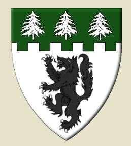
Since I’ve always liked the embattled look, I thought I’d try this. What do you think? Fairly simple, but original enough. I think I actually like either of these.
http://i127.photobucket.com/albums/p122/BrokenChainsX/Text.png
The second one isn’t bad, but I like the most recent one that Kenneth posted if for no other reason than the wolf is bigger.
Question to the group at large, unless otherwise blazoned, would the wolf naturally be armed and langued red?
Interestingly on my other computer when I look at the shield Kenneth posted, the wolf looks jet black without any shading. Yet I come on here, and now it looks better because it’s not solid black haha. I like what he did with the trees on the last one also. I think it’d helped to do that on the second one I posted.
AILD;71487 wrote:
Since I’ve always liked the embattled look, I thought I’d try this. What do you think? Fairly simple, but original enough. I think I actually like either of these.
http://i127.photobucket.com/albums/p122/BrokenChainsX/Text.png
I’d be very happy with the second one here. Simple, effective, elegant.
Thanks John, glad you like it. Can’t say I have any complaints about it from what I can see.
I, too, like the second by Joshua. It has a more traditional feel to it than the per chevron enhanced. If you must have a chevron, I really like the one that was posted a while back showing two wolves combatant over a single tree - very well balanced.
Take care,
I like the embattled chief, but here is perhaps a more traditional spacing and layout.
Very nice, and much better with the trees outlined properly. Have to say I’m leaning strongly toward this one.
AILD;71506 wrote:
Very nice, and much better with the trees outlined properly. Have to say I’m leaning strongly toward this one.
Avatar test it (file provided below ![]()
Alright I’ll switch it to my avatar now…and I’ve already begun the fridge test :D. I’m also doing a hand drawing of it myself so I can get the full feel of how to flows together. Call it weird…but it helps me haha.
Joshua - Just understand that there may always be a nagging temptation to redesign your arms. For me at least that is part and parcel of being both free to assume arms and continuing to learn more about heraldry. It took me ten years to arrive at my arms and even then I changed several minor things in the weeks leading up to my registration with the USHR. Even today, I see other arms that make me think, "I should have…." I often wonder how I could have made them better, simpler. But I am still happy with and committed to the arms I have registered.
http://img513.imageshack.us/img513/3305/kfmcoa2.png...just thinking out loud. ![]()