Joseph McMillan;98232 wrote:
How about a star of six straight points with the staff (or just the snake) on it? Any colors.
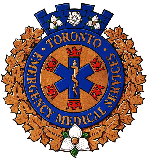
Actually, I don’t think there would be a problem using the "star of life" in heraldry. It may be modern, but it’s not something that a medieval herald couldn’t have invented. (The Canadian Heraldic Authority has granted badges to EMS units using this symbol). But I do think that if it is used it should only be by actual EMS organizations, not by individual members. So good call not to put it in your own arms, but I think a reference to it such as the six pointed star I suggested above would be fine.
http://reg.gg.ca/heraldry/pub-reg/ProjectPics/iv377_19990019_arms_toronto.jpg
I actually thought about this but wanted to convey more than just my occupation which is why i went with the tau
friarbrett;98230 wrote:
This a good idea, i intentionally avoided the star of life as it is a very modern symbol and therefore out of place in heraldry
If you think the modern star of life has no place in heraldry, take a look at the former coat of arms of South Africa, especially the fourth quarter!
friarbrett;98230 wrote:
This a good idea, i intentionally avoided the star of life as it is a very modern symbol and therefore out of place in heraldry
If you think the modern star of life has no place in heraldry, take a look at the fourth quarter of the former coat of arms of South Africa.
http://3.bp.blogspot.com/-xYuxojD57pk/TgDPGwu_tAI/AAAAAAAAARM/UNjjhhxOvEw/s1600/SA.jpeg
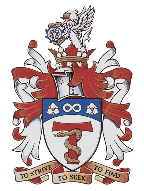
ok heres what we came up with:
http://www.americanheraldry.org/forums/picture.php?albumid=126&pictureid=1956
we decided to keep the tau red as a nod to the fire service (ems is integrated into FD here) as well as the fact that the blue did not correspond with the arms
One of the real tragedies for modern heraldry is the relative ease of using clip art to create, not coats of arms, but designs. When you are limited in your design concepts by the art you have at your fingertips, you are necessarily limited in your creativity. The end results can be nice, but often they look like, well, what you’d get by combining various pieces of clip art. That is not to say, however, that the same results wouldn’t or couldn’t be arrived at by traditional methods. But in the case of Brett’s badge, I think the ability to draw something results in a more original design. YMMV.
Kenneth Mansfield;98256 wrote:
One of the real tragedies for modern heraldry is the relative ease of using clip art to create, not coats of arms, but designs. When you are limited in your design concepts by the art you have at your fingertips, you are necessarily limited in your creativity. The end results can be nice, but often they look like, well, what you’d get by combining various pieces of clip art. That is not to say, however, that the same results wouldn’t or couldn’t be arrived at by traditional methods. But in the case of Brett’s badge, I think the ability to draw something results in a more original design. YMMV.
Id go with this but im afraid kimon would have a fit ive changed the blazon too often already
More power to ya!
I was just doing it for the fun of it.
I am not a fan of the snake around the cross from a religious point. Its almost as if it has a hold on the cross.
Kenneth Mansfield;98256 wrote:
One of the real tragedies for modern heraldry is the relative ease of using clip art to create, not coats of arms, but designs. When you are limited in your design concepts by the art you have at your fingertips, you are necessarily limited in your creativity. The end results can be nice, but often they look like, well, what you’d get by combining various pieces of clip art. That is not to say, however, that the same results wouldn’t or couldn’t be arrived at by traditional methods. But in the case of Brett’s badge, I think the ability to draw something results in a more original design. YMMV.
Kenneth,
I really like this particular badge design, particularly because it mimics the colors of the shield’s chief. Very, very nice.
harold cannon;98258 wrote:
More power to ya!
I was just doing it for the fun of it.
I am not a fan of the snake around the cross from a religious point. Its almost as if it has a hold on the cross.
actually its straight out of the bible, the staff upon which moses affixed the serpent was a tau. also I wasnt refering to you harold but rather the society IT director if I had to submit another change. personally i dont know which i like better there are good things about both designs.
also is there anyway to modify my username to drop the "friar"
harold cannon;98258 wrote:
More power to ya!
I was just doing it for the fun of it.
Harold - I certainly meant no offense toward you or your efforts and I hope that you can understand where I’m coming from. Imagine if the heralds of Lyon Court or the College of Arms only offered coats of arms for which they had available clip art. I understand that it’s fun. I enjoy coming up with ideas for coats of arms, crests, and badges as much as anyone. Clip art serves many a useful purpose, but I don’t think you should limit yourself to what it can provide when you’re looking to develop graphic identifiers that presumably will be associated with your family for posterity. And when you rely on clip art for illustrations, you start to think about what you have when it comes to designing rather than thinking about all the possibilities that exist. That’s all I’m saying.
David Pope;98259 wrote:
I really like this particular badge design, particularly because it mimics the colors of the shield’s chief. Very, very nice.
Thanks, David.
friarbrett;98262 wrote:
also is there anyway to modify my username to drop the "friar"
Shoot Kimon a PM with what you’d like your user name to be.
Kenneth Mansfield;98264 wrote:
Shoot Kimon a PM with what you’d like your user name to be.
hes going to kill me by the end of this week but thanks, and if you dont mind I just might use that rendering of the badge.
Kenneth Mansfield;98256 wrote:
One of the real tragedies for modern heraldry is the relative ease of using clip art to create, not coats of arms, but designs. When you are limited in your design concepts by the art you have at your fingertips, you are necessarily limited in your creativity. The end results can be nice, but often they look like, well, what you’d get by combining various pieces of clip art. That is not to say, however, that the same results wouldn’t or couldn’t be arrived at by traditional methods. But in the case of Brett’s badge, I think the ability to draw something results in a more original design. YMMV.
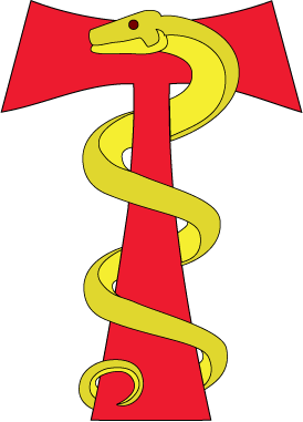
would the blazon be: a serpent or, coiled around a tau cross gules?
Check out this similar design:
http://reg.gg.ca/heraldry/pub-reg/ProjectPics/v162_20050022_arms_wh.jpg
Which is blazoned as:
a tau-staff Gules entwined by a snake Or
More information at this link:
http://reg.gg.ca/heraldry/pub-reg/project.asp?lang=e&ProjectID=1177