harold cannon;98988 wrote:
Here are just a few versions of society arms where the crest does not face the same direction as the helm. All three granted through Lyon I believe.
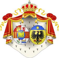
But that is because at some point Lyon decided on the sallet affronty as the default position. A crest affronty ought to be on a helm affronty. Just because someone with authority does something wrong, doesn’t mean we ought to follow their example. ![]()
As Lyon is the authority on Scottish Heraldry and these arms are for a Scottish society I think it will work out ok. Lyon has also issued arms with the sallet helm in profile as you had shown earlier.
As to this being a mantle. I do know the difference and this would be mantling. A mantle issues out from the base of a crown usually or may attach to nothing at the apex and then the entire arms crest and supporters are with in the confines and shelter of the mantle. In Scotland the mantle may wrap around the shield but I cant recall a mantle attached to the torse at the helm. I do know that it looks a little odd as I decided to go with an older tradition and use mantling gules doubled argent but that is fine from what I have been taught.
Here is the standard type of mantle with crown.
http://farm9.staticflickr.com/8136/8809952680_e96072c9aa_o.jpg
Here is a mantle without the crown.
http://farm3.staticflickr.com/2822/8799372497_02ba9ebc02_o.jpg
Finally here is the Scottish version.
http://farm4.staticflickr.com/3820/8799372843_80e6d155d3_o.jpg
I am well aware of what the pavilion and mantle usually look like. What you’ve drawn is, as a certain someone on another forum might say, "neither fish nor fowl." To my eye it doesn’t look right. I’m sure there are some out there who will disagree, but I’d need to see examples of something similar before I’ll be convinced it’s just simply wrong. Sorry to be so blunt.
harold cannon;98993 wrote:
How about these.
http://farm4.staticflickr.com/3795/8810409936_73497e7fb2_o.jpg
I think I just threw up a little bit in my mouth.
Quote:
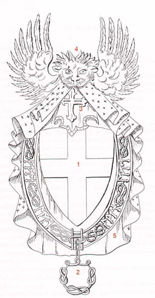
http://farm8.staticflickr.com/7318/8799828651_275658f3a0_o.jpg
I don’t recognize the illustration, but it’s clearly designed to show the various parts of an achievement belonging to someone with the decoration of an order of knighthood. Not a good example, unless it’s of how people often takes parts of things they see and incorporate them in other, unrelated achievements. The most common of these I see is clip art mantling standing by itself that was clearly lifted from an illustration that included supporters.
Quote:
http://farm9.staticflickr.com/8261/8799828609_4dd9a80669_o.jpg
Clearly Von Volborth’s art, but whose arms?
Here’s the insignia of our St. Andrew’s Society of North Carolina:
I recognize that it isn’t necessarily good heraldry. What I like about it, though, from a design standpoint, is that it is compact and easily recognizable. Many of the extraneous bits (helm, mantling, etc.) have been left off. The extra bits that are there (pine cones and pine needles, thistles, strap and buckle) symbolically reiterate the fact that it’s the St. Andrew’s Society of NC.
For the same reason, and in contrast to the practice of LL, I think you’d be better to leave off the helm and mantling altogether. My suggestion is to make the top of the shield convex and rest the torse directly on the shield. This allows you to make both the shield and the crest larger and more distinguishable.
I also think I like the lion sejant affronte better Gules, as a direct reference to the crest of the King of Scots. The St. Andrew’s and St. Patrick’s crosses are just too good heraldically to pass up. I like them in the crest, but perhaps make them sloped per bend and per bend sinister, a bit more like this:
http://www.dunvegancastle.com/content/mediaassets/jpg/crest.jpg
And less upright like this:
http://upload.wikimedia.org/wikipedia/commons/thumb/f/f7/Royal_Coat_of_Arms_of_the_United_Kingdom_(Scotland).svg/250px-Royal_Coat_of_Arms_of_the_United_Kingdom_(Scotland).svg.png
That way, the arrangement of the flags fills the space normally taken up by the mantling, but does so in a way that has inherent symbolism- Scotland and Alabama…
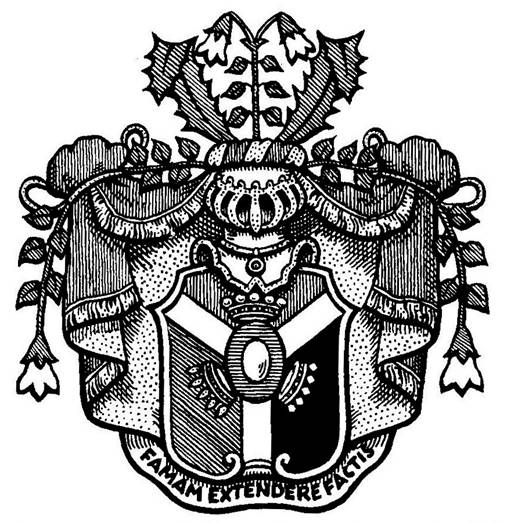
The first set of arms is from a fraternity. This is not the best emblazonment of them but it was handy at the time.
The third are the arms of the botonist Carl Linnaeus.
harold cannon;98996 wrote:
The first set of arms is from a fraternity. This is not the best emblazonment of them but it was handy at the time.
So probably not artwork created by anyone with any knowledge or understanding of heraldry.
Quote:
The third are the arms of the botonist Carl Linnaeus.
http://upload.wikimedia.org/wikipedia/commons/d/d6/Linne_CoA.jpg
"Coat of Arms of Carl von Linné (Carolus Linnaeus), from his Letter of Nobility." I think a drawing based on an emblazonment from a mid-18th century Swedish grant of nobility works in my favor. Maybe I’m wrong.
I will pass this issue on to a friend of mine who is an expert in the field and get his view on it.
Quote:
http://www.tke.org/files/img/COA pen&ink.png
Miss Emily H. Butterfield, a founder of Alpha Gamma Delta International Women’s Fraternity, was one of the country’s leading authorities on fraternity heraldry and was brought in by Frater Tex Flint to help. She, along with others in TKE’s ranks, put together a lengthy list of criticisms including the dagger issue. They wrote to Frater Schattenberg asking about his design and received correspondence that said, "I must plainly and frankly say that I’ve gone as far as my feeble ability allows me … I gladly withdraw from the competition and bow to others of superior ability."
Miss Butterfield put together a design which was reviewed by the committee. While they liked the much improved look and feel, it lacked some of the masculinity they sought. She took back these suggestions (among others) and drew what we now know as the final draft and official coat-of-arms. The 1926 Conclave (17th) held in Chicago was the end of the debate and controversy. The Grand Chapter adopted what you see today.
Emily Butterfield seems to have written two books, Use of Heraldry by the American College Fraternity (1917) and College Fraternity Heraldry (1931). Neither unfortunately is available on Google Books or the Internet Archive, but I think we may have finally found out why all college fraternity heraldry has the same look to it.
harold cannon;98999 wrote:
He was a knight not a peer.
Linneaeus was an untitled noble. The particular rank is neither here nor there. He was ennobled by the king, confirmed by the privy council, and introduced into the Riddarhus, the House of Nobility. It’s a mistake to equate the noble rank of knight as found on the Continent with English-style knighthood or membership in an order.
Anyway, if you’re insistent on following Lyon’s rules, then the kind of hybrid mantle-mantling Kenneth is criticizing is clearly inauthentic and not something Lyon would be likely to accept.
And I’m going to dissent on the crest. I find it far too obvious and too generic. Except for the wreath of cotton, which will be almost unnoticeable if emblazoned in black and white, it could be anything Scottish almost anywhere. I also expect that Lyon will find it too directly derivative of the royal crest with the lion sejant, but maybe not.
Again I will ask my friend who is an expert and see what he says.
Joseph McMillan;99004 wrote:
And I’m going to dissent on the crest. I find it far too obvious and too generic. Except for the wreath of cotton, which will be almost unnoticeable if emblazoned in black and white, it could be anything Scottish almost anywhere. I also expect that Lyon will find it too directly derivative of the royal crest with the lion sejant, but maybe not.
Harold,
Are you planning to seek a grant from LL for the TVSS?