http://img64.imageshack.us/img64/1397/coasheildunderconstrict2wf6.jpg
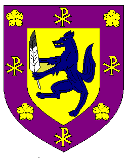
I worked for awhile on this, and in keeping with the wolf(?) being the initial family logo, I redid it. Please forgive my limited knowledge of blazon lexicon. The 3 Or ChiRho represent the Trinity, and the purpure outer border represent the royalty thereof. The inner background is azure, which represents the day. the darker azure rampant wolf represents the colour of my birthstone (sapphire) the 3 flowers chief represent my lucky number which is 3 and the flower is the Golden poppy which is Californias state flower. The eagle feathers below represent my Native American heritage.
Again please forgive my lack of knowledge of heraldic lexicon. I am pretty much an artist myself and am still learning on the computer. Well, whatcha think? I have another design on standby as well.
I think this is a good start for someone new to heraldry, I have just a few comments.
Azure on azure violates the rule of tincture (no color on color, no metal on metal); while the rule is broken sometimes, in this case I’d say it isn’t recommended because the artist chooses the shade of azure and it’s normally a royal or dark blue. So anyone drawing your arms from the blazon will be very confused. If you want to keep this combination, I’d blazon the light blue as bleu celeste and the wolf as azure. But Or (gold) might look better, you should try it out, it would also look better with purpure bordure.
The shield within the bordure looks a little cramped. I understand the desire to include symbols that have meaning for you, but perhaps they could be used in a different way. For example, the Canadian Heraldic Authority has used a coronet composed of Indian feathers, perhaps you could engorge the lion with a similar coronet.
I have to admit that I’m not a fan of using the Chi Rho or other "Christian" symbols in personal arms of a person not a priest. Plus, it might get lost when you reduce it down. Why not move the poppies to the bordure, where they’ll stand out?
You could then have a demi-lion holding a Chi Rho for a crest if you wanted to keep the symbol, and it would be more identifiable.
Just some thoughts. Good luck.
I have to say that I am not a big fan of this design, it seems a bit crowded, a bit. It seems like there are too many different elements competing for space on the shield…. Sorry, I mean this with the most respect and I encourage you to keep trying…
Hugh Brady wrote:
I think this is a good start for someone new to heraldry, I have just a few comments.
Azure on azure violates the rule of tincture (no color on color, no metal on metal); while the rule is broken sometimes, in this case I’d say it isn’t recommended because the artist chooses the shade of azure and it’s normally a royal or dark blue. So anyone drawing your arms from the blazon will be very confused. If you want to keep this combination, I’d blazon the light blue as bleu celeste and the wolf as azure. But Or (gold) might look better, you should try it out, it would also look better with purpure bordure.
The shield within the bordure looks a little cramped. I understand the desire to include symbols that have meaning for you, but perhaps they could be used in a different way. For example, the Canadian Heraldic Authority has used a coronet composed of Indian feathers, perhaps you could engorge the lion with a similar coronet.
I have to admit that I’m not a fan of using the Chi Rho or other "Christian" symbols in personal arms of a person not a priest. Plus, it might get lost when you reduce it down. Why not move the poppies to the bordure, where they’ll stand out?
You could then have a demi-lion holding a Chi Rho for a crest if you wanted to keep the symbol, and it would be more identifiable.
Just some thoughts. Good luck.
Hmmm. I also realized that it does look crowded as well. Im thinking on going with what you suggest in the demi lion holding the chiRho. By the way I’m an ordained minister (non denominational), and I was thinking of changing the symbol to "IHS". Im thinking of the colours as well. and move the poppies to the border. Ill be back and show you the end result
Might I suggest these two designs?
http://img.photobucket.com/albums/v517/Maramalo/ElSteveo-Arms.png
I realize now that’s a wolf, and I apologize for mischaracterizing it earlier.
Hugh Brady wrote:
I realize now that’s a wolf, and I apologize for mischaracterizing it earlier.
Its ok. I thought it was a fox or a wolf, one or the other.
Jongr90 wrote:
Might I suggest these two designs?
http://img.photobucket.com/albums/v517/Maramalo/ElSteveo-Arms.png
Wow just wow….these are great!!! I think and am pretty sure the scroll chief is supposed to be IHS. I like the second one though. I love the combo of the ChiRho and the poppies. the Or field goes well since California is noted as the golden state. I feel even though the site that I got the original arms from may not be all that accurate, This would do quite well also since the wolf is a native American symbol of power. I would like to adopt the second one as my own with your kind permission. Thanx:D
Louis,
I prefer the second design as well.
I suggest you change the color of the feather so that the dark portion is on the tip. As it is now, the sable next to the Azure hand is a bit muddied. Changing the colors would (1) be easier to discerne and (2) would better represent the color of an immature golden eagle feather (below, left).
http://www.feathersource.com/Large/RIM01964.JPG
http://www.feathersource.com/painted.html
—Guy Power
Of course you can use it! So long as you send me $1000 payment for the design. Just kidding ![]()
Now do you have a crest?
If I could make one minor suggestion for a final tweak?
If you’re trying to work in a Spanish style—which, whether you meant to or not, you’ve done rather well—you might want to add one more of each symbol on the bordure. Eight somethings seem to be more common on Spanish bordures than six. So it would be poppies in dexter chief, sinister chief, and the lower part of each flank, and chi-rhos in chief point, the upper part of each flank, and base.
Not a big deal, just a thought.
http://img.photobucket.com/albums/v517/Maramalo/ElSteveo-Arms-Final-2.png
Well…it does look better in my opinion.
Jongr90 wrote:
Of course you can use it! So long as you send me $1000 payment for the design. Just kidding
</a>
I took the liberty and did the corrections to the poppies, and added shading. It does look much better with the extra ChiRhos and poppies. Whatcha think? I still am debating on a motto. The ones I have though is:
"All Things Through Him"
"My Lord, and My God"
"He is My Strength"
I added the last one for effect. I might keep it I’m not sure.
Can someone blazon this for me please?
I’ve been "away" for a week or so—and am most impressed by the arms (shield) resulting from this on-line designfest! Makes one proud to be a member!
As for the crest—the IHS "floating" doesn’t look like something that could actually be crafted & mounted above the helm. One simple expedient, drawing from one of the earlier options for the shield, might be to have the crest-arm grasping a scroll or roundle or whatever charged with the IHS…
Michael F. McCartney wrote:
I’ve been "away" for a week or so—and am most impressed by the arms (shield) resulting from this on-line designfest! Makes one proud to be a member!
As for the crest—the IHS "floating" doesn’t look like something that could actually be crafted & mounted above the helm. One simple expedient, drawing from one of the earlier options for the shield, might be to have the crest-arm grasping a scroll or roundle or whatever charged with the IHS…
Good Idea. I’ve been getting some good feedback critisisms on the hand grasping the IHS, and Mr. McCartney came close to what I was envisioning. hows this?:
http://img148.imageshack.us/img148/8862/stevecoa3ub2.jpg
Heres the blazon originally provided by Hugh Brady, but last part changed by me:
"Or a Wolf rampant Azure holding in his sinister forepaw an Immature Golden Eagle Feather Proper erect the whole within a bordure Purpure charged with four California Poppies alternating with four Chi Rho symbols Or, and for a crest, on a torse Or and Purpure, a sinister hand couped at the wrist Proper grasping a small bannerstaff proper Or within the banner Argent charged the Christian momogram "IHS" Gules."
Hows that?
ElSteveo wrote:
... Or within the banner Argent charged the Christian momogram "IHS" Gules."
Hows that?
I would say on the banner Argent the Christian monogram IHS Gules
First, let me say if Geoff or anybody else has a better way to blazon the shield, I have no pride of authorship.
Second, I think the blazon for the crest should read something like "grasping a small bannerstaff [either Proper or Or, not both] [flying therefrom a Banner Argent the Christian monogram "IHS" Gules."