Thanks so much! I like it. An interesting way to add the book to the crest. I have a feeling others won’t care for it but I kinda dig it.
Don’t have time to sit in a classroom? Try our new "Education on a Stick"! For the modern family-on-the-go.
In all seriousness, I’m not sure what the take-away message is there.
Just in case:
http://farm4.static.flickr.com/3232/5867990599_a87d79b842_b.jpg
FWIW, I really dig the plain demi-bear sable for the crest. Particularly if it correlates with a black bear in the crest…
J. Stolarz;85252 wrote:
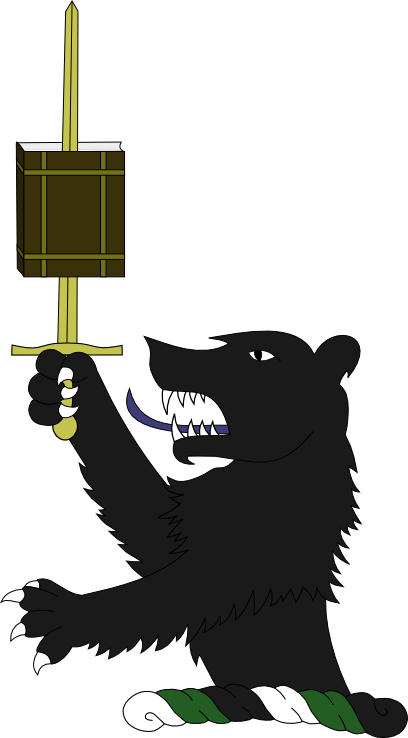
Instead of the bear resting his paw on the book, how about something a little different?
http://i127.photobucket.com/albums/p122/BrokenChainsX/BearStab-1.png
Rightly dividing the word of truth?
Never stab your books, or you’ll get the look of anger the bear possesses in the crest? ![]()
Well, so long as neither you nor your descendants ever go into library science… ![]() ) the choice is yours. Just please avoid "all of the above" as your answer!
) the choice is yours. Just please avoid "all of the above" as your answer!
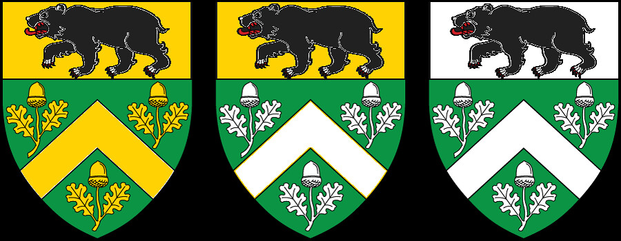
So I thought I had it all figured out and was ready to go. I even had Josh create my first official emblazonment of my arms and right after that was done the "polar bear" issue came up again. Some people thought the bear on my chief was a polar bear simply because it’s white. Then they read the blazon and/or the meanings of everything and realized it wasn’t. So I had Josh mock up one with the reverse colors on the chief to see which is better.
Here’s the thing. Logically, I know the white chief/black bear is the better option because it makes more sense at first glance. However, the color scheme of the original design is much more powerful to me and, therefore, I think a better shield. I don’t dislike the white chief, but it definitely does not grab me the same way as the original design.
What does everyone think? We’ve already tried adding some gold to it and that made it look worse. I don’t want to go through a whole new design process because I really love my overall design and want to stay with what I have, but can’t decide if I should go with the one that I really love or the one that makes more sense to others.
Either is a good design. I like the white chief/black bear better for two reasons:
1. The bear in the crest matches the bear in the arms. That’s a very central European thing to do.
2. I really don’t think there’s enough contrast between black and green for a black ordinary on a green field to work well.
I have to say, I like the one on the left (black chief) better. I’m sure some will say that the white chief is better "technically", but I just like the other one better. I guess there is just too much white in the one on the right for me.
I did say that I didn’t like the one with the white chief during our PM’s, though I have to say it is growing on me. It does all flow well together.
I actually like both designs. I agree with Joe in saying that the white chief definitely adds more contrast between the chief & the rest of the shield, not to mention it helps the black bear tie in more closely with the black bear in the crest.
I especially like the color of green you have chosen, and it definitely goes well with the black chief. One thing I have to remember is to "color" my arms using various shades of green & blue. After all, while the black & white may remain fairly constant, future renderings of your arms may result in other shades of green. See if that helps you decide.
Overall, a very nice & well balanced look - - either way you go! :cool:
Artistic opinion, and green color selection is part of the reason I opted for my arms to only be vert and argent. The argument being that at distance, a cooler green would blend into the black, so they opted for a very lime shade of green…which is not something I wanted.
i like both too. i prefer the original as for me there is too much Argent in the newer one for my own taste (that’s just personal opinion and has no merit), but i will concede the point Joe made in that there’s better contrast between Vert and Argent than Vert and Sable. i also agree with Joe that it mirrors the crest very well.
as for the whole polar bear issue, i’d say so what? if they think that, so what? you know what it is and in the end you have to live with it. now if it was you who thought that, then i’d say listen to that. but, not others.
You could also potentially request from an artist that he draw the bear with a more realistic body shape to either black bear, or more likely the brown bear due to your symbolism. Brown bears have a very different build than a polar bear. Unfortunately this lame artist went with an artistic version of the bear, and not realistic ![]()
I should find a better artist then. ![]() . Jk
. Jk
I also really like the shade of green that Josh chose. I think it works well with the black. It would be very interesting to see an entirely different shade of green to see what that looks like.
I had considered blazoning it a brown bear argent but wondered if that sounded odd. But it may be the way to go to avoid the polar bear issue. I think if the head is drawn correctly people won’t see a polar bear.