My 2¢:
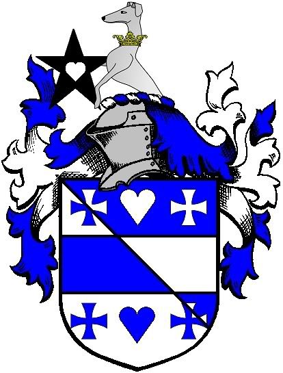
I prefer the Passant with the heart pierced mullet. I prefer the heart pierced mullet over the unpierced for all three greyhound positions too. I think it’s a nice bit of canting.
My preference is the demi-puppy, which seems more like something that could, at some point, actually have been modeled in 3-D & worn, issuing from a real wreath, on a real helmet. The others - especially the dog rampant - looks to me to be rather precariously balanced and (if modeled & worn) somewhat unstable. But that may just be me…(i.e. my opinion, not that I’m unstable…no really…).
Also, given the same space alloted to the crest, the demi-dog, the star & the heart-shaped piercing will all be larger scale and thus more readily visible and recognizable than either version with the whole animal etc. crammed into the same space. (Poor sentence structure, but I hope the meaning comes through). Imagine each design shrunk to signet-ring size - put each one on the xerox & shrink it to a total of maybe an inch high for the whole achievement—and I think you’ll see what I’m fumbling to say.
And obviously I like the mullet pierced of a heart, partly because I thought of it ![]() but also because it relieves (or lightens) the visual heaviness of the black star.
but also because it relieves (or lightens) the visual heaviness of the black star.
And if Philip or whoever will indulge the exercise (I love to make others do the real work!) try the shield with hearts replacing the center crosses in chief & base—I really like the cant!
Or not…
Mike~~
Michael F. McCartney wrote:
And if Philip or whoever will indulge the exercise (I love to make others do the real work!) try the shield with hearts replacing the center crosses in chief & base—I really like the cant!
You cant, I can! ![]() :lol:
:lol:
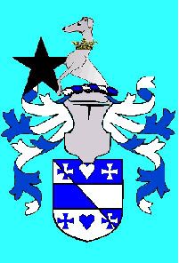
http://i40.photobucket.com/albums/e221/pblanton/White-13.jpg
Michael F. McCartney wrote:
Imagine each design shrunk to signet-ring size - put each one on the xerox & shrink it to a total of maybe an inch high for the whole achievement—and I think you’ll see what I’m fumbling to say.
Like this?
http://i40.photobucket.com/albums/e221/pblanton/White-13-1.jpg
Take care,
Wow. Many thanks to Philip, once more, for all the pro bono artwork. All of the examples look great. In terms of which one will have the most enduring appeal, I’ll have to meditate on that.
The advice about shrinking the passant design down to signet ring size to get a sense of its dimensions is particularly helpful, because I imagine I will want to have such a ring made one of these days. Although, isn’t it the case that people sometimes have signet rings featuring only their crest? I think I saw some tasteful-looking examples of rings like that at the Dexter Seal Engraving website.
It seems like most of the active posters here really dig the heart idea and really think a heart needs to be worked in, one way or the other. I’ll definitely consider it, though my instinct is to prefer the black star as is, heaviness and all.
I will continue to read with interest any feedback offered.
Michael F. McCartney;49924 wrote:
Also, given the same space alloted to the crest, the demi-dog, the star & the heart-shaped piercing will all be larger scale and thus more readily visible and recognizable than either version with the whole animal etc. crammed into the same space.
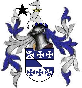
I think this problem would be eliminated if the helmet and mantling were eliminated, and the crest displayed simply on the torse directly above the shield. That would allow the greyhound passant and his attributes to "grow" a few sizes. Phil, if you have a minute, can you render the arms like that—sans helm and mantling, just torse and crest right above the shield? Just the passant version. The other crests are pretty big as it is.
I still can’t see putting a heart in there anywhere. Sorry!
fwhite;49929 wrote:
Wow. Many thanks to Philip, once more, for all the pro bono artwork. All of the examples look great. In terms of which one will have the most enduring appeal, I’ll have to meditate on that.
The advice about shrinking the passant design down to signet ring size to get a sense of its dimensions is particularly helpful, because I imagine I will want to have such a ring made one of these days. Although, isn’t it the case that people sometimes have signet rings featuring only their crest? I think I saw some tasteful-looking examples of rings like that at the Dexter Seal Engraving website.
It seems like most of the active posters here really dig the heart idea and really think a heart needs to be worked in, one way or the other. I’ll definitely consider it, though my instinct is to prefer the black star as is, heaviness and all.
I will continue to read with interest any feedback offered.
Yes, many people do have signet rings carved that show only the crest. I’m a fan of the demi-dog for no other reason than I, too, feel that it could have been a real and functional crest more easily than the full dog.
I’ll also chime in on the side of not liking the mullet voided of a heart. Too "Lucky Charms"-ish for my tastes. Just add a shamrock and a couple of crescent moons and there will be leprechauns dancing everywhere. :D
fwhite;49942 wrote:
I think this problem would be eliminated if the helmet and mantling were eliminated, and the crest displayed simply on the torse directly above the shield. That would allow the greyhound passant and his attributes to "grow" a few sizes. Phil, if you have a minute, can you render the arms like that—sans helm and mantling, just torse and crest right above the shield? Just the passant version. The other crests are pretty big as it is.
I still can’t see putting a heart in there anywhere. Sorry!
Fred, when you get to the real emblazonment stage, you’ll find that most artists will render your crest, helm and arms as a one-third, one-third, one-third sort of thing. So even if you put the crest on a torse alone, it still will measure about the same size as it would with helm and mantling. These proportions are pretty standard.
In the pics you’re seeing here, the helm is way too small for the shield.
Here’s a quick and dirty rework using Phil’s art and a few other things I have on my computer. It will give you a much better idea of scale.
http://i52.photobucket.com/albums/g29/PaddyW_photos/white1.jpg
Forgive the forward facing helm, it’s all I have readily available.
And looking at it, the mullet is also way too big.
Patrick Williams;49947 wrote:
Fred, when you get to the real emblazonment stage, you’ll find that most artists will render your crest, helm and arms as a one-third, one-third, one-third sort of thing. So even if you put the crest on a torse alone, it still will measure about the same size as it would with helm and mantling. These proportions are pretty standard.
In the pics you’re seeing here, the helm is way too small for the shield.
But if I hear you correctly, in this case, too, the size of the greyhound passant wouldn’t be such an issue.
Patrick Williams;49946 wrote:
I’ll also chime in on the side of not liking the mullet voided of a heart. Too "Lucky Charms"-ish for my tastes. Just add a shamrock and a couple of crescent moons and there will be leprechauns dancing everywhere.
I’m glad I’m not the only one who has trouble with it, though I appreciate the effort and the intention behind the original suggestion.
And here, because I obviously have too much time on my hands, is another version:
http://i52.photobucket.com/albums/g29/PaddyW_photos/white2.jpg
fwhite;49953 wrote:
But if I hear you correctly, in this case, too, the size of the greyhound passant wouldn’t be such an issue.
Sure it would: how do you put a greyhound passant on top of a helm if it’s as tall as the helm? The legs would be in thin air.
Now I’ll inject my particular biases for you. (Don’t you just love how we try to keep you confused?) :D
I don’t think the heart makes it as a cant unless the name is Hart (and then a stag would be better) or you’re in France. So in the last mini-emblazonment I went back to all crosses patee, which I think has a classier look.
If you’ve just got to put De la Coeur in there, why not adopt "From the Heart" as a motto? That’s one of the possible translations anyhow and I think it’s terrific. Then nobody’s running for their Latin to English dictionary and then trying to patch it back to French.
Patrick Williams;49960 wrote:
I went back to all crosses patee, which I think has a classier look.
I’ve reached the same conclusion.
Patrick Williams;49960 wrote:
If you’ve just got to put de la Coeur in there, why not adopt "From the Heart" as a motto?
Well, remember, working "coeur" in any form into the design isn’t a priority from my standpoint—though it’s not a bad idea. What is a priority is doing the least harm possible to the original Habersham arms while not seeming to simply usurp them.
Alas, of the greyhound designs, the one I like is the passant.
I’m beginning to wonder if leaving the crest alone (leaving it as "mullet Sable on a ducal coronet Or") would be best, and generating the second expected difference through a bordure azure and argent counterchanged is the way to go.