steven harris;96621 wrote:
I know that the livery colors are usually said to be the first color and the first metal mentioned in the blazon – here, that would yield Vert doubled Or. Given the arms, however, I would be more likely to say that the liveries were Sable (the color of the ordinary) doubled Or (the metal of the field). Thoughts?
I think a strong case could be made here for using sable (if preferred) instead of vert since the bends compete with the billets for dominance.
To me, the "rule" as to livery colors being the first metal & color in the blazon (or whatever) is merely a "default"—i.e. that’s what they are if nothing else is specified.
Of course it can lose a connection to the arms if there is, in fact, no visible connection (circular logic—my favorite!) but if both metals, or more than one color, are roughly equally prominent, which you choose shouldn’t pose any real problem.
There is also historical precedent for e.g. wreaths of more than two colors, or multi-colored manteling. It may or may not appeal to everyone—clearly doesn’t since it’s definitely not the normal "default"—but that’s OK.
werewolves;96619 wrote:
I’m liking this design- it allows me to incorporate the stripes as well as the two bottom designs that I’ve been toying with.
I’m not a huge fan of that type of skull, but a single skull a bit smaller and more realistic could work! Is there a special term for the type of division that slopes instead of angling?
I would blazon the enhanced tierce as:
Tierced per point arched.
Or…
Tierced in pale reversed and embowed.
Anyone else?
Also, I wouldn’t quibble about the style of the skull. What’s important is that the type of skull you’re looking for is followed… either with or without a jaw. For development purposes, try not to let clipart be a sticking point and just imagine the ideal of whatever charge is being presented. ![]() I think it would be helpful to imagine that some 13th century scribe is going to emblazon (read that as finger paint with the zeal of a five year old) your arms on a roll and it’s going to look barely like what you want it to… and then some scholar is going to look at it 500 years later and say, "These are the arms of so and so" and that may be the only reference your going to get. That in mind, better pick charges which don’t look good only when rendered a certain style, lol.
I think it would be helpful to imagine that some 13th century scribe is going to emblazon (read that as finger paint with the zeal of a five year old) your arms on a roll and it’s going to look barely like what you want it to… and then some scholar is going to look at it 500 years later and say, "These are the arms of so and so" and that may be the only reference your going to get. That in mind, better pick charges which don’t look good only when rendered a certain style, lol.
Haha I’ll keep that in mind Jeff!
Medugal;96682 wrote:
I’m liking this design- it allows me to incorporate the stripes as well as the two bottom designs that I’ve been toying with.
I’m not a huge fan of that type of skull, but a single skull a bit smaller and more realistic could work! Is there a special term for the type of division that slopes instead of angling?
I think you kind of lose the concept of the sun’s rays hitting a graveyard when you go with the seme of billets on the sinister, thereby negating the reason for the "rays" of Or and Argent… losing the cohesiveness of original intent and art.
But, that’s just me…
I have to agree with Kathy. Although the design has meaning, it lacks IMO an overall cohesiveness. A good start, although I feel less would be more.
Medugal;96605 wrote:
Haha yes it is pretty familiar- it’s inspired by St. Francis Xavier’s CoA:
I don’t think these are the arms of St. Francis Xavier—or the Spanish post office doesn’t think so. Here is a stamp they issued commemorating him.
http://img39.imageshack.us/img39/2218/xavier1.jpg
Uploaded with ImageShack.us
Dohrman Byers;96693 wrote:
I don’t think these are the arms of St. Francis Xavier—or the Spanish post office doesn’t think so.
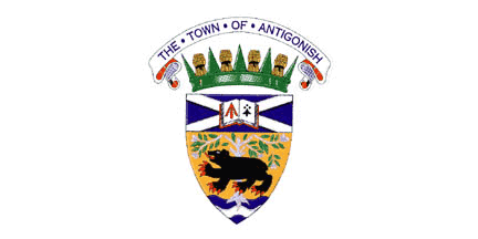
They aren’t. They’re the arms of St. Francis Xavier University in Antigonish, Nova Scotia.
Antigonish has a nice coat of arms, by the way:
http://www.crwflags.com/fotw/images/c/ca-nsant.gif
Explanation is at http://www.crwflags.com/fotw/flags/ca-nsant.html
Richard G.;96692 wrote:
I have to agree with Kathy. Although the design has meaning, it lacks IMO an overall cohesiveness. A good start, although I feel less would be more.
I must concur. Three different charges on a three-part field seems rather cobbled together.
I’m enjoying the color/pattern composition of it. I think Kevin did a great job of deciphering what I was going for based on my different designs (i.e. having too many ideas and not enough canvas for it all!).
I’ve made the "arched/embowed" (thanks Jeff!) modification and have been playing with different charges for the sable section, but honestly just having it uncharged right now still looks pretty good imo.
I’ll keep sketching, maybe soon I’ll have settled down a bit!
I just wanted to update the thread and let everyone know that I’ve currently narrowed myself down to two designs:
and
I personally enjoy the bottom one.
As do I. Although I still feel that the torch is still a little cliche, but I like the overall look of the design.
Ditto—of the two, the bottom one is IMO by far the better — both artistically (i.e. a design that any number of artists could render quite nicely in a variety of styles—the upper design not so much…)
and heraldically (a unified design, with sufficient internal variety to be interesting but no likely implication of some sort of marshalling—again, the upper design not so much…)
Of course the final choice between the two is ultimately yours to make, but hopefully our comments and suggestions are & have been helpful.