Greens and blues? Check. Hunting and fishing? Check. Outdoors? Water? Check. Christian faith? Check.
<div class=“bbcode_center” >
http://img827.imageshack.us/img827/7256/i0i.png
</div>
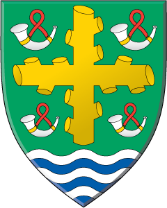
Maybe one vs 4 horns will make it look a little less static.
http://www.americanheraldry.org/forums/attachment.php?attachmentid=1206&stc=1&d=1371223106
That is an improvement.
Interesting proposals.
Another more straight-forward approach to arms for this Catholic outdoorsman apparently not really "into" the fine points of heraldry would be Azure a tree (his choice—maybe pine for the northern woods) Proper—his blue, green & brown outdoors—between two or three religious items, or an orle of small crosses or whatever—maybe dogwood blossoms?; or maybe within a string of rosary beads in orle with a crucifix suspended in base (on the shield, not surrounding it) if this use of the rosary would be considered an acceptable charge for a Catholic layman.
While "Proper" technically avoids a violation of the tincture rule, the artist would of course have to exercise discretion in choosing shades of color for visual contrast—either dark blue field and light green & brown tree, or vice-versa. (I could suggest "bleu celeste" but no need to provoke Joe unnecessarily ![]() )
)
It will be interesting—as always!—to see which way this design process goes.
You’ve GOT to allude to St. Hubertus, patron saint of hunters!! Usually a stag with a shining crucifix between the antlers.
Perhaps: [for crest] A stag’s head erased [tincture], between the attires a cross raguly.
Examples:
http://i84.photobucket.com/albums/k27/jakyl32/365 Rosaries- NOVEMBER/113hubert20.jpg
Jaegermeister:
http://3.bp.blogspot.com/_xslElWhAZBQ/SUXy_vQRLLI/AAAAAAAABCk/TGtmBnVFa04/s400/jager.jpg
http://www.creativeminorityreport.com/2010_10_01_archive.html
http://www.nemzetijelkepek.hu/pictures/onkormanyzat/Keszeg_265.jpg
—Guy
Michael F. McCartney;99379 wrote:
Interesting proposals.
Another more straight-forward approach to arms for this Catholic outdoorsman apparently not really "into" the fine points of heraldry would be Azure a tree (his choice—maybe pine for the northern woods) Proper—his blue, green & brown outdoors—between two or three religious items, or an orle of small crosses or whatever—maybe dogwood blossoms?; or maybe within a string of rosary beads in orle with a crucifix suspended in base (on the shield, not surrounding it) if this use of the rosary would be considered an acceptable charge for a Catholic layman.
It will be interesting—as always!—to see which way this design process goes.
Similar to the idea you presented. The arms of Mníšek, Czech Republic
http://upload.wikimedia.org/wikipedia/commons/9/98/Znakmnisek.jpg
So here are some designs I put together tonight, mainly to see how they would look. The ones with the rosary feel overly cluttered to me, but it could just be the artwork I used. I’m personally happy with the top right design and feel it covers the basics I’m looking to achieve.
Ignore the alignment on the top left design, I moved my layer and didn’t catch it.
Thanks to Guy for the reference!
http://i18.photobucket.com/albums/b146/Snydercrew/samples-01.jpg
Those are very nice!
I like the first five best; #6 is nice, but no allusion to St. Hubertus.
—Guy
I like 3, 4 and 5. ![]()
Jeffrey Boyd Garrison;99582 wrote:
I like 3, 4 and 5.
If those were the only designs to select from, I’d choose 5. I really like that one.
—Guy
three
I agree with Kenneth that #3 is the best of this lot, by a wide margin.
#3 followed closely by #4, in my opinion.
Another vote for 3!
3 appeals to me most.