Charles Mosteller;42957 wrote:
I’m not really a fan of horses, and I understand what you are saying, Joseph. I don’t really like the horse comb as a charge.
Not a problem. Just one approach to arms design, among many acceptable ones, offered for whatever it was worth.
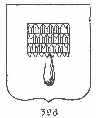
In case anyone’s interested, here’s the image of a heraldic curry-comb from Francois Velde’s heraldic glossary and atlas at www.heraldica.org:
Charles Mosteller;42957 wrote:
I try to remain flexible, though, and am open to suggestions. I’m not dead set on any design in particular, though of the designs that I have played with on my computer, thus far, I am most partial to a gold one-eyed sun on a dark blue shield.
Two points: (1) "dark blue" is not a heraldic tincture—"blue" (Azure) is. Whether Azure is rendered as dark blue, royal blue, midnight blue, or light blue is between you and your artist. (There is a tincture called Bleu Celeste, not part of the traditional heraldic palette, used for light sky blue when it’s necessary to stipulate that particular shade, but no equivalent for dark blue.)
(2) A gold sun on a blue field (regardless of the number of eyes, which would be indistinguishable at a distance) is such a simple composition that it inevitably duplicates many, many other arms, including (as found by a quick Google search) one medieval knightly family (the Elthams/Aldhams), an English town (Banbury), a Swiss family (Wyssachen), and at least a half dozen families and towns in various French provinces. If you want to use a gold sun on a blue field, that’s fine, but you’ll need some other things on the shield to make a good faith effort at uniqueness.
Simple is good, but the simplest designs are, unfortunately long since taken.
Joseph, that brings a question to mind I’ve been struggling with: in an image from an old armorial, I recently discovered a CoA whose blazoning would be problematic. It was per pale, two shades of blue, over all a gold Fleur d’Lys. Now, I know we try to avoid such things, but this is an historical example and so we know it has, on occasion, been done. How would we blazon it? Per pale, two shades of Azure, over all a fleur d’lys Or? The lighter shade was darker than celeste, so that wouldn’t work ... anyhow, it leaves me confused. Any insights?
How old an old armorial? Some inks and paints used in the old days for green tended to fade to blue (or greenish-blue, or bluish-green), plus, if you’re not looking at the original manuscript, you may have some color distortion from the lighting used for the photograph. Also, a manuscript painted using metallic paint for Argent will tarnish, sometimes to something with a dark bluish tinge. Or Sable could have faded to dark blue as well. So there are lots of possible explanations.
If it’s a real armorial, I would tend to discount the idea that an early herald would have used two shades of the same tincture.
David Pritchard;42966 wrote:
As you want to have an entirely fresh field to represent yourself and your son without any reference to any charges used any earlier Marstallers, may I suggest that you keep the ties to the historical origin to your surname when it comes to your crest and mantling. Your mantling could very easily be powdered with horse shoes or snaffle bits. Your crest could be an arm wielding a lunge whip (used in training and exercise).
What’s a snaffle bit? I don’t have any set notions on what I want the mantling to look like, so there is considerable flexibility there. When you say "powdered with," does that simply mean lots of them?
With regard to the crest, could I put the sun there? Or a Titan figure there? I don’t know exactly what all is considered to be "acceptable" in the various parts of the whole thing.
Joseph McMillan;42968 wrote:
Two points: (1) "dark blue" is not a heraldic tincture—"blue" (Azure) is. Whether Azure is rendered as dark blue, royal blue, midnight blue, or light blue is between you and your artist. (There is a tincture called Bleu Celeste, not part of the traditional heraldic palette, used for light sky blue when it’s necessary to stipulate that particular shade, but no equivalent for dark blue.)
Understood. To me, it’s blue, though, whatever the heraldic term for it may be.
(2) A gold sun on a blue field (regardless of the number of eyes, which would be indistinguishable at a distance) is such a simple composition that it inevitably duplicates many, many other arms, including (as found by a quick Google search) one medieval knightly family (the Elthams/Aldhams), an English town (Banbury), a Swiss family (Wyssachen), and at least a half dozen families and towns in various French provinces. If you want to use a gold sun on a blue field, that’s fine, but you’ll need some other things on the shield to make a good faith effort at uniqueness.
Joseph McMillan wrote:
Simple is good, but the simplest designs are, unfortunately long since taken.
That’s fine. I don’t have a problem with trying to make it unique. Not knowing what various other individuals have used down through history, though, I can’t guarantee that it won’t be similar to what someone else has used at some point in history. Previously, someone had encouraged me to consider keeping it simple.
I would suggest looking at the arms Joe mentioned so you know what to avoid in your design.
You can also do multiple suns if you wanted
Keeping it simple in terms of charges and divisions of the field I think is what is meant.
Perhaps you could tweak your current idea by adding something in chief or on a chief or flaunches? Perhaps something that reflects you and your wife? While you want something to reflect how central your son is to your life in your arms, when he inherits them from you he may want something to reflect how important you were to him.
As for powdering the mantle, you are correct. If you look at Davids arms in the armorial, you can see the powdering of a charge on his mantle.
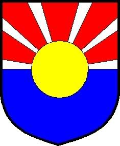
Since you like the idea of a sun on a blue field, what about something like this?
http://i40.photobucket.com/albums/e221/pblanton/Mosteller.jpg
I believe the blazon would be something like:
Per fess Argent and Azure in chief five piles in point Gules a bezant overall.
Just a thought. :wink:
Take care,
Another option might be to add an orle of some smaller objects—possibly horseshoes or snafflebits or whatever strikes your fancy—maybe golden apples of the sun? ![]() This does minimal visual "damage" to your preferred main design theme of a sun, but still distinguishes your arms from others featuring a sun. You can play with color variations—same color as sun—in your case, Or (gold), or Argent (silger or white) for a little more color contrast.
This does minimal visual "damage" to your preferred main design theme of a sun, but still distinguishes your arms from others featuring a sun. You can play with color variations—same color as sun—in your case, Or (gold), or Argent (silger or white) for a little more color contrast.
Phil,
That design makes me think of Japan. Is there an ancestral link to Japan?
Trent wrote:
That design makes me think of Japan. Is there an ancestral link to Japan?
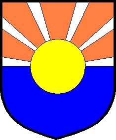
I kinda see what you mean. I was trying to stick with the red-white-blue theme. The gules could always be changed to something like tenne to better represent the sun’s rays. Like this:
http://i40.photobucket.com/albums/e221/pblanton/Mosteller2.jpg
Take care,
Phillip,
The sun with rays or piles reminds me of the flag of the State of Arizona, which I find terribly unappealing. The next thought I had about these proposed arms was their resemblance to the flag of Tibet under the Dali Lama, which is another flag that I find particularly hard on the eyes. I think that the Mosteller arms would look best if they were to have some Gallic influence, that is simplicity of partitions and charges, balance in form and the colours used, which when combined produce an overall elegance and timelessness.
As I have no ability in computer graphics, would you be willing to work up a few designs with me for Charles?
I knew there were other flags that it resembled. Thanks for bringing those up David.
I see what you mean about the Arizona and Tibetan flags. That was just the first idea that came to mind. :D
David Pritchard wrote:
As I have no ability in computer graphics, would you be willing to work up a few designs with me for Charles?
Absolutely! PM me or post your blazons here and I’ll draw them up as quickly as I can.
Take care,