The shield looks great. Clean, simple, memorable. Looks good small and large. Works on a number of levels. Hope it does not resemble other arms too closely.
As I mentioned in a previous post, animals connected with Helios are the rooster, bull, and white horse. Doesn’t the surname have something to do with horses? Wouldn’t a horse charge kill two birds with one stone?
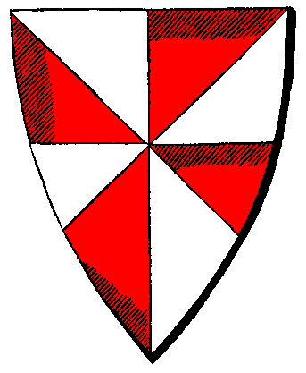
What about the colors red and white? Charles wanted to express his nationality with the colors red, white, and blue.
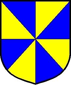
Phil, would you try a plain gyronny design (without a roundel) with the colors blue and yellow, and put that gyronny in base?
Trent wrote:
Phil, would try plain gyronny design (without a roundel) with the colors blue and yellow, and put that gyronny in base?
I’m not sure what you’re asking for, but I’m fairly sure that Gyronny Azure and Or has been taken. Probably a few times.
http://i40.photobucket.com/albums/e221/pblanton/gyronny.jpg
Take care,
PBlanton;43192 wrote:
I’m not sure what you’re asking for, but I’m fairly sure that Gyronny Azure and Or has been taken. Probably a few times.
http://i40.photobucket.com/albums/e221/pblanton/gyronny.jpg
Take care,
Especially since, unless I am mistaken, that is gyronny Or and Azure.
I meant making the base of the shield a gyronny of 8 or 10. The upper portion would be some other color/division.
ESmith wrote:
Especially since, unless I am mistaken, that is gyronny Or and Azure.
From Parker (emphasis mine):
Gyronny, (fr. gironné), (from the Spanish Gyron, a triangular piece of cloth sewed into a garment). The usual number of pieces is eight, but there may be six, ten, or twelve. Party per saltire has been erroneously called gyronny of four, but in English armoury one of the lines forming the pattern must be in fesse. It will be observed that the term is an ancient one. The gyron with which the tinctures begin is the uppermost upon the dexter side.
Given as an example is the arms of Acton:
Gyronny of eight, argent and gules—ACTON.
http://www.heraldsnet.org/saitou/parker/images/301a.gif
Trent wrote:
I meant making the base of the shield a gyronny of 8 or 10. The upper portion would be some other color/division.
Ahhhh…I see. :D
Take care,
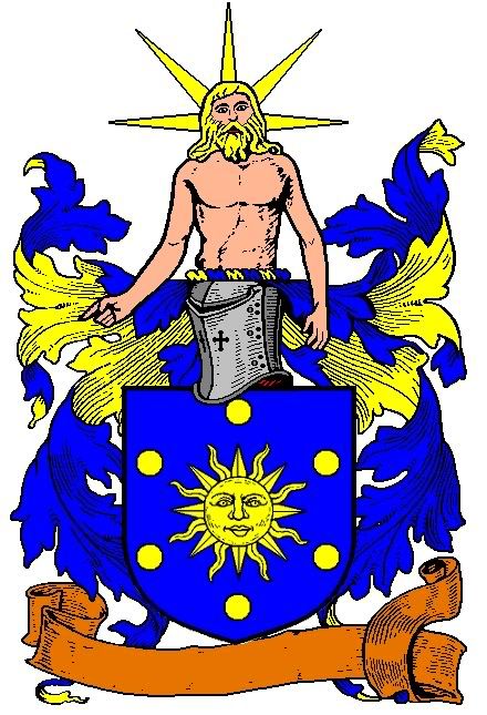
None of you should be surprised that I like the design. I am especially pleased with Phil’s fine rendering of Hyperion. In regards to Trent’s comments about the colours red, white and blue being a reference to Charles’ nationality, I do not really see the point in this reference unless Charles plans to emigrate. Most of us on this forum are US citizens who have various colours in our arms and this fact makes us none the less patriotic. In fact when I see red, white and blue arms, I do not think American first but rather French, British, Russian, Czech, Dutch, Slovene, Luxembourgian, Slovak, Serbian, Panamanian, Dominican, Cuban, Puerto Rican, Liberian, Malaysian, Taiwanese, Thai, etc., etc., etc. In other words this colour scheme is very tired.
By the way, my proposed blazon would make a great heraldic flag, which was something that Charles wanted for his house.
PBlanton;43182 wrote:
http://i40.photobucket.com/albums/e221/pblanton/MostellerAchievement.jpg
Arms: Azure, the sun in its splendor Or, within an orle of six bezants.
Crest: On a wreath Or and Azure, a demi-figure of the Titan Hyperion Proper.
That’s a nice design, but I feel that the chief makes the gyronny seem a bit "squashed".
How about this design that I made:
http://i25.photobucket.com/albums/c93/mohamedhossam/arms-1.jpg
I know it may seem a bit "off", but I think it shows your American roots as well as keeps the sun symbolism.
I can always simplify it, or better it (fewer stars?). I also think you should avoid placing anything on the sun, unless of course you are in some way connected with the Air Force in which case I think a blue roundel (hurt) with a mullet argent in the center of the gyronny would do a great job of showing, in which case, the "rays" can be gules.
Mohamed,
These arms look like they were designed for Captain America and the Nija Turtles!
Hey Phil,
I didn’t make that quote about Gyronny Or and Azure. I think Everett did. Why does it say it was posted by me?
Yes, the version with the chief is close to what I was getting at. Something like the NSTAR logo is more what I had in mind.
http://www.nstaronline.com/residential/ Now that I look at that logo, maybe it’s some type of pily. Anyone know how to blazon it?
David,
The red, white, and blue was not my idea. If you read the first post of this thread, you’ll see that it’s Charles’ idea.
Sorry about that Trent, I must have been in too much of a hurry. :oops: It’s been changed.
Mohamed, cool design! But I have to agree with David, it looks very "comic-bookish". Any American-ninjas out there needing arms?
Take care,
Mohammed,
I agree with Phil and David.
Hmmm…..what if I deleted the stars, and made the rays Gules and Argent, made the "sun" Azure and in the center put a Mullet Azure bordered Argent? Lemme see how that would look, but be warned, my heraldic expirements have been known to induce physical illness due to their sheer ugliness! ![]()
Sorry, I have to go with Phil, David, and Trent. Can you say "Wonder Woman"?
WBHenry;43211 wrote:
Sorry, I have to go with Phil, David, and Trent. Can you say "Wonder Woman"?
That is exactly the comic book character who came to mind! There are alternative takers for these arms besides Wonder Woman, like an American-Japanese Joint Police Task Force or the Japanese-American Frisbee Golf Association of San Diego County.
Leaving aside the comic book characters I had a moment’s wonder at the titan Hyperion because I came into this part of the thread at David Pritchard’s statement
Quote:
None of you should be surprised that I like the design. I am especially pleased with Phil’s fine rendering of Hyperion.
and I hadn’t scrolled down far enough to see any images. My immediate reaction was that this was the Hyperion mentioned
http://www.jockey-club-estates.co.uk/images/pic10.jpg
For those in the UK the word Titan in front of Hyperion is gonna be pretty essential.
James