I did not particularly care for the saltire in previous renditions, but with it outlined in sable and with the peels in sable, I kinda like it now. And I see the "star crosses" have at last made an appearance! When this becomes a constitutional republic, I will vote for #3. ![]() Till then, what do you think, Jonathan? (By the way: Where’s the french bread?)
Till then, what do you think, Jonathan? (By the way: Where’s the french bread?)
PBlanton;44533 wrote:
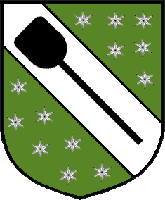
I changed the peels on the saltires to Sable to make them stand out a bit more. The odd looking stars on the last two are actually mullets of four points radiant. This was included to give the idea of a "cross" and "star" in the same charge.
Mullets of four points radiant, from whence did this heraldic description come? I know this charge as the heraldic spark, at least that is how it is described in continental Europe. Is your radiant mullet a British term? Maybe sparks in conjunction with the peels make a fine reference to the baker’s oven.
David Pritchard wrote:
Mullets of four points radiant, from whence did this heraldic description come? I know this charge as the heraldic spark, at least that is how it is described in continental Europe. Is your radiant mullet a British term? Maybe sparks in conjunction with the peels make a fine reference to the baker’s oven.
That was the best description I could come up with. :D
Take care,
For what it’s worth (not much ![]() ) I am partial to #3 on phils last post. I think it looks very nice and incorporates nearly everything Jon wanted into the arms.
) I am partial to #3 on phils last post. I think it looks very nice and incorporates nearly everything Jon wanted into the arms.
Jonathan R. Baker;44491 wrote:
I showed my dad some of the stuff we’ve worked up, and he really liked Colin’s idea to put the peels on a saltire, but he liked the other stuff as well.
Inspired by a read through the Finnish Genealogical Project thread, here are a couple more renditions. Again, I’m just throwing ideas out there for comments and criticism, so don’t hold back.
http://i5.photobucket.com/albums/y155/jonishairy/Heraldry/Baker4.gif
My wife didn’t like the bezants, so I attempted to make a French loaf.
http://i5.photobucket.com/albums/y155/jonishairy/Heraldry/Baker4-2.gif
I just found out that my parents and grandparents will both be in town for Mother’s Day (that never happens), so I’d like to have a few proposals to show them. I like what we’ve got so far, but I’d like to see any other ideas you guys might have.
Thanks,
JRB
These are okay, but I like the symmetry of the previous ones you have been working with better. If you were going to do this, I might suggest just going with a normal cross and having the peels cross there, instead of this off-axis cross.
I am not a fan of the "Peel in the masoned oven" Coat of arms. It might be okay for a bakery to use, but for family arms, I think the baker profession illusion is a little strong, for my tastes.
But my opinion’s not worth much, and if jon, and his family, like them that’s what’s really important.
I really like all of Phil’s latest renditions. The only thing about the "spark" or "mullet of four points radiant" is that while I like the charge itself, I wouldn’t want to use something that wouldn’t be easily reproducible by an heraldic artist. That, to me, is the whole purpose of using blazon, and so it would be a self-defeating effort to blazon such a shield. On the other hand, if we were to find a precedent for its use, I’d be happy to keep it on the shield, as I think I like it better than the estoile.
As a wise man once said, "And now for something completely different…" Here are a couple more I came up with. They’re a little bit different from previous depiction, but that doesn’t mean that I’ve necessarily dismissed those designs. These are just more options to mull over.
Let me know what you think.
JRB
These are my first and second choices of those recently displayed. I suggest for the arms on the left that the crest be Or and the torse be Argent, Or and Vert with the mantling being Vert doubled paley of Argent and Or.
http://i40.photobucket.com/albums/e221/pblanton/baker2.jpg http://i5.photobucket.com/albums/y155/jonishairy/Heraldry/Baker5.gif
A nordic style one-off…
[ATTACH]219[/ATTACH]
Jonathan, of your most recent choices, I like the bend with peel best. Just out of curiosity, why the dovetails on the chiefs?
Take care,
I really like it Mike, but the flames seem a bit, um…scary. Sorta "heck"ish ![]()
cheers,
PBlanton;44595 wrote:
Just out of curiosity, why the dovetails on the chiefs?
The dovetails are a <i></i>subtle nod to our Pentecostal heritage. I had actually mentioned a dovetailed partition way back in my very first post, but had yet to try it on for size.
JRB
MohamedHossam;44598 wrote:
I really like it Mike, but the flames seem a bit, um…scary. Sorta "heck"ish
cheers,
I thought about using a line of torteaus (representing red coals) instead of flames. I think it is better than the "place holder" arms! Reminds me of "this page empty" or "billboard for rent."
I think torteaus would look nice.
Hmm, how about this:
Or, a Peel fesswise gules between three torteaus?
That would look very nice and simple, and it would use only two colors. By the way, something that I feel I should point out, and it may seem a bit mean, but in your coat of arms, you don’t have to refer to every single aspect of your heritage/family/etc.
Cheers,
Michael Swanson;44601 wrote:
I think it is better than the "place holder" arms! Reminds me of "this page empty" or "billboard for rent."
And I was beginning to think that no one noticed my little joke.:p
MohamedHossam;44605 wrote:
By the way, something that I feel I should point out, and it may seem a bit mean, but in your coat of arms, you don’t have to refer to every single aspect of your heritage/family/etc.
Not mean at all….I’m not a person easily offended. I thought I was doing pretty well about not trying to cram too much symbolism onto one shield. Yes, all of the charges have a meaning behind them rather than being arbitrary additions, but I have endeavored to keep the design simple.